
Excuse me! I’m an email subscription pop-up. I hope you don’t mind the interruption. You can tell me to go away, if you like… or you can pop in your address and look forward to some juicy content in your inbox. Does a 15% discount sweeten the deal?
Modern websites are full of things popping up. Cookie permission(ugh), app downloads, browser notifications. And of course email subscription pop-ups. Let’s take a closer look at the latter.
But aren’t pop-ups annoying?
Yes, they are. People hate pop-ups. I’m not using the H-word for dramatic effect. G2’s survey on the topic found that over 80% of respondents felt that strongly. By contrast, fewer than 5% expressed positive feelings towards pop-ups.
So why use them? Because they work! The average email pop-up converts nearly 4% of website visitors. And that can’t be chalked up to people who were going to subscribe regardless. Pop-ups offer a 100% increase in subcriptions when compared to a static sign-up box. The stats don’t lie – pop-ups are worthwhile.
Take a pop-up at it
We’ve established that email pop-ups are simultaneously annoying but effective. Ultimately any annoyance is likely to be short-lived, whereas the benefits for those who subscribe are ongoing. I know I don’t hold a grudge against thatgoddamnwebsite.com for the time it asked me if I’d like to receive a newsletter.
The aforementioned survey backs this thinking up. The primary reason for pop-up hatred is that “they’re everywhere”. That’s a factor of ubiquity that is neither focused on nor controlled by any one brand. A single pop-up on a single website is no big deal.
Still, this doesn’t mean that your pop-up should be slapped onto your website without a plan. Apply a bit of strategy and you can mitigate the annoyance factor while squeezing out a few more conversions. Here’s what to consider.
Content with context
It’s useful to remind oneself that a pop-up is part of the website, and not some detached entity. Its content can change, both contextually and periodically. As with all content, if you can personalise it to the user in some way, great.
That personalisation could be a simple as page-specific wording. Is the user browsing a particular department on your website? Focus on that. Are you able to track where the user came from, or what they’ve been doing on your site? That’s some pop-up-tailoring data at your disposal.
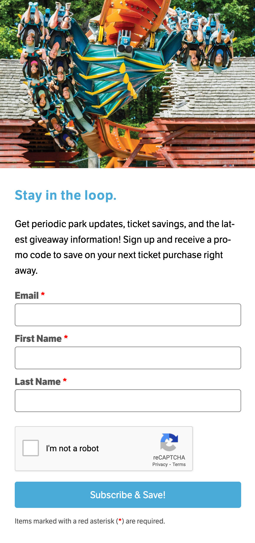
Something for your trouble
Time on the internet passes in a sped-up form, like some kind of digital dog years. Every second is valuable. Signing up may only take a few moments, but dismissing a pop-up is even quicker. It’s seconds versus milliseconds.
An incentive helps to swing the odds a little. For retailers, that often takes the form an introductory discount. Entry into a prize draw is an alternative. If yours isn’t an ecommerce business, you could offer a white paper in exchange for subscribing.

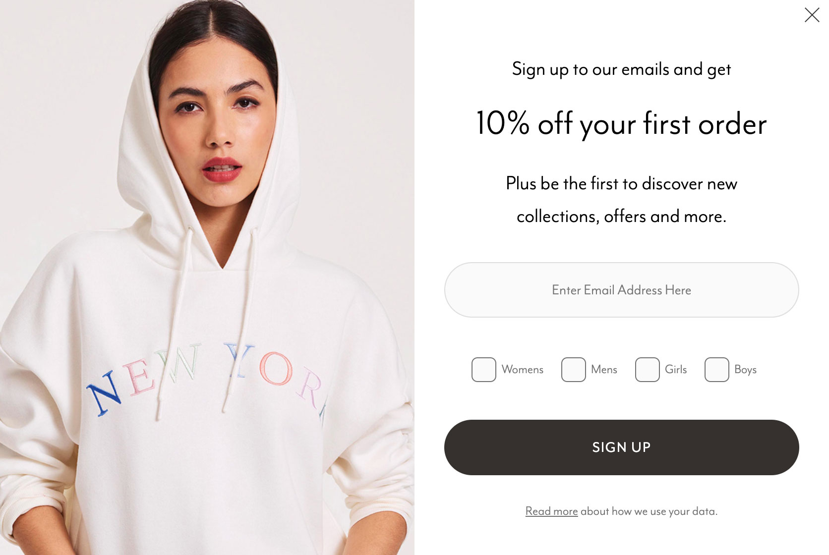
An opportunity to learn
What you ask the user to input into a pop-up box is up to you. Email of course is essential. Customer name is optional.
But how about interest checkboxes? Your data on an imminent subscriber could be meagre to non-existent, and we all know how valuable personalisation is in email marketing. Giving people the means to tailor their emails up-front is a great way to get to know your subscribers better.
Feeling triggered
There are several ways to make a pop-up pop up. Instant, time-based, scroll-based, exit intent, click-based. Each of those has a range of options to consider. How many seconds should elapse before the message appears? How far down the page is sufficient? Are multiple triggers appropriate? It’s probably worth mentioning that Wisepop’s stats on pop-up conversion rates hugely favour click-based triggers.
You don’t necessarily need to think within the scope of a single page. A global pop-up plan could be just what you need. Perhaps you want to set off on the right foot and leave the pop-up until the user has clicked onto a second page.
Design considerations
Pop-up designs come in various forms. The most popular is an in-your-face middle-of-the-screen prompt. Some variations even go for broke and fill the entire viewport. A more subtle option is to slide a box or tab in from an edge of the screen, quietly requesting attention rather than demanding it.
There’s also a clever hybrid design that blends aspects of a static sign-up box and a pop-up. Place a sign-up box somewhere on the page, and highlight it as the user scrolls past. A glow effect, a wobble animation – there are plenty of creative options.

Don’t give up to soon…
A lot of websites have a single email pop-up. Dismiss it, and that’s that – at least until the cookie that suppresses it expires.
But it’s very easy for a user to instinctively dismiss a pop-up the moment it appears. Just because the user zapped it this time, doesn’t mean that they won’t ever be interested. Creating a series of infrequent pop-ups – distributed across a series of days or weeks – gives you additional chances to gain a subscriber.
…but know when to stop
A series of two or three pop-ups is fine. But stop before asking becomes pleading. You’ll also want to consider what the user is currently doing. A disruptive message springing up while watching a video or filling out a form is likely to cross the line from annoying to infuriating.
Always include an easy-to-find static sign-up box somewhere on your website in addition to any pop-ups. Minds can be changed!
Don’t guess. Test
If ever there was a piece of website content that can benefit from comparitive A/B testing, it’s a subscription pop-up. Put a plan in place to test a theory, give it time to gather statistically significant results, and discover what your visitors respond best to.
Continuing the theme of testing – don’t forget to test that the pop-up displays properly across a range of browsers and devices! While trawling the internet for example pop-ups, I found a surprising number that failed visually or functionally in some way. Some had truncated text or unintended partial scrolling, others clashed with cookie pop-ups and were accidentally dismissed alongside them.
Don’t forget to say hello
Your pop-up is just one of many landmarks in your customer journey. Don’t leave new subs hanging – greet them with a welcome email and let them know their subscription matters.
And now it’s time to say goodbye. Thanks for popping in.