

There’s a lot to like about email. Unrivalled return on investment. Unique capacity for one-to-one personalisation. The little ding sound effect when new mail arrives.
There are a few things to dislike too. Spray & pray marketing. Skewed engagement rates. And of course spammers and spamlike mailing strategies.
It’s easy to discern the good from the bad. Or is it? Let’s explore a few blessings in disguise.
Unsubscribers: a healthy fact of life
New subscriptions and growing mailing lists are lovely. New people, new opportunities. That’s what we want to see.
Today’s enthusiastic new subscriber however might be tomorrow’s disengaged recipient. Maybe they only signed up for the introductory discount. Perhaps they only had a one-off need for your products. Or it could be that their interest was based on passing curiousity rather than a real passion for what your brand represents.
Whatever the reason, the worst thing that can happen next is for inactive subscribers to hang around doing nothing. Your engagement rates will drop. You’ll waste money sending emails to people who don’t care. Your sender reputation could take a knock. Therefore it’s better for you, the marketer, if they leave. Unsubscription is healthier than inactivity.
Truncation: keeps us guided
If your email is too big, it gets chopped in Gmail. It goes without saying that is something to be avoided.
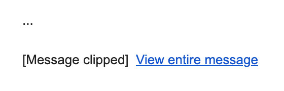
When the HTML document reaches around 100KB, you’ve hit the danger zone. I’ve seen many a struggle to limbo dance under that limit when working with larger mailings. What a needless constraint, right?
Actually, no. The kilobyte cap serves as an important reminder about design and content. We’re designing emails, not mini-websites. There are often extraneous items that can be shed, not as a reluctant sacrifice but as way to produce a better mailing. And don’t send oodles of content to everyone. Segment your audience and stick to focused, targeted content.
Forced dark mode: helps keep our designs clean
Black text, white background is no longer the norm… necessarily. Dark mode has become optional but standard functionality across a range of operating systems, and some websites.
What does it mean for email? It depends where you’re viewing that email. Apple Mail on iPhone and Mac lets you, the developer, take full control. You can and should create a dark mode look and feel that satisfies both the user’s choice of display settings and your branding.
Not all email applications are on the same page however. Gmail and Outlook force a dark mode colour scheme of their own. With images left untouched, this can result in a horrible, partially inverted mess.

Until such times as these applications have modernised CSS support, the only solution is to design around this accidental ugliness. But really that’s not as bad as it sounds. Using real text rather than images-of-text goes a long way to solving the problem and is in the spirit of accessibility. PNG images with transparency make sure that your imagery can blend correctly with any background, where appropriate. And avoiding needlessly complex designs reduces the number of things that can go wrong. Less is more in email.
Limited CSS support: encourages creativity
We mentioned Apple Mail’s capabilities earlier. Its CSS support is unrivalled among major email applications. And therein lies the problem – there’s a lack of standardisation, and in particular the ever-popular Gmail simply does not match up to Apple Mail when it comes to displaying emails.
An email designer therefore needs to know what works where and how a mailing can gracefully degrade on less advanced rendering engines. Seen through the right lens, this patchy support for HTML and CSS isn’t so much a nuisance as it is a creative and technical challenge to overcome. There’s an element of liberation through limitation. And to use an obnoxious cliche, it encourages out-of-the-box thinking.
The promo tab: improves the email experience
Gmail introduced a secondary tab for marketing emails over a decade ago, and other email providers have since followed suit. This auto-sorting of mailings was met with intense trepidation by marketers, who feared that their offers might never been seen. There are still questions to be found here and there on forums by people looking for the secret formula to escape the promo tab.
In reality, the promotions tab has helped to create a cleaner inbox for customers… and without destroying the email marketing industry! It’s easily accessible and the stats demonstrate that most users check it regularly. But perhaps most significant is the behavioural insight proposed by Chad White at Oracle – that those who go rummaging in the promotions tab have an active interest in buying something. That in turn is likely to yield a higher click-to-open rate.
Outlook: it helped create an industry
Microsoft Outlook is the standard and long-standing email application in the business world. And it’s also considered the bane of many an email developer’s life. With an antiquated level of HTML and CSS support, Outlook necessitates all manner of coding trickery in order for HTML emails not to fall apart.
But that’s not an entirely bad thing. In fact, it’s a major factor in why email development is a niche skill worth paying for. Knowing how to cater for Outlook while simultaneously making the most of other email applications – that is at the core of email design and development.
Every cloud
Or at least some clouds have a silver lining. Focus on the positives and let’s make the most of this unique medium.