Email Design

Are your brand guidelines throttling your creativity?

Colours. Tone of voice. Typographical style. Logo dos and don’ts. A brand’s identity is a complex, multifaceted thing. Brand guidelines play an essential role in keeping this distinct character in check.

Just don’t take them too seriously.

Creative straitjacket

It’s no secret that consistent branding is important. Consistency fosters familiarity. Your customers – and potential customers – come to know and instantly recognise your brand.

It’s easy however to get carried away when putting down the rules in black and white (or whatever your colour scheme may be). Brand guidelines should serve as a helpful design aid, not an iron fist that stifles creativity. The clue is in the name: guidelines. Not laws.

Absurdity in detail

I’m a big fan of documentation in general. And the more detail, the better. Usually.

Some of the finer details in brand guidelines however tend to verge on absurdity. Do people really care or even notice that an apostrophe is curly rather than straight? And while it could be argued that our brains are subconsciously aware of these subtle details, my gut tells me that it’s overkill. Focus that energy on quality content instead.

Content blindness

There are consequences to restrictive brand guidelines. Thinking specifically about email marketing, it’s common to see the same design wheeled out time and time again. And that includes recurring content blocks. Regular readers may start to experience ‘content blindness’ as a result.

We have one particular client that is not afraid to break free and design a little more liberally. They were the inspiration for this article in fact. Each of their email’s ‘hero’ images is unique. The typography is varied. In short: their emails are fun to receive, and the variety keeps people coming back for more. But crucially these designs are still on-brand. There is a balance to be struck.

Flexibility is key

The solution isn’t scant detail or oversimplification in a company’s brand guidelines. After all, a creative free-for-all defeats the purpose.

The key is to build flexibility into the rules. The aim is to keep your publications on-brand while giving your designers and marketers room to breathe. Let your creative minds be creative.

Don’t forget about accessibility

In this day and age, no brand big or small should be overlooking accessibility. But I regularly see examples where brand guidelines are favoured over accessible design. Tiny fonts are your thing? Too bad for people with visual impairment.

Adaptability is part of flexibility, and a company’s design choices need to change with the times.

Shake it up

There’s a handy side effect to having an established brand. When you have an important announcement to make, a one-off change of style tells your readers: this is something special. Used sparingly, this can make for some powerful marketing.

Less dramatically, it’s also worth thinking about a template redesign from time to time. Even the best designs become stale after a while. A new look keeps your marketing fresh and engaging.

Here’s to creativity

We live in the age of AI-generated slop. AI-generated imagery now appears regularly in YouTube videos, LinkedIn posts, and the internet in general. Amazingly, spelling mistakes and surreal glitches that could be fixed in Photoshop are left uncorrected. Lazy content like this does not deserve your attention.

True human creativity on the other hand, is something to be celebrated. Let it flourish within your brand and the results will speak for themselves.

Artificial intelligence

Photoshop AI image generation – is it any good?

Generative AI feels simultaneously revolutionary and rudimentary. It’s an incredible, world-changing technology in some respects… but a glitchy, error-riddled prototype in others.

With regards specifically to image generation, there are now several tools on the market. Some are standalone applications and others are additions to existing software. Adobe, no stranger to the forefront of visual technology, is one of the players. Let’s see what Photoshop’s image generation functionality can do.

An impossible photoshoot

Photoshop offers two top-level categories of generative AI image: photo and art. We’ll try the former first.

I have to admit, I could not immediately think of any fauxtographic content that I might want to conjure up for an email in a real-world scenario. My first notion was a tropical beach, for a travel company I suppose… but why would they want to show an imaginary destination? Then I considered something as painfully generic as a person checking their phone. But come on, this is an AI image generator – we can let our imagination run riot.

With that in mind, I settled on something out-of-this-world, literally:

astronaut relaxing on a sun lounger on the surface of the moon

Why would we need that? Who knows. But it’s a good example of something that we could not obtain a real photograph of, no matter how nicely we asked NASA. Photoshop helpfully rattles off three variations whenever you generate an image, letting you pick your favourite, or opting to spin again if none hit the mark. Here are my three leisurely astronauts:

Photoshop has followed the prompt accurately but I can’t say I’m particularly enthused about any of the three pictures. Curiously they all have a second moon in the background. If you look carefully at the night sky in real life, you’ll notice we only have one. But this gives me an idea for enriching the image:

astronaut relaxing on a sun lounger on the surface of the moon, planet Earth visible in the background

These are far more pleasing to the eye. The composition in the first variation is lovely. We have a winner.

Selected image

Art-ificiality

Photoshop did an excellent job at generating photographic content. Now let’s see how well it performs at the other category: art.

Photoshop image generation categories - art or photo

Here’s what it came up with for the same prompt:

Each of these has a somewhat realistic digital airbrushing look. They’re alright, if a bit characterless. But let’s not blame Photoshop for that – we didn’t give it any styling guidance.

We need to be more specific about what we want:

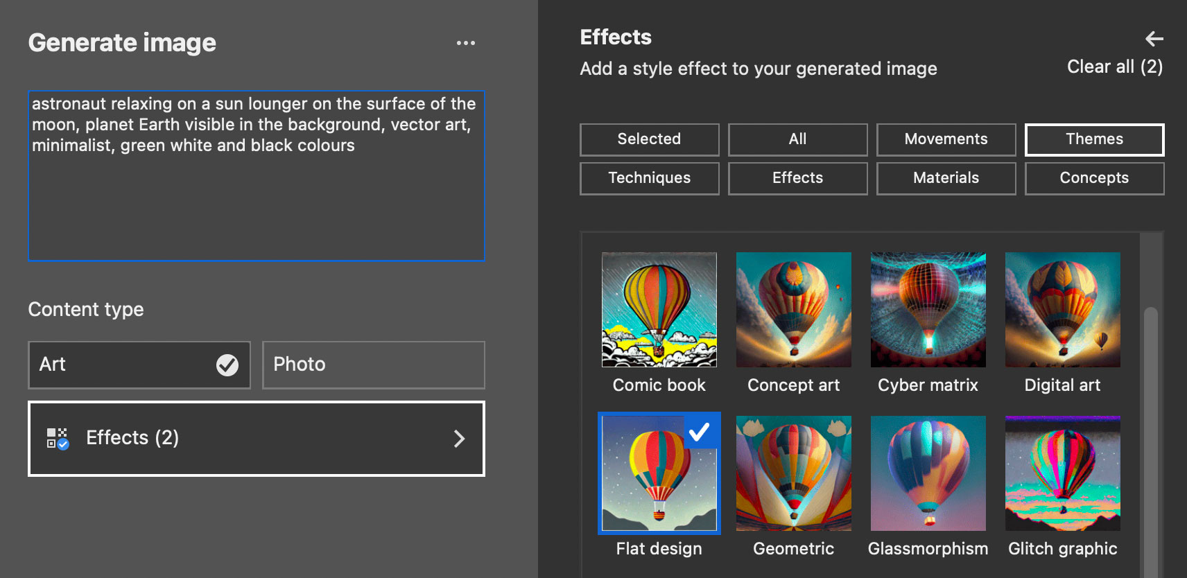
astronaut relaxing on a sun lounger on the surface of the moon, planet Earth visible in the background, vector art, minimalist, green white and black colours

The results:

These are are getting much nicer, particularly the third variation. They still aren’t quite what I had in mind. It’s time to explore the effects options. Adobe provides a large array of pre-defined styling techniques. For our astronaut, I’m going for flat design plus bold outlines (you can apply multiple effects).

Photoshop image generation effect options

And here’s how it’s looking:

It’s still a lot more detailed than I had in mind. It’s hardly minimalist. Perhaps if I found just the right combination of words and experimented more with effects, then it might produce something more like a vector drawing and less like some kind of traced photograph.

Style-conscious

But we’re not going to sit here and experiment endlessly. There are deadlines to meet! Instead we’re going to feed Photoshop a reference image. We have a distinct illustrative style at The Email Factory, so let’s grab an image from our design team:

Example The Email Factory illustration

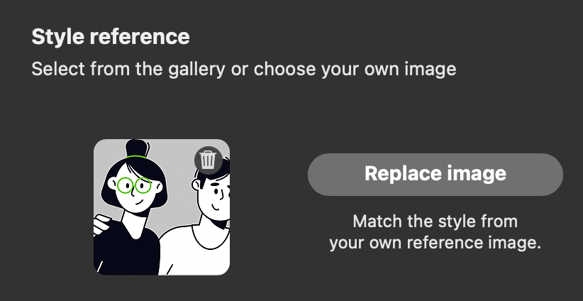
And we’ll load it in the image generator:

Photoshop image generation style reference

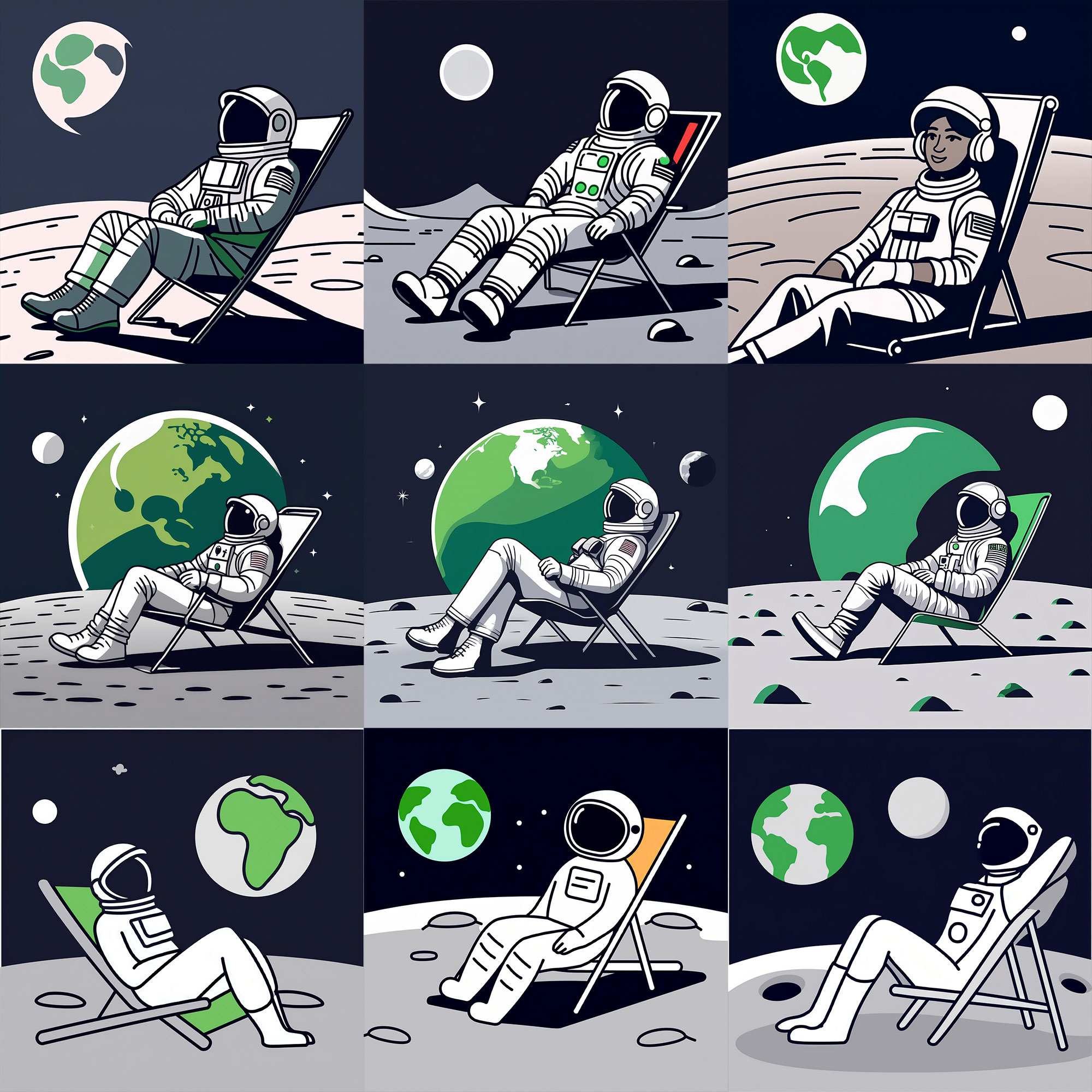
The wording makes it very clear that we are matching the style of the image – not its composition. Here goes nothing:

Multiple generated images

For each row I tried different phrasing and settings in addition to the source image. On the third row I kept the prompt simple, describing only the scene rather than the styling, selected no effects and did not even specify ‘art’. That final set is the closest match. The lesson here is to keep it simple when working with a reference image.

But are any of these actually usable? Does it emulate our style closely enough to be practical? The answer is no. Bottom middle is the best of the lot, and is a whimsically pleasant illustration in its own right, but it’s nowhere near authentic enough for us to consider using in a commercial sense.

Generative AI as a creative assistant

We’re forgetting a crucial detail – we’re working in the world’s most powerful image editing application. That means that we don’t need to use the AI-generated image straight as it comes. Instead, we can use it as a base to work from. And we could combine multiple generated images. We can do whatever we want.

This is how I see generative AI being actually useful rather than a novelty. Not as a magical do-it-all but as another creative tool in the belt.

Time to answer the question: is Photoshop’s image generation any good? Yes, it is – but so are you.