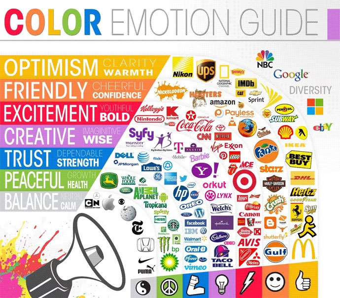
Colours. Tone of voice. Typographical style. Logo dos and don’ts. A brand’s identity is a complex, multifaceted thing. Brand guidelines play an essential role in keeping this distinct character in check.
Just don’t take them too seriously.
Creative straitjacket
It’s no secret that consistent branding is important. Consistency fosters familiarity. Your customers – and potential customers – come to know and instantly recognise your brand.
It’s easy however to get carried away when putting down the rules in black and white (or whatever your colour scheme may be). Brand guidelines should serve as a helpful design aid, not an iron fist that stifles creativity. The clue is in the name: guidelines. Not laws.
Absurdity in detail
I’m a big fan of documentation in general. And the more detail, the better. Usually.
Some of the finer details in brand guidelines however tend to verge on absurdity. Do people really care or even notice that an apostrophe is curly rather than straight? And while it could be argued that our brains are subconsciously aware of these subtle details, my gut tells me that it’s overkill. Focus that energy on quality content instead.
Content blindness
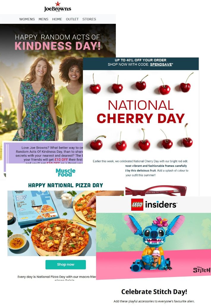
There are consequences to restrictive brand guidelines. Thinking specifically about email marketing, it’s common to see the same design wheeled out time and time again. And that includes recurring content blocks. Regular readers may start to experience ‘content blindness’ as a result.
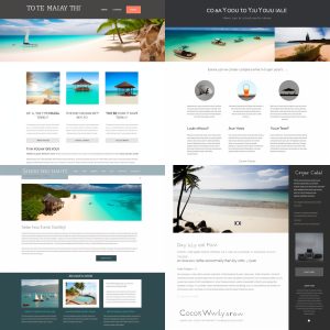
We have one particular client that is not afraid to break free and design a little more liberally. They were the inspiration for this article in fact. Each of their email’s ‘hero’ images is unique. The typography is varied. In short: their emails are fun to receive, and the variety keeps people coming back for more. But crucially these designs are still on-brand. There is a balance to be struck.
Flexibility is key
The solution isn’t scant detail or oversimplification in a company’s brand guidelines. After all, a creative free-for-all defeats the purpose.
The key is to build flexibility into the rules. The aim is to keep your publications on-brand while giving your designers and marketers room to breathe. Let your creative minds be creative.
Don’t forget about accessibility
In this day and age, no brand big or small should be overlooking accessibility. But I regularly see examples where brand guidelines are favoured over accessible design. Tiny fonts are your thing? Too bad for people with visual impairment.
Adaptability is part of flexibility, and a company’s design choices need to change with the times.
Shake it up
There’s a handy side effect to having an established brand. When you have an important announcement to make, a one-off change of style tells your readers: this is something special. Used sparingly, this can make for some powerful marketing.
Less dramatically, it’s also worth thinking about a template redesign from time to time. Even the best designs become stale after a while. A new look keeps your marketing fresh and engaging.
Here’s to creativity
We live in the age of AI-generated slop. AI-generated imagery now appears regularly in YouTube videos, LinkedIn posts, and the internet in general. Amazingly, spelling mistakes and surreal glitches that could be fixed in Photoshop are left uncorrected. Lazy content like this does not deserve your attention.
True human creativity on the other hand, is something to be celebrated. Let it flourish within your brand and the results will speak for themselves.