

Do you work in marketing? Then there’s a good chance you’ll have seen a colour theory chart like this one:
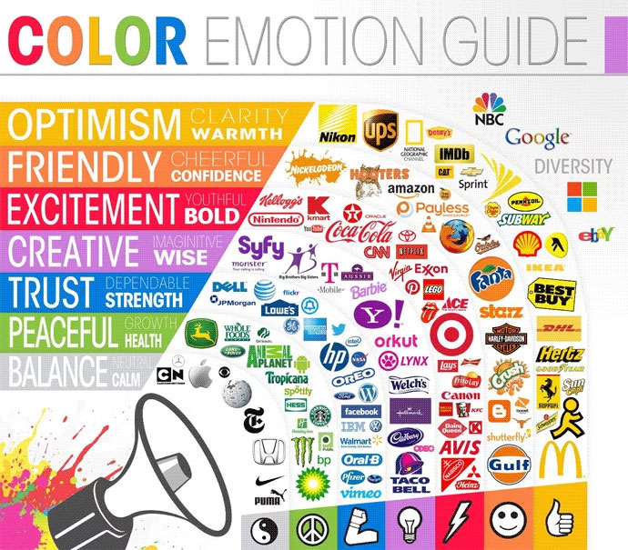
There are a few variations kicking about, and they can often be found doing the rounds on LinkedIn. These charts all follow much the same pattern: emotions are grouped by colours, and an assortment of brand logos are cherry-picked as examples.
The trouble is that it doesn’t take much scrutiny to spot weaknesses in the logic or think of contradictions. Ferrari with its yellow logo is in the optimism and warmth group, but I doubt anyone would argue against exciting and bold as better descriptors. Even their cars are rosso corsa. Or what about BBC News? It does have a red logo, and yet would seem more at home in the blue sector of emotions.
So, it’s easy to poke holes in this. Does that mean that colour theory (in marketing) is all wrong?
The age of oversimplification
The answer is no. It’s not all wrong. Things are rarely so black and white.
But we’ve inadvertently highlighted the problem. Social media is the land of brevity and bite-sized absolutes. Content candy is addictive, and reality is inconveniently complex. On an algorithm-driven platform like LinkedIn, engagement is valued above education.
Armchair psychology
On the topic of education: professional psychology is a field that demands years of study. I can’t claim to know the precise stats, but I’m willing to bet that ninety-nine point something percent of marketers are not qualified psychologists. Marketing techniques like split testing can certainly yield insight into customer behaviour but I would hesitate before labeling Monday’s A/B test as a psychological study.
Colour psychology is a subject that can fill a 764-page, professor-authored book. Is it possible to condense such an expansive topic into a meme-sized infographic?
Hue are you?
Let’s go back to a design and marketing perspective on this. Colour is certainly an intrinsic element of branding. It’s often a simple way to differentiate competing brands within a particular sector at a glance.
Back in the day, the big three UK mobile networks were Orange, O2 and Vodafone. The orange one, the blue one and the red one. I can’t say I ever thought of them as the friendly one, the dependable one and the passionate one.
The scope of these colours extends beyond the logos. Their websites and marketing in general predominately feature each colour. It’s colour-coded brand recognition.
A visual key change
Brands can capitalise on this colour familiarity. If there’s an important announcement to be made – perhaps a product launch or an off-topic statement – a one-off change of palette can be an effective attention-grabber.
Context is everything
Colour associations vary depending on context. A blue sky is positive, but feeling blue is not. Green can signify safety, but you wouldn’t want to be green around the gills.
Likewise, the colour of a brand’s logo or a piece of advertising is just one factor in the overall mood. An important one, of course, but one that contributes alongside typography and shape and imagery and tone of voice.
True colours
There is certainly an element of truth to these simple colour charts, but design is a broad, complex topic. It deserves better insight than like-farming posts for social media. The real world is far more colourful.