
One area of email marketing that is always changing is email design. All our clients often look to improve their email designs. Whether it’s questions about what a certain email platform can do or simply where to start with an email design, the questions about email design can be endless. We have many articles on good email practice and email design on this very blog as well as on our sister site display block. In this blog however I’d like to ask some questions I usually ask myself, or our clients when starting on a new email design project. A collection of these questions might be helpful in your next email design project, and help you create a more engaging and effective email.
What should you consider before starting an email design?
Companies or organisations seldom send one-off emails so it’s important to know if the email sits within a wider marketing campaign. If it is to run alongside in-store promotions or any other type of marketing their might be a wealth of guidelines that the email design might need to stick to in order for it to seamlessly join the rest of the marketing effort. Even in the case of one-off emails it is important to match the branding and voice of the company or organisation sending the email so if at all possible try and collect as many previous communications as you can. Lastly it is important to understand the primary goal of the email. Are you selling products, telling people about an event and so on. The goal needs to be clear to best inform your design choices.
How to organise your content or create a clear content hierarchy
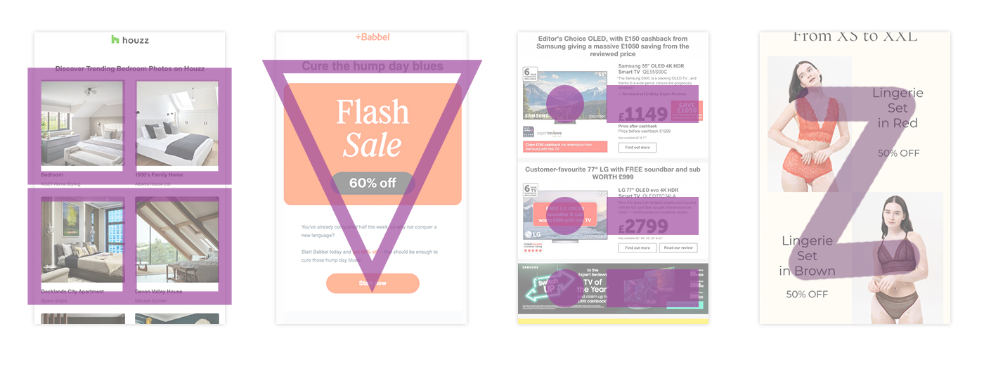
Once you know what the goal of your email is then it is time to start to organise the content for your email. Most emails these days lead with a large hero graphic and there is nothing wrong with this, emails need to be eye-catching. Make sure to try keep the top of your email as clean as possible. Minimise cruft, ask whether the logo needs to take up that much space? Can the view online link be moved or made smaller. Is it possible to drop the navigation bar (emails are not websites)? Once you have the pre-header and logo area decided the rest of the email’s content needs to flow in a way that supports the goal of the email. Common and effective layouts are the standard grid, inverted triangle, bulleted list, and zig-zag.
How do images fit in with the design, does it even need images?
Good design is simple design, and great design is design you probably don’t even notice. Images can be great visual pieces of colour or interest for a design however it’s important to ask if you even need them. Product emails are great and including an image of the product is a usually a great idea but then you might ask is the additional lifestyle image also really needed?
Another common pitfall in email design is just adding everything in. Great emails use a lot of empty space where necessary to really allow the content enough room to draw the eye and focus the attention.
Can you strike a balance between message and design?
Text is a vital part of email and not only helps the email get delivered literally but also by getting the message of the email across to the reader. It is important to strike a good balance between text and images. If an email is too overladen either way the email can quickly be discarded by the reader as either to wordy and boring or just images and vague or confusing. Striking a good balance also allows you the designer to place important email parts like buttons where the reader can see them.
What can you do if there is too much copy?
Concise copy in email is essential. When writing email copy the goal should always be as succinct as possible. Edit it down as much as you can to get the message across as simply as you can. If you imagine you only have a few seconds, probably less than 7, to keep someone’s attention you need to keep the brand’s voice and get the message across. It’s no easy task but with the right amount of editing you can get there.
Remember the goal of any email is to be relevant to the reader, email copy needs to be engaging and entice with clearly actionable conclusions.
How many CTAs can an email have?
Too many CTAs can quickly get confusing and disrupt the focus of the reader. I suggest including one CTA per concept or section. e.g. If there is an email about men’s shoes and women’s shoes, I would include one CTA for men’s shoes and one CTA for the women’s shoes. While each individual shoe might link to its own product page sometimes having a button for absolutely everything can make things too crowded.
To summarise
- Keep it concise. Emails need to have a clear purpose and be easy to read and understand.
- Content hierarchy is important. Make all the content flow to an action point.
- Stick to tried and tested grid layouts, but this don’t mean the design needs to be boring.
- Create a good balance between images and text too much of either can be overwhelming.
- Make sure the brand identity shines through.
Need more help with your email designs?
Get in touch and we can create you a solution specifically tailored to your requirements. If you’re just looking for a second opinion or would like some analysis on your current designs get in touch and we can help you.