
Getting and keeping people’s attention has never been harder.
We are the biggest captive audience ever assembled. Phones in hand, screens everywhere, connected around the clock. Yet the competition for our eyes and our time has never been more intense. Social media, streaming, apps, short-form video, notifications, emails – all competing simultaneously for a finite amount of attention from people who have become very good at ignoring things that aren’t immediately relevant.
For email marketers, this is both a challenge and an opportunity. Email remains one of the best performing marketing channels available but in terms of results and brand perception, the gap between email done well and email done badly has never been wider.
Here’s what good engagement looks like in 2026.
Hitting the mark
If you’re not segmenting and targeting your email database with relevant and timely content, you should be. Even basic targeting consistently outperforms sending the same email to everyone and the tools to do it are available in most email platforms.
At a minimum you should be able to identify your best customers, understand who clicked on previous emails and know when your audience is most likely to engage. Beyond that, preference centres, behavioural triggers, trend analysis and purchase history data all provide the information you need to send emails that are more personal.
AI has taken this significantly further. Sophisticated predictive models can now score customers by likelihood to purchase, churn or respond to a specific type of campaign and use that scoring to determine not just what to send but when to send it and through which channel. The brands investing in this capability are pulling ahead.
But don’t confuse any of this with excluding people on your list because they don’t fit with your segments. Email is about reach as much as anything else and reach is an advertising fundamental. Being visible is more important than ever to remind your subscribers about you on a consistent basis – remember, they signed up to get your emails. Just don’t send the same email to everyone every time.
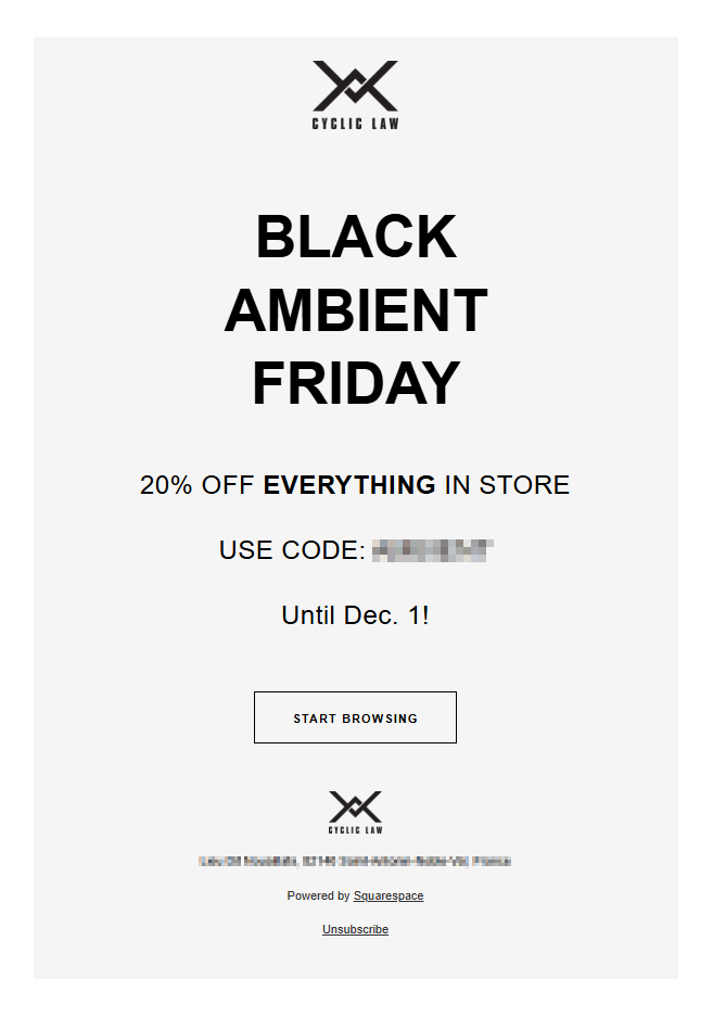
Picture perfect
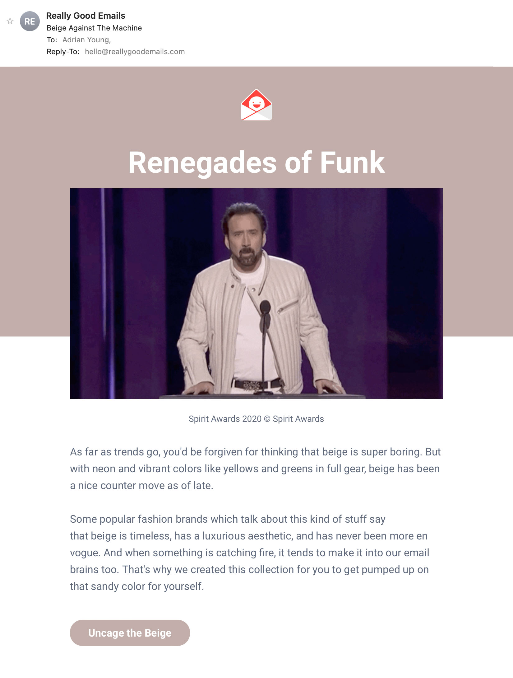
Images in email have never looked better and never carried more risk if handled badly. Modern devices have pin-sharp screens that reward high-quality photography and penalise low-resolution images. Stock images, as ever, lack warmth and authenticity so if your email imagery could belong to any brand, it probably shouldn’t belong to yours. That hand-shake photo, the studious gaze at a bar chart with an upwards arrow, the ecstatic shopper who’s just bought something online… I mean, come on people!
We now also have AI image generation tools, making it possible to create original, on-brand imagery without the cost and time of a photoshoot. Used well this is a genuine opportunity but, as we have all experienced, used carelessly it’s immediately obvious and just adds to the library of ‘slop’. ‘Schlock’ images rather than ‘stock’ images.
Dark mode has also changed how images need to be handled. Images with white or light backgrounds that look fine in light mode can look jarring or broken in dark mode. Transparent PNGs and dark-mode-aware image design are now essential rather than optional considerations.
As email marketers, we should always check how our emails look in dark mode before sending them out in the wild.
Mind your language
Keep your copy concise and to the point. Adopt a conversational tone that reflects your brand’s personality but don’t try too hard to be clever or current. Copy that feels forced is worse than copy that’s simply straightforward.
The rise of AI-generated copy has created a new challenge here. AI tools can produce serviceable email copy quickly, but they tend toward the same phrases, the same structures and the same voice. If your emails sound like they could have been written by anyone, they probably won’t be remembered by anyone. Your brand voice – specific, distinctive, human – is more valuable now than ever.
One practical note: with AI now summarising emails in inboxes before they’re opened, the first sentence of your email body matters more than ever. Write it as if it might be the only thing your subscriber reads because increasingly it might be.
To infinity and beyond
Emails are getting smarter and the case for interactive email content grows stronger as email client support continues to improve. Apple Mail in particular has led the way and given that it accounts for a substantial proportion of email users, the creative possibilities are genuinely worth exploring.
That said, interactive elements need a fallback as not every client supports every technique. An email that breaks for a significant portion of your audience because of an unsupported interactive element is worse than a well-executed static email. Design with the fallback in mind from the start.
Dark mode deserves another mention here too. A significant and growing proportion of subscribers read email in dark mode (estimates suggest anywhere from 35% to over half depending on the audience). Designing and coding specifically for dark mode is no longer a fringe consideration. It’s a core part of email production and should be factored in from the beginning.
A note on links: Always use deep links. Tapping an image, button or text link should take us directly to the relevant product or page not your homepage – so have a think about that link at the design stage.
Accessibility: Don’t conform to the norm
Accessible email design has always been a good idea. Emails that incorporate proper semantic structure, sufficient colour contrast, meaningful alt text, logical reading order and touch-friendly tap targets make your emails better for everyone – not just those using assistive technologies.
The European Accessibility Act has given accessibility a legal dimension for many organisations. Emails aren’t explicitly mentioned in the Act but accessible emails simply perform better. They render more cleanly, deliver more clearly and reach more of your audience effectively. Why go to the effort of making your website compliant and not do the same for your emails?
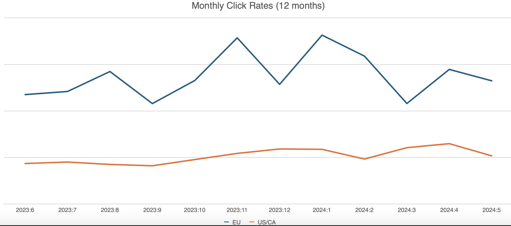
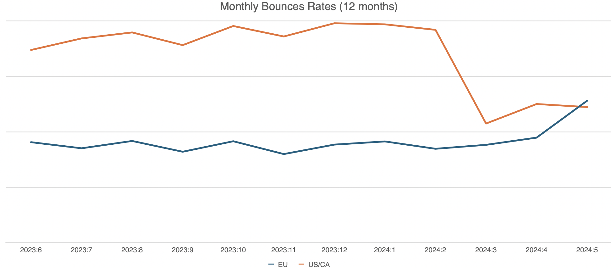
Measuring what matters
We’ve all been working long enough with Apple’s Mail Privacy Protection and Google’s use of proxy servers to understand open rates are only really useful these days for tracking trends. Emails are routinely being “opened” by machines before a subscriber ever sees them.
Clicks have always been a better metric and this shift has encouraged a more meaningful approach to measurement, including a focus on revenue, conversion and customer lifetime value.
Much ado about something
Email isn’t going anywhere. If anything its position as the highest-returning owned marketing channel has strengthened as social media and search have become more fragmented, more expensive and less reliable as organic reach tools.
But the standards have risen. Subscribers expect relevance, they expect emails to render correctly on their device, they expect personalisation that goes beyond their first name in a subject line and they expect brands to respect their time and their inbox.
AI-generated content and misinformation from bad actors continues to erode online trust and this is where email has the upper hand. Yes, there will always be spam and phishing emails but well built emails from brands we signed up to hear from and thoughtfully delivered campaigns are where email marketing can excel. We should strive to build and send the best emails.
Meeting our subscribers’ expectations requires the right strategy, clean data, properly built campaigns and emails that are designed and coded by people who understand how all of it fits together. Done well, email remains one of the most powerful tools available to a marketer. Done badly, it’s just more noise.
The rules of engagement haven’t changed. The stakes have.