
When it comes to sending marketing emails, batch-and-blast is still surprisingly common. The same message, sent to the same people, at the same time regardless of who they are or what they’ve done.
The smarter approach? Using behavioural data to trigger relevant, timely emails based on what people actually do. I wrote about it in 2015 when the best marketers had already been sending emails like this for years so the idea is nothing new.
So why is batch-and-blast still a thing, especially when the technology available to send more relevant and timely emails has made it easier than ever? The expectations of the people receiving your emails have shifted. If you’re still sending the same email to everyone, it’s about time you shifted and caught them up.
Why behaviour matters more than ever
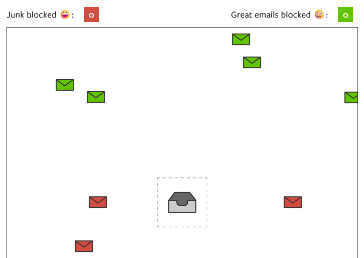
As consumers we’ve become accustomed to personalised experiences across search, social media and the websites we visit. When a marketing email arrives that has no relevance to us – wrong product, wrong timing, wrong tone – we don’t just ignore it, we unsubscribe. Or worse, we mark it as spam.
Behavioural targeting gives marketers the chance to change that. And the best part is that you already have the data you need. It’s gathered every time someone visits your website, clicks a link in an email or interacts with your brand. No form. No survey. How people behave is more indicative of what they want than what they might tell you anyway.
Think of it this way. A customer visits your website, browses a specific product category, adds something to their cart and leaves without buying. They didn’t do that by accident. They came to your site because they were interested. The question is whether your email programme is set up to respond to that signal or whether it’s going to send them your next scheduled newsletter about something completely unrelated.
What’s changed since 2015
When I first wrote about behavioural email marketing, it was mainly something the most sophisticated brands were doing. Today the tools to do it are widely available and the technology is mature so there’s really no excuse for not using it.
More significantly, AI and machine learning have taken behavioural targeting to a level that wasn’t possible ten years ago. McKinsey’s recent thinking on ‘next best experience‘ describes AI-powered systems that can detect what a customer needs before they even realise it – co-ordinating every touchpoint across the entire customer lifecycle, sequencing communications intelligently and personalising content dynamically at scale.
The results they cite are significant: customer satisfaction up 15-20%, revenue up 5-8%, cost to serve down 20-30%.
That’s the fully evolved version of what behavioural email marketing was pointing toward in 2015.
What good looks like in practice
Personalisation isn’t adding someone’s first name to a subject line. It’s sending a unique message to someone based on what they’ve actually done. A one-to-one (or very close to) email with a relevant message at the right time and a compelling call to action.
Some examples of behavioural triggers worth building if you haven’t already:
- Cart abandonment – the most well-known trigger, and still one of the highest-converting emails you can send. Timing matters enormously here and how many emails in the sequence depends largely on the revenue each email generates. Three emails is likely the limit but if there’s enough money still coming in from the third email, add a fourth and measure it.
- Browse abandonment – someone views a product but doesn’t add it to their cart. A timely, relevant follow-up can bring them back. Be careful with this one though as it can come across a bit ‘big-brother’. I’d strongly suggest having no more than two emails in this sequence.
- Post-purchase – the moment after a purchase is one of the highest-engagement windows you have and is a great way to keep in touch with your new customers and build a brand story. Emails include: confirmation, onboarding, cross-sell and review request.
- Win-back – customers who haven’t engaged or purchased in a defined period. A well-timed, relevant message can reactivate a surprising number of them. Avoid using “We’ve missed you!” In the subject line (or anywhere else for that matter!)
- Milestone triggers – birthdays, anniversaries, loyalty thresholds. Low effort, high return, and they feel genuinely personal when done well.
Where to start
You don’t need to implement everything at once. Start with a single sequence – cart abandonment is the obvious choice because the intent signal is so clear and the ROI well established. Get that working well, measure it, then build from there.
The technology to do this is available in most email platforms. What it requires is good data, a clear strategy, properly built automations and someone who understands how the pieces fit together. That last part is where many brands fall short – the thinking behind them needs to be done properly.
In a world of increased digital distraction and rising subscriber expectations, well-timed and relevant emails aren’t just nice to have. They’re the difference between an email programme that drives revenue and one that drives unsubscribes.
I wrote that in 2015. It’s even more true now.


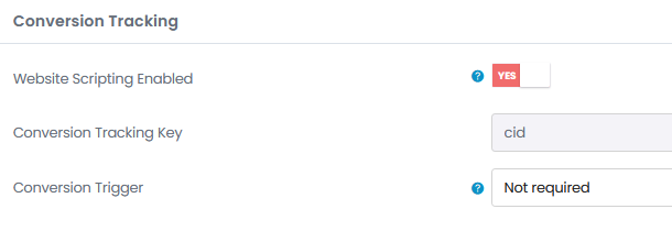
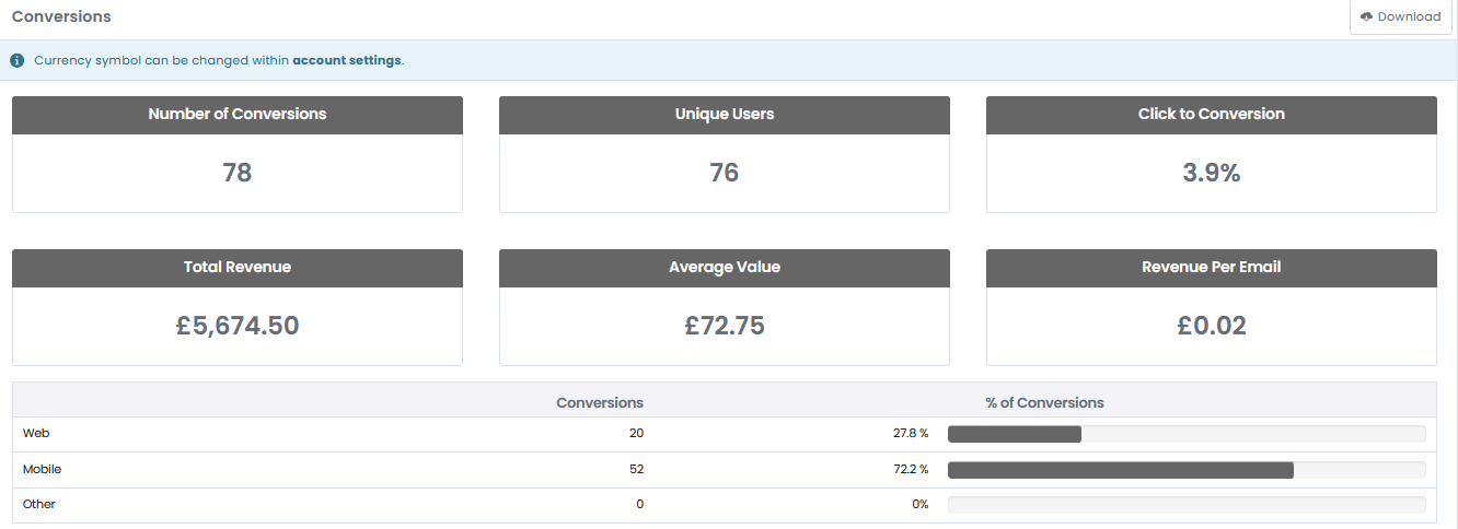