Email coding

Become an interactive email master

Open, read, click. That’s all there is to email, right? Wrong!

Thanks to some clever coding techniques, email can become a rich interactive environment. Quizzes, menus, surveys, games – you name it. Your imagination is the limit.

Pushing the boundaries of a medium is of course no small task. But we’ve got you covered. Download our 86-page Complete Guide to Interactive Email, and your brand could be sending world-class interactive mailings before you know it.

Get the guide

Front cover of the Complete Guide to Interactive Email

Sneak preview

Our guide covers everything you need to know about interactive email. The whats, the hows, the whys. Here’s what to expect:

  • An in-depth guide to the checkbox hack – the CSS technique that makes interactivity possible.
  • Downloadable demo files. Experiment with and learn from existing code.
  • Examples of the coolest interactive content possible.
  • Our tips for content, accessibility, animation, design and more.

Page from the guide about the checkbox hack

Set your brand apart

Interactive content is experimental. Most brands currently send mailings of a more traditional nature. There’s nothing wrong with that, of course. But there’s a lot right with putting your brand at the forefront of email. Make your customers excited to open your emails and the rewards will speak for themselves.

Get involved

Email is niche, and interactive email is even niche-er! We’d love to hear about your interactive content projects, big or small.

Email coding

Totally random

Do you like surprises? Your customer might. We all know about the value of personalisation in email, but is there room too for a touch of randomisation?

Randomisation as a feature

First things first. We don’t mean dropping random content into emails like some kind of scattershot A/B test, or A/B/C/D/E/F/G test for that matter. We’re talking about the element of chance as an interactive feature. Think along the lines of spin-the-wheel, where the user is aware that they can trigger a random result. And, crucially, that they want to.

How it works

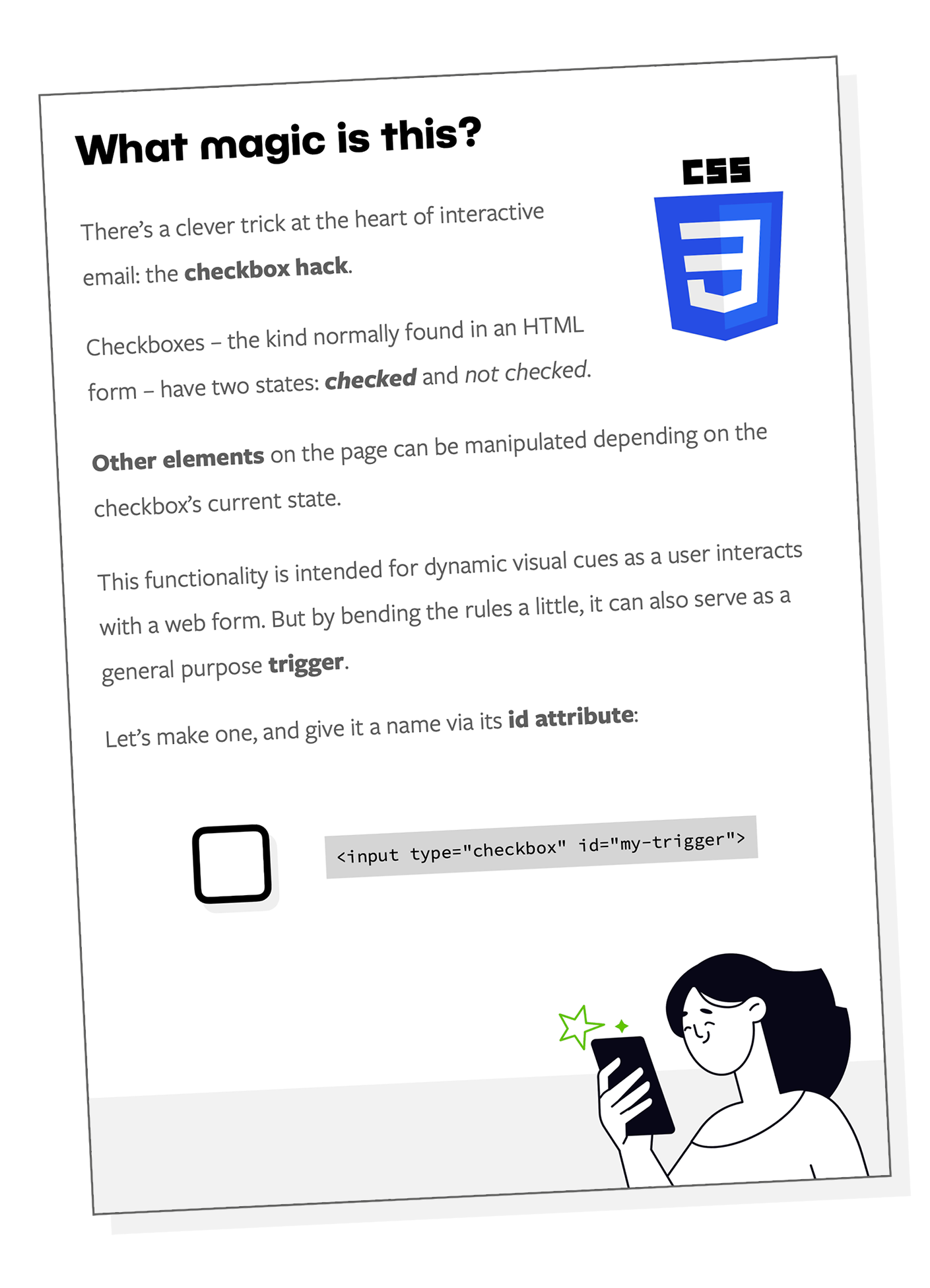
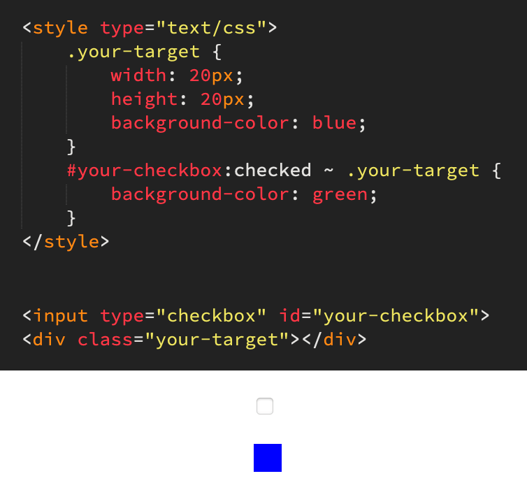
Randomisation is a form of interactive email. The state of an input element – i.e. a checkbox or radio button – can be used to toggle styling on any number of other elements on the page. That lets you show, hide, move or otherwise change content in your email based on the user’s actions. This technique is known as the checkbox hack.

Animation demonstrating checkbox hack basics

While JavaScript has built-in functionality to generate a random number, HTML and CSS do not. And email of course is a JavaScript-free environment. But there is still one variable and unpredictable factor – user timing. We don’t know when the reader will hit the button. We can capitalise on that.

First, we place a series of identical-looking triggers. Next, we cycle through them rapidly. We’re talking milliseconds. The result of a click is equally random to developer and customer alike.

Let’s build it

We need some inputs. Radio buttons to be precise. Let’s say we have ten possible random results. Therefore we need ten triggers:


<input type="radio" name="radio-group" id="radio-1">
<input type="radio" name="radio-group" id="radio-2">
<input type="radio" name="radio-group" id="radio-3">
<input type="radio" name="radio-group" id="radio-4">
<input type="radio" name="radio-group" id="radio-5">
<input type="radio" name="radio-group" id="radio-6">
<input type="radio" name="radio-group" id="radio-7">
<input type="radio" name="radio-group" id="radio-8">
<input type="radio" name="radio-group" id="radio-9">
<input type="radio" name="radio-group" id="radio-10">

The name attribute is the same for all of our radio buttons, thus grouping them. Only one can be active at a time. This is extremely useful functionality for interactive email in general, and will be helpful here for testing.

The id attribute on the other hand is unique to each radio button. We’ll use these to identify which radio button has been pressed.

Secret message

Our triggers need something to, well, trigger. We’ll create ten div-wrapped messages to go along with our ten triggers. They’ll all be hidden at the start.

Even though this is a no-frills, bare-bones example, we’ll stick them in a container. That better resembles the structure of a full-on interactive email.


<div class="messages">
    <div class="message message-1">You pressed trigger 1</div>
    <div class="message message-2">You pressed trigger 2</div>
    <div class="message message-3">You pressed trigger 3</div>
    <div class="message message-4">You pressed trigger 4</div>
    <div class="message message-5">You pressed trigger 5</div>
    <div class="message message-6">You pressed trigger 6</div>
    <div class="message message-7">You pressed trigger 7</div>
    <div class="message message-8">You pressed trigger 8</div>
    <div class="message message-9">You pressed trigger 9</div>
    <div class="message message-10">You pressed trigger 10</div>
</div>

You’ll notice that they each have two class names. We’ll use one of those to to neatly hide all messages by default.


.message {
    display: none;
}

The other class name will act as a unique identifier. We could use an id tag, like we did for the radio buttons, but that can lead to CSS specificity problems for elements that we want to restyle in an interactive email.

Hook them up

Our triggers are in place. Our messages are in place. But they’re not connected yet. We’ll use the following CSS for that:

  • The general sibling selector. That’s the tilde. It’ll let us refer our inputs to the messages div which sits later in the document on the same level.
  • The descendant combinator. That’s a space between two target elements. It’ll let us connect to specific messages within their container.

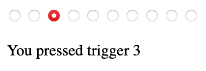
#radio-1:checked ~ .messages .message-1 {
    display: block;
}
#radio-2:checked ~ .messages .message-2 {
    display: block;
}
#radio-3:checked ~ .messages .message-3 {
    display: block;
}
#radio-4:checked ~ .messages .message-4 {
    display: block;
}
#radio-5:checked ~ .messages .message-5 {
    display: block;
}
#radio-6:checked ~ .messages .message-6 {
    display: block;
}
#radio-7:checked ~ .messages .message-7 {
    display: block;
}
#radio-8:checked ~ .messages .message-8 {
    display: block;
}
#radio-9:checked ~ .messages .message-9 {
    display: block;
}
#radio-10:checked ~ .messages .message-10 {
    display: block;
}

Let’s try it. By clicking any radio button, the corresponding message will be displayed.

Example of checked input and corresponding message

Label it

We’re going to hide all of our radio buttons – permanently. That’s because there are very limited styling options for input elements and we don’t want our triggers to actually look like radio buttons. It’s better to think of them as the circuitry inside your interactive email, not the buttons that people push.


input[type=radio] {
    display: none;
}

And we’ll now create our labels. Using their for attribute we can tie them to their corresponding radio button:


<label for="radio-1">Surprise me</label>
<label for="radio-2">Surprise me</label>
<label for="radio-3">Surprise me</label>
<label for="radio-4">Surprise me</label>
<label for="radio-5">Surprise me</label>
<label for="radio-6">Surprise me</label>
<label for="radio-7">Surprise me</label>
<label for="radio-8">Surprise me</label>
<label for="radio-9">Surprise me</label>
<label for="radio-10">Surprise me</label>

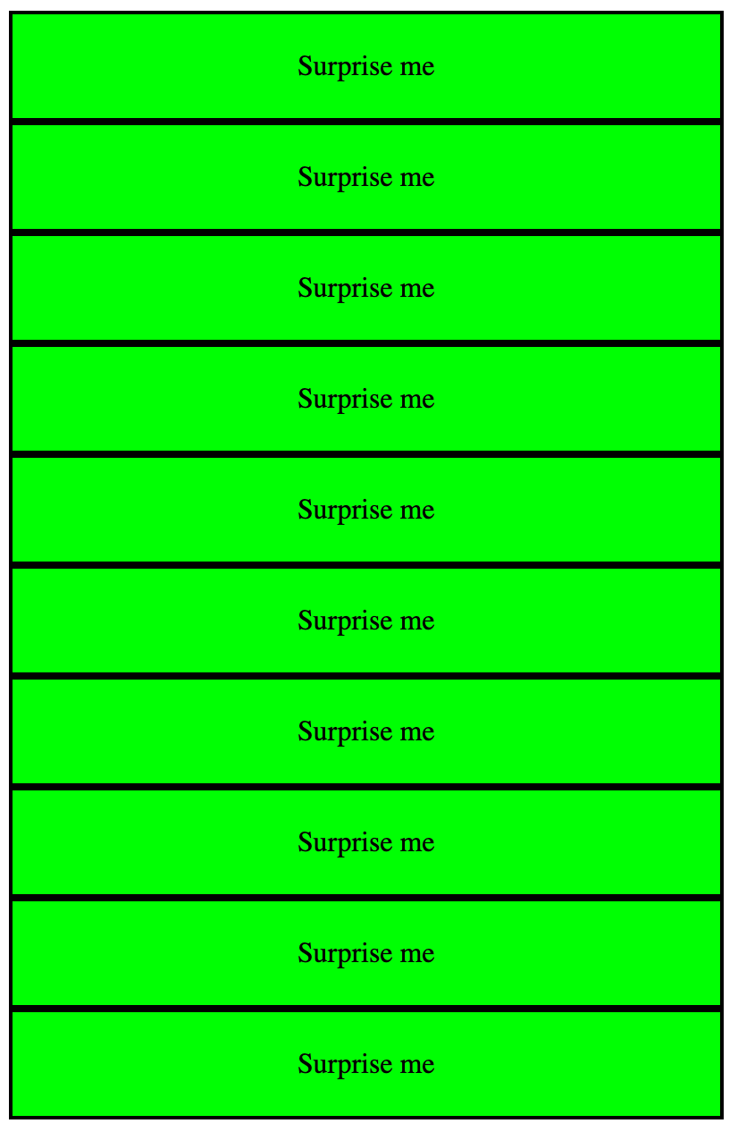
They need some styling. How about a garish lime green and black outline?


label {
    display: block;
    width: 400px;
    text-align: center;
    padding: 20px 0;
    box-sizing: border-box;
    border: solid 2px black;
    box-sizing: border-box;
    background-color: lime;
    cursor: pointer;
}

That cursor property is handy for desktop users. Upon hover, the pointer icon will appear, indicating that the ‘button’ is pushable.

Start cycling

Our buttons are functional, but they’re just sitting there. In a big tower of buttons.

Screenshot showing all buttons on screen

We need to house them in two divs:

  • A viewing window with a hidden overflow. It’ll be sized to match the dimensions of a single button, while the other nine are hidden at any time.
  • A slider that will pull each button into view in turn. And to reiterate: this is a process that will take mere milliseconds.

We can put the HTML code into place first:


<div class="inputs-window">
    <div class="inputs-slider">
        <label for="radio-1">Surprise me<label>
        <label for="radio-2">Surprise me<label>
        <label for="radio-3">Surprise me<label>
        <label for="radio-4">Surprise me<label>
        <label for="radio-5">Surprise me<label>
        <label for="radio-6">Surprise me<label>
        <label for="radio-7">Surprise me<label>
        <label for="radio-8">Surprise me<label>
        <label for="radio-9">Surprise me<label>
        <label for="radio-10">Surprise me<label>
    <div>
<div>

And now for the CSS. Let’s start with the window. It’s pretty simple:


.inputs-window {
    width: 400px;
    overflow: hidden;
}

The width matches that of a button. We don’t need to specify a height, as it’ll automatically match that of its contents.

Next, we need the slider. There’s a lot more to explain here.


.inputs-slider {
    width: 1000%;
    display: grid;
    grid-template-columns: 1fr 1fr 1fr 1fr 1fr 1fr 1fr 1fr 1fr 1fr;
    animation-name: cycle-triggers;
    animation-duration: 0.01s;
    animation-iteration-count: infinite;
    animation-timing-function: steps(10);
}
@keyframes cycle-triggers {
    from { margin-left: 0; }
    to { margin-left: -1000%; }
}

The width is 1000% – i.e. ten times the width of the viewing window. That sizes it for our ten buttons.

We’re using a grid layout. Normally unheard of in email due to a general lack of compatibility, but we can use it here. Any email applications that can run the checkbox hack have decent CSS support in general. We’ve set up 10 columns, each sized to one fractional unit and thus taking up a tenth of the slider.

We use a keyframe animation to pull each button into place. An entire animation loop takes just 10 milliseconds, and runs infinitely. We don’t need to code all ten button positions into the animation. Instead we can make use of the steps functionality and set the ‘to’ value to the full 1000% slider width. Nice and succinct.

Hit pause

Uh oh – there’s a problem. It doesn’t work. That’s because a click is comprised of two parts: pressing the mouse button… and releasing it. These both need to take place on the same trigger. But we know that the triggers are cycling at a blistering pace. A human finger is glacially slow by comparison and a click could not possibly be completed on the same trigger.

We therefore need a means of pausing the trigger cycle. Thankfully, there’s a straightforward solution. We can pause the keyframe animation upon hover:


.inputs-slider:hover {
    animation-play-state: paused;
}

This hover state doubles up as ‘on touch’ for touchscreens. Now our triggers are held in place when the user interacts with them, allowing a full click to be completed.

Don’t leave functionality to chance

All emails need to be tested, but particularly those with interactive content. Things can and do go wrong!

In order to test all of our random triggers, we’ll temporarily slooooow our animation speed right down:


animation-duration: 5s;

And we can place an identifying number inside each of our otherwise-identical labels:


<label for="radio-1">Surprise me 1</label>
<label for="radio-2">Surprise me 2</label>
<label for="radio-3">Surprise me 3</label>
<label for="radio-4">Surprise me 4</label>
<label for="radio-5">Surprise me 5</label>
<label for="radio-6">Surprise me 6</label>
<label for="radio-7">Surprise me 7</label>
<label for="radio-8">Surprise me 8</label>
<label for="radio-9">Surprise me 9</label>
<label for="radio-10">Surprise me 10</label>

That gives you a solid half second to press each trigger in turn as they rotate. Now that you know everything works, you can revert to its previous state, safe in the knowledge that everything works as it should.

Jazz it up

Our example is purely functional. In a real interactive email, you can harness all of the power of CSS animation and create something special.

What’s the point?

Do you remember that amazing marketing email you got from [brand]? Me neither. Most marketing emails, frankly, are nothing special. But yours could be.

Randomisation encourages exploration of your products and services. It’s fun to interact with. Your subscribers might wonder what cool content you’ll be sending next time. And when your email engagement rates go up, there will be nothing random about that.

Email coding

What’s the point of design and hand coding?

Designing by numbers

So, we’ve been working with a client who came to us a few years ago wanting to get away from image heavy, WYSIWYG coded emails for their EU region. Meanwhile their US region continued to do things in their traditional manner, not the traditional manner. Things were going okay until they had a crisis of resource and over the last 6 weeks have had to revert to type, and their EU emails have gone back to being the very samey, very US style. The new management team asked us to justify the benefits of going back to proper design and properly hand coded emails with live text and background images, and generally all the cleanliness in the code that comes from not getting a machine to do it.

We gave them the justifications:

  • Better delivery
  • More clicks
  • More consistant rendering
  • Better user experience
  • Fewer unsubscribes
  • More on-brand
  • Higher revenues
“Designing” by numbers

Ultimately, well designed and hand coded emails would give them small long term gains, they would getter better delivery, better engagement, less churn – not a silver bullet on its own but a really, really good long term strategy. Unfortunately, we felt this advice was falling on deaf ears. We knew the argument that to increase profits you either need more sales or less cost and felt the less cost argument was winning over the opportunity cost argument we were making. Fortunately, we have numbers available to us. Could we prove, using the last year’s numbers that the argument we were making was in fact correct?

So we delved into their data

We had our data team go back and look at a comparison between all factors available to us within their Email Service Provider. We then ran some analysis over those numbers. Since MPP, open rates have been a soft metric and there has been a greater take up of MPP in the US. However their EU data performed at 104% of the US number. But interestingly, in the 6 weeks since changing from proper design and coding to the US style, open rates also fell off by around 104%. Within this period there was also a large data cull in the US of people who hadn’t engaged for a long period and this meant there were 2 months of increased open %’s there. Essentially skewing the figures a little because if you look at the numbers before the cull there it a 116% increase for EU over the US.

More interestingly for me are the clicks, unsubs and bounce rates. As a long term strategy the longer you can keep people engaged on your list and clicking, the higher the revenues. So we took a look at those. The EU emails designed by a designer and coded by hand received approx 3 times the number of clicks per email as the US emails, 3 times! That’s a number so significant as to be impossible to ignore.


Monthly Click Comparison

When we looked into the unsubscribes and bounces we get a similar story, unsubs for both are well under 0.1% which is below industry average with EU being slightly higher but only very marginally and this can be accredited to the fact there was no cull in the EU data and also the US data is less engaged and as such is less likely or able to unsubscribe. If we look at unsubs as a % of opens then EU is significantly lower than the US.

However, what was really interesting were bounce rates, the ISPs were voting with their servers! Bounces for US emails before the cull were at 2.636% and for the EU were 1.223%. The ISPs don’t like image led, code heavy WYSIWYG emails. Interestingly in May where the EU were no longer hand designing and hand coding the email bounces went up from an average of 1.223% to 1.794%. The big drop in US bounces coincided with the cull of the long term unengaged data but over time will gradually start to increase.


Monthly Bounce Comparison


So in conclusion

In a game of inches the opportunity cost of taking short cuts has a dramatic bottom line effect. The stats don’t lie, design great engaging emails, code them by hand, send them regularly and clean your data. A recipe for long term email marketing success over a short term cost saving.

Email coding

Was Outlook right about email all along?

Ask any email marketer what their biggest bugbear is, and there’s a strong chance that they will answer Microsoft Outlook. The desktop Windows application is notoriously uncooperative with modern coding standards. It’s a place of archaic development techniques, myriad quirks and unpredictable rendering glitches. That sometimes leads to protracted development times and hair-pulling levels of frustration.

Here’s a comparison of clean web-style code versus Outlook-targeted bloat:

Comparison of web-style and Outlook coding

But I don’t think Outlook is entirely to blame. Here’s why.

Outlook is not alone

Modern web browsers, for the most part, agree on how HTML and CSS code should be interpreted. The same cannot be said for email services. The various pieces of desktop software, webmail sites and mobile applications all behave differently. Each email platform, from Gmail to Samsung to Yahoo, has its own strengths and weaknesses. The only significant exception is the ever-reliable Apple Mail. This uneven landscape is the reason for email-coding being a profession of tricks and workarounds.

While Outlook is inarguably the least code-friendly of all major email applications, it’s not alone in its patchy support for modern web-coding standards.

I’m here for the offer

I don’t open a marketing email to see brand fonts or fancy design or flashy GIFs. I open it because I think there’s something of value to me in there. That might be a special offer, or a new product that matches my interests.

And I want to absorb the information in the quickest time possible. A marketing email is rarely a thing to be perused. If I crave visual stimulation, I will look at art. If I’m in the mood for reading, I open a book.

When I open a marketing email, seeking that tempting discount, a plain-looking design or a graphical defect is not going to be a deal-breaker. It’s an irrelevance.

Email is email, the web is the web

I missed an if earlier: if I want to browse the internet, I’ll browse the internet. Email – electronic mail – used to be the digital equivalent of a posted letter. But at some point it became standard practice for marketing emails to resemble mini websites. Navigation bars, complex layouts, rich graphics, fully-blown footers. Even interactive components such as drop-down menus have become fairly commonplace.

To achieve such an email requires layers upon layers of non-standard coding techniques. To a front end web developer who is used to coding efficiently, it’s likely to look like an incomprehensible mess at first glance. I picture it as a ramshackle machine, bodged with duct tape and liable to break down at any moment. And what is all this effort for? To force a medium to do something that it was never intended to do!

Word games

Microsoft made an industry-changing decision when they released Outlook 2007. Emails would be displayed using the Word rendering engine. Yes, that’s Microsoft Word as in the word processor. And, at the time of writing, it has remained this way for all subsequent Windows editions of Outlook.

Not only does this explain the platform’s extremely limited support for modern web code, but it’s also the reason for sporadic rendering glitches. Marketing emails are often fractured by pixel-thin lines appearing as if at random. One common cause of this is content falling on Word’s unseen page breaks behind the scenes.

Example of rogue white line in Outlook email

But is this truly a flaw in Outlook, or a problem created through misuse of the medium?

Things change: part I

From time to time, email vendors update their platforms and significantly change how they interpret HTML and CSS code. Sometimes that means improvements, sometimes it means email-breaking regressions.

Here’s a good example. More than once, I’ve seen the code used to stack content on mobile suddenly stop working. The solution: yet more unorthodox coding techniques.

This is part of the reason why companies (should) regularly check their mailings on as many email services and devices as possible. An email may display perfectly today, but tomorrow could be a different story. Even the most robust HTML email template is ultimately fragile. Keeping things simple is an effective future-proofing technique.

My needs are simple

From a consumer’s perspective, Outlook is perfectly capable of everything I need a marketing email to do. Formatted text allows me to scan over an email and pick out key points such as product name and price. High resolution images show me what a product looks like. Large, clear buttons give me a means to move onto the next step – in a web environment – should I choose to.

But what about pixel-perfect design, drop shadows, cool GIFs, web fonts, animation, and other bells and whistles? I don’t need those. Such non-content is of immeasurably more concern to a marketing department than it is to a customer.

Things change: part II

And now it’s time to unravel everything I wrote above. Technology progresses, trends move on, and I don’t want to be a closed-minded Luddite.

When I claim that Outlook does all I need it to, I’m seeing things through a conventional lens. In actual fact there are several pieces of enhanced functionality that would benefit me as a customer. It would be handy to watch a movie trailer, or to listen to a snippet of an album, or check out a t-shirt in different colours… all without leaving the mailing. Just because email has traditionally been a gateway to a website doesn’t mean it must always be that way.

So, is outlook right?

I’ll pick a side – no. There are definitely lessons to be learned from Outlook’s approach to email, and it reinforces the importance of substance over style. But ultimately its resistance to modern web standards is resistance to progress in general, and holding the medium back. And if Microsoft was truly making a stand about what email should be, why equip Outlook with a diluted level of HTML and CSS capabilities rather than none at all?

Google’s AMP for Email is a determined move to transform email into a rich, fully interactive experience. The technology may not have taken off in dramatic fashion, but adoption rates are slowly growing. In any case, it would be absurd for the world of email to maintain its antiquated coding techniques forever.

There’s also a new version of Outlook on the horizon. Anticipated for late 2026, there are convincing rumours that it will at last support modern development techniques. That changes everything.

When that day comes, we’ll be given the gift of time. Instead of wrestling with rendering problems, let’s focus our efforts instead on customer-focused content and design.

Email coding

Modules vs snippets in email development

As an email marketer, you probably don’t go back to the drawing board every time you create a mailing. Email layouts are saved as templates, and recurring components are stored as content blocks. There’s more than one way to do that. Let’s compare the email development merits of modules versus code snippets.

Some email development definitions

Modules are recurring template components stored on an email platform.

Code snippets are shorthand phrases defined by a developer that trigger pre-built chunks of code.

Modules and snippets therefore serve the same purpose. But the means to get there is very different. That deserves a closer look.

Module methodology

A module is essentially a standalone HTML file that can be dropped into a larger template. It might be a banner, or a stacking product section, or an intro with a hero image and a button. Whatever you like, it can be moduled.

Diagram of a project

That module is hosted in a library on your email platform. You can copy, edit and select any module for use in individual mailings. The specifics vary but you’ll generally perform this task via a graphical user interface. There often needs to be some additional programming using your platform’s scripting language.

Next, there’s usually a master template which has modules slotted into preset positions. These can of course be moved around or removed or added to as required.

So, that’s modules. Now for snippets.

Snippet style

The phrase ‘hand-coding’ is sometimes misunderstood. A developer will not sit and type thousands of lines of syntax in their entirety. Modern development environments support all manner of production shortcuts.

Among these shortcuts are code snippets. There’s more to these than simple blocks of code. A developer can set a snippet’s variables and cursor locations, thus producing a piece of code that can be navigated and edited in seconds.

Developer working on a laptop

Thinking about email development specifically, one example of a snippet could be a call-to-action button. By typing a pre-determined phrase – let’s say ’embttn’ – the developer triggers the snippet. Within moments, the text, link, colour, size and border can be set.

And the winner is…

I’ve kept the tone neutral(-ish) so far, but now it’s time to pick a side. By just about any reasonable measure, there’s a clear winner: snippets.

Here’s why:

Understanding

A skilled developer will work primarily in a code editor like Sublime or VSCode. Raw code may look daunting compared to the friendly GUI of an email platform, but ultimately that interface only fragments and obscures what is going on behind the scenes. When a new user needs to familiarise themself with the setup, it becomes a puzzle to be pieced together.

Speed

Working with modules means navigating through multiple pages and menus in an email platform. It is never quick. Working with snippets on the other hand is lightning fast. I’ve seen build durations reduced from all-day to an hour as a result of switching to snippet-based coding. There is no comparison.

Cohesion

Snippets mean far fewer sources of content for an email, and a more consistent format. Often an entire template can exist in a single file. Dynamic content written in your email platform’s scripting language can go there too, peacefully co-existing alongside HTML and CSS.

Flexibility

We’ve already covered the flexibility of snippets themselves. But there’s a related benefit – it means the developer can work in their environment of choice, rather than the one presented to them by an email platform. The advantage of a familiar and custom-configured comfort zone cannot be understated.

Final thoughts

To pit modules against snippets is part of a larger battle – drag & drop email builders versus hand-coding.

We are biased, of course. But with good reason. As a company of email developers, we’ve seen the comparative disadvantages of module-based configurations. There are situations in which errors can go unseen months or years. But the fault is buried somewhere in a maze-like setup that potentially no one person understands fully.

Hand-coding, by contrast, is uncluttered and transparent. For me, snippet-based email development is not only the best way to build mailings – it’s the correct way.

Email coding

Cut and waste: is email clipping ruining your mailings?

Websites are displayed in web browsers. Browsers, for the most part, agree on how things should work. There’s a high degree of standardisation.

Emails are displayed in email clients. They do whatever the hell they want.

As email developers we need to contend with patchy support for modern web technologies and a shifting landscape of rendering quirks. And then there’s the matter of email clipping. That’s a nice way of saying your email could potentially be chopped in half.

The root cause of email clipping

Gmail has a 102 kilobyte limit on email code. Let’s round that to a neat 100KB. We’re not talking about images – they’re a separate entity. The 100KB cap applies to the HTML at the core of your email.

Exceed the limit and your email will be unceremoniously sheared. It doesn’t matter if you’re using a desktop or mobile device, via the Gmail web page or the app. The same rule applies across the board.

I’ve knocked together a purposely code-heavy email to demonstrate this process in all its ugliness. Here’s how my mailing should look:

Image of demonstration email

There’s a significant amount of bloat in this email. That includes things like superfluous code, border effects, device-specific imagery, and a drop-down menu on mobile.

The result is a file weighing in at 120KB. In Gmail it renders up to a certain point and then… stops. This is as far as it gets:

Image of clipped email

And yes, there is a link to view the email online in its entirety but realistically who is going to press that? I wouldn’t. The damage is already done.

Apart from the obvious consequences of a broken email and wasted content, clipping can also result in the unsubscribe link and terms & conditions going missing. That’s a serious problem.

Let’s find out what we can do about it.

Accept the limit

This is step one. The limit exists and there’s no way to circumvent it.

We also cannot afford to ignore it. Gmail is the world’s second most popular email platform and accounts for a third of the market.

I think it’s important not to think of this restriction as a nuisance. Much better to regard it as a reminder to follow good practice. If your emails are being clipped, that’s your cue to reign in rambling marketing spiel or refine your code or declutter your design.

Respect the limit and your marketing emails may end up all the better for it.

Code efficiently

There’s a single top-level cause of email clipping: the file size is too big. This is caused by one or more of the following factors:

  • Excessive content
  • Excessive code
  • Complex design

Let’s focus on code for now. If an email is being clipped, it doesn’t necessarily mean that its code is bad. It may be error-free and email-friendly in the traditional sense. There’s just too much of it.

We should always strive to find the most efficient way to turn content into code. Some of the most helpful methods I’ve found are as follows:

  • Padding on table cells is well supported in email and makes for a lighter alternative to spacers.
  • Nested tables are intrinsic to email-coding, but it’s easy to get carried away. See if you can cut back.
  • Merge tables where possible. If you can add a row to an existing table rather than creating a new one, do it.
  • Be prepared to deviate from the design. A simplified email is eminently preferable to a truncated email.
  • Allow some leeway. If you’re scraping under the limit, remember that image references and tracked links could end up longer than they appear in your local files.
  • Know your templates. It’s worth reviewing what every piece of code actually does.

If you’re have truncation troubles, it’s not a battle that needs to be fought on a daily basis. Snippet-based development and a template library lets us record and re-use good code. Solve the problem, save the solution.

Show the right products to the right people

I wasn’t kidding when I suggested that Gmail’s code limit is a good thing. Sending huge mailings with lots of products and no personalisation is a haphazard and old-fashioned approach to email marketing. Please buy something, buy anything! A limit on file size discourages that.

Tailored email marketing via strategic segmentation and data-fuelled product recommendations is the way to go. It’s easy to treat personalised content as an afterthought, but personalisation deserves to be at the heart of our marketing programmes. Modern email tools and technologies make that possible.

With a mere 100KB to work with, code is precious. Let’s not waste it on irrelevant content.

Redefine your design

If elaborate design is the root cause of your email clipping woes, then it’s time to go back to the drawing board. As dramatic as it sounds, it can be helpful to re-assess what email actually is.

Consider these questions:

Simplified design means a slimmer file. I’d wager that customers are a lot more interested in product and price than borders and background effects. And if you pit fancy design against an email that actually works, there’s no contest.

Out with the indentations

In the real world, this fix is likely to be the first course of action. It can be extremely effective and takes seconds to implement. But I haven’t listed it first here, as it doesn’t reflect the same spirit of best practice as the other improvements above.

Indentations in code are useful… to humans. A screenful of HTML or CSS becomes a lot more readable when it’s neatly formatted.

Image of some HTML code with indentations

But these indentations serve no purpose for a computer, and they account for a surprising chunk of your overall file size. Stripping them is often all that’s needed to save an email from clipping.

Image of some HTML code with no indentations

The scale of this kilobyte reduction is affected by various factors but it primarily depends on whether your indentations are tab-based or space-based. While tab-based reductions are relatively modest, space-based reductions hover around 20% in my tests. That’s a significant result for such a low-effort fix.

You don’t even need to lose your indentations forever – create a copy of your HTML file for uploading, and keep the original for editing.

Final cut

It’s time to take my Fauxrniture email and rescue it from Gmail’s axe. I don’t want to sacrifice content, so my focus is on improving code and dropping unnecessary extras.

There is huge scope for code refactoring. Several blocks of HTML can be merged, dramatically reducing the overall file size. Plus that makes it even more readable for my human brain.

The application of links to every single paragraph is overkill. The drop-down menu is a gimmick. Alternative imagery for desktop and mobile serves no useful purpose. So we’re saying goodbye to all of those.

The code-based border effects on the main image come with a hefty kilobyte cost, so I’ll incorporate them into the JPEG directly instead.

And finally (although we’ve done enough already at this point) let’s get rid of the indentations for good measure.

The end result is a file that is half the size of the original. That’s so far into the safe zone that we can relax completely. And crucially, nothing of importance has been lost.

The lesson here is that a clip-proof email absolutely does not have to mean a short email. Code efficiently, design for email, and lose the fluff. Now you can concentrate on content creation rather than email truncation.

Email coding

Tips from a Junior Email Developer

As a fresh media graduate looking to make a start in my career, I did not expect to join the email development industry. I was familiar with web development, but had little knowledge of how an email developer works.

Joining this new and unfamiliar industry was a challenge, there was a lot of information to learn quickly since email development is a fast paced and busy industry.

From my own experience, here are some tips that I can share from my brief time as a junior email developer.

Ask for help

Chances are, you are going to get stuck or confused. It’s always better to ask a quick question to someone with more experience instead of struggling for hours on end because you’re too stubborn to ask for help. It’s also a great learning opportunity to figure out how you can improve in different areas and also learn new skills.

Once you get started building emails and developing campaigns by yourself, it is a good idea to ask your colleagues to check your work and give feedback on what you have been doing well, as well as any mistakes that they have noticed.

Juggling multiple projects at a time can be stressful and you may start to feel overwhelmed sometimes, so it’s more than acceptable to ask a colleague to cover a task you may not have time to complete. There is no shame in admitting you have too much on your plate as a beginner, and overall it will benefit your mental health by not being over-stressed whilst you are still trying to get the hang of things.

Skills to succeed as an email developer

Starting in email development, you need a dynamic set of skills that will help you succeed in your new role. From more obvious skills such as knowledge of HTML and CSS, to more personal skills such as understanding your client’s needs. Being able to pick up new software and learning new skills quickly will benefit you greatly. There are a number of different tools that I have had to learn since starting and I expect to keep learning many more as I carry on my career in email development.

Having a keen eye and attention to detail is integral to producing high quality campaigns for your client, so it is important to take your time and make sure that you double check your work before finalising anything. Yes, you will make mistakes but it’s all part of the learning process and developing your skills as an email developer.

Discovering how to properly format my code was something I had to learn how to do from starting as a junior email developer. It’s definitely something I have not mastered yet, but having a clean HTML file allows not only yourself to notice mistakes more easily, but if a colleague needs to check your work, your code will be legible compared to a jumbled mess.

Understand job priority and manage your time wisely. You may have several briefs come in at once so making sure you know what is important will help you stay on top of deadlines. Once you have been working for a while, you will understand the average time it takes to build certain emails so you can use this knowledge to your advantage.

Working Environment

Making sure you have a work environment that works for you is essential to not only your work efficiency but your physical and mental health. Investing in good quality hardware will ultimately save you time and money, as well as help improve your comfort whilst working. Personally, I use a wireless keyboard and mouse so my workstation can be dynamic.

Additionally, using a secondary monitor can help spread your workload so you don’t feel claustrophobic whilst working with multiple programs. Having a neat and clean desk helps to minimise distractions whilst working, it’s also just nicer to not be working in a cluttered mess for hours a day!

As an email developer, you’re classed as a Display Screen Equipment (DSE) User, so make sure to take breaks every so often to minimise repetitive strain injury. Prolonged activity sitting down and looking at a screen will not be beneficial to your health so it’s recommended to take short breaks every so often.

Additional Tips

When you’re just getting started there is a lot of information to remember, if you struggle at first then you can make physical notes to keep. Having something to refer back to when you are struggling to remember key details will save you time and help you feel less stressed, especially if you have a deadline coming up. You could take notes of shortcuts or tasks you have left to do, anything you feel is necessary that you may struggle to remember.

Take advantage of making checklists, these are extremely useful for when you are finishing up a project so you can go through and make sure you have not missed any crucial information.

If you can find a way, use different tools to help you get simple tasks done faster. Utilising different snippets and shortcuts will save you heaps of time as well as stop you from typing the same blocks of code, when all you really need is a line. However, remember to keep these updated and always check the code is correct after using, you don’t want to end up with outdated elements!

Within reason, take you time with your projects. Sure, you may be able to rush through five email builds but there is a high chance you will make many mistakes compared to taking your time through two. Remember, you’re creating emails that could be seen by thousands of people so you don’t want to make the company you work for and the client you are representing look bad with huge mistakes often.

Be resilient and persevere, it will take some time to learn but once you have the basics of email development down it will be smooth sailing… at least until the holiday seasons come around.