Email marketing is our business, and that includes a sneaky peak at some top companies. Along the way, we’ve come across some surprisingly basic mistakes, plus some poor designs and strategies to be avoided. Without wanting to name and shame, here are some of the top errors we’ve spotted.
Spleling and grammar mistakes
Just joking! The number one rule before sending any email out is make sure it has been thoroughly proofread and tested. So what happened here?
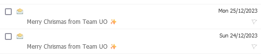
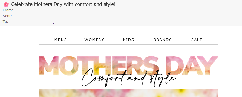
No! They couldn’t possibly have misspelt Christmas, could they? Twice!
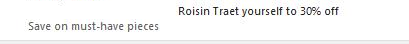
This from a well known fashion retailer.
Apostrophes can be tricky, but this is a bad one for both subject line and copy.
Getting basic things like spelling or grammar wrong shows a lack of attention that may lead some people question what else are you are being inattentive about?
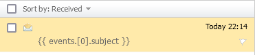
Encoding mistakes
Email checking tools like Litmus or Email on Acid will highlight most rendering issues, but not necessarily how the subject line or pre-header will look across all email clients. Good old Outlook is one example where you might encounter an encoding problem:

In this pre-header example you would be better off using a straight instead of curly quote, and avoid any other symbols that could cause similar issues.
GIF design
Whilst pretty much all email clients support GIFs, there are still some that don’t, for example, Outlook 2007-2019. A common GIF design seems to have the initial frame as just a blank slate or a single word.
The finished product might look amazing after all the frames cycle round…unless you use Outlook 2007-2019. Understanding the percentage of your mailing list that will see only the static GIF should determine whether you can get away with this design with only minimal fallout.
Unless it will utterly destroy your GIF design, it’s worth planning the first frame to look presentable with any pertinent information you are trying to convey. Or use a static image as an alternative for the necessary Outlook versions.
Fake Countdown Timers
Creating a countdown timer normally involves dynamically generating a GIF to create a set number of frames with a second value decreasing by 1 each second. We all know how a timer works! They operate under the assumption that the user won’t leave their email open for so long the GIF cycles back round to the first frame and starts again with a misleading time. If they do open the email again, the counter should start again from the correct time until hitting 0 when you can display a message or all 0s to indicate time has run out on whatever fantastic offer was available at the time. This is a great way to add impetus to the customer.
Creating a fake countdown timer, i.e. a static GIF that always reverts back to the same time is a terrible idea. This relies on customers all receiving the email at the exact time it is released (impossible) and not opening after the event has finished (also impossible). For people that fall outside this working window, they will be annoyed to believe the offer is still open only to discover they’ve missed it.

Every time an email involving a countdown timer was opened for this retailer, no matter what time of day, there always seemed to be about 4 and a half hours to go! After enough time, people will start to notice.
Images
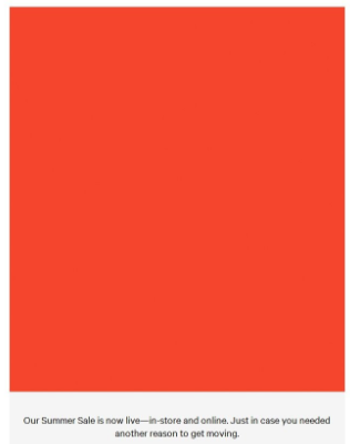
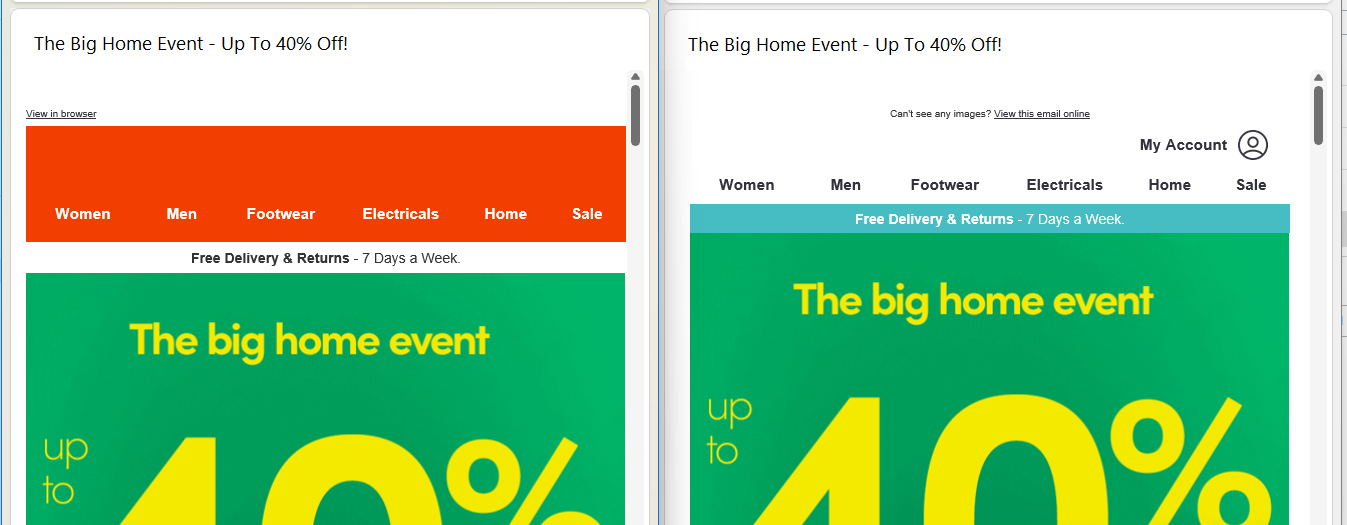
Images spice up an email and can paint a picture without all that tedious text to read. But shockingly, even now we have seen some emails that are entirely made up of images, and not even Retina-sized images. The quality will look terrible on Retina displays which is just plain bad practice. To make matters worse, every square inch of the email is clickable, which will only serve to confuse the poor user, rather than a nicely focused single CTA.

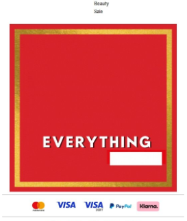
Meanwhile, at the other end of the spectrum, a missing image looks terrible:
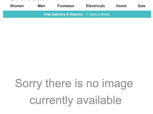
Just a technical glitch perhaps, that may have happened after the send (one would hope not before)? However, scrolling through the inbox and seeing that is off-putting! Whilst all the effort can be made beforehand, it is still worth monitoring sends afterwards for any mishaps.
Bad data hygiene
People are notoriously bad at entering their own details into things like forms. There is simply no time for capitalising or writing full first names when an initial will do! Data cleansing is therefore essential, especially before any send that will use some kind of salutation. “Hello,”, despite being non-personalised, would naturally be better than “Hello a,”. Otherwise, you get something like this:

A quick once over to remove funny characters would have done the trick here.
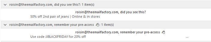
Even worse, somehow using the email as a first name.
Bad data management
If you are going to personalise with salutations you may have people with missing names. You will likely need to employ some kind of template language for scenarios with and without names.
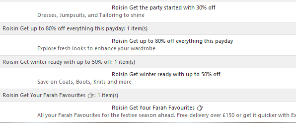
Here are examples where a comma followed by a lower case word would have been the correct grammar usage. We have sophisticated template language available to us that would have enabled this, with a capitalised word where the first name was non-existent. Of course template language can go wrong:
How did this get through the testing phase?
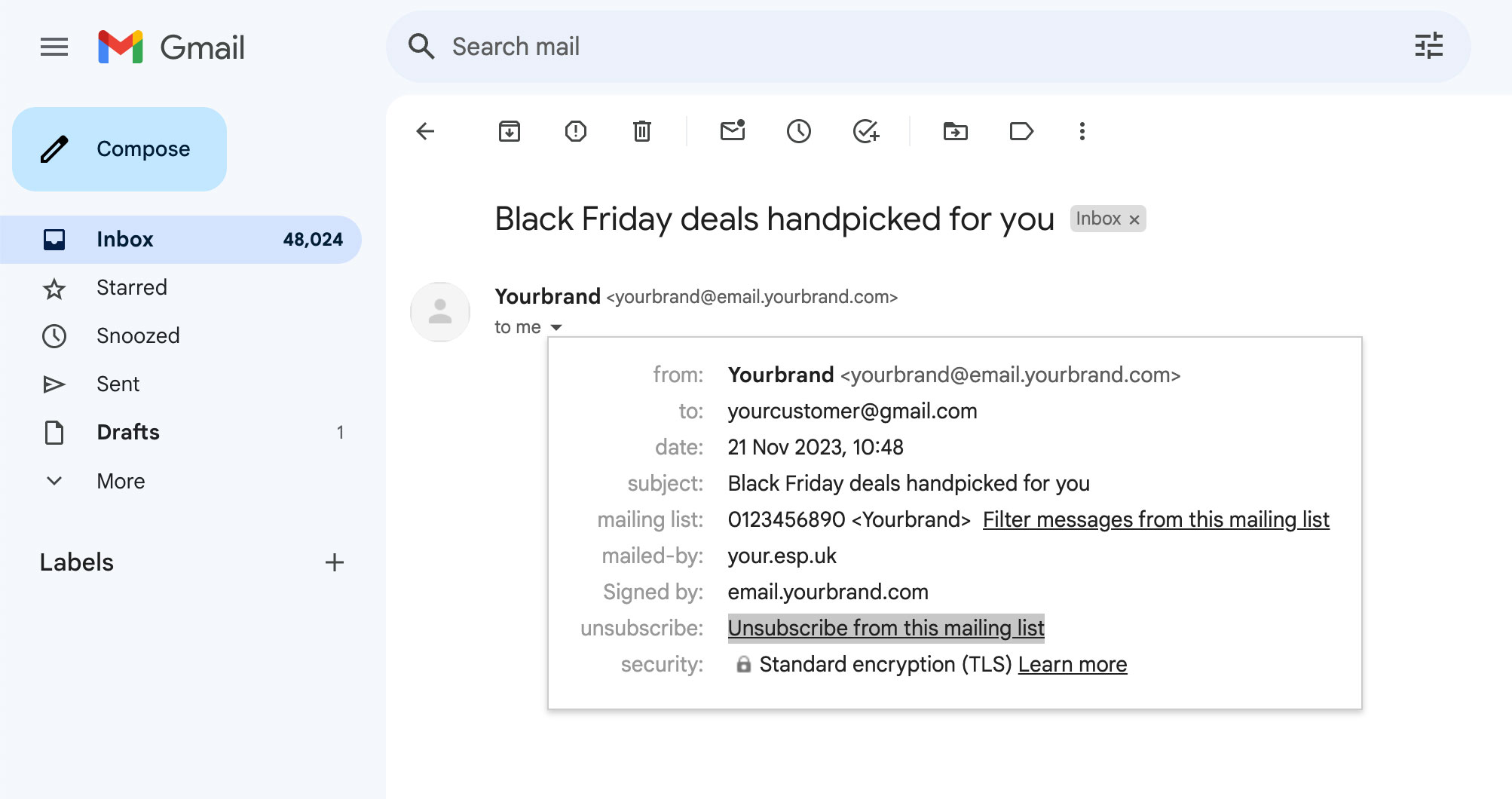
Here’s a niche case, but worthy of a mention, for potentially bad data management. We stumbled upon a company that had multi-brands to promote. Unfortunately, these brands were not differentiated at all, apart from a different header and footer. To make matters worse they were sent mere seconds apart, leading to two practically identical emails appearing at the same time.
Different header, but same subject line and hero image
This may have an unfortunate effect of casting suspicion on the brands – did I really sign up to both of these? Which one should I click on as the email and websites seem to be exactly the same? At the very least it might be worth sending them at different times to avoid confusion, but brand differentiation should be a consideration.
Repetition
This one is a bit subjective, but having seen hundreds of emails from the same companies, patterns emerge. You want your brand to be recognisable, naturally. But what you don’t want is to do the same thing week after week leading to consumer blindness. Keep the core elements of your brand, but make your emails dynamic to ward of staleness. Seeing the same hero image week in, week out led me to simply stop reading. Seeing the same subject lines every 3-4 days for months with pretty much the same email each time gave very little incentive to open.
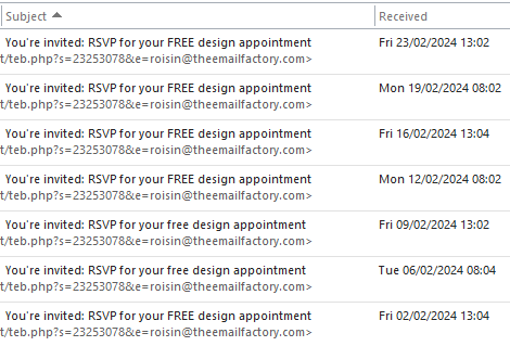
Avoid too much repetition, I repeat, avoid too much repetition.
The Oops email
Of course, despite all the best efforts in the world, mistakes still happen. But the cost of sending an “oops” email (both monetary and annoying your recipient) has to be weighed up against how bad the mistake is. We’ve seen an email re-sent with no reference as to why, with the only difference being an emoji added. Ummm…that does not seem a reasonable reason.
On the plus side though, Oops emails get a huge open rate, it’s like car crash TV for emails! But, if you make real mistakes, like a discount error, it is worth it. It could even work in your favour! Look at these stats from our own subject line tool:
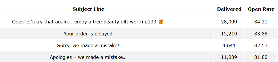
These are some mighty fine open rates!
Vigilance
Mistakes such as these can be distracting to a user and take a chip out of your professional image. Enough chips, and trust in your brand could begin to fully erode. Many of these mistakes are avoidable, and might have been caused by complacency or lack of time. Extra vigilance would prevent the majority, but some of these highlighted issues run deeper. If design capacity or time resources are holding you back, why not get in contact and see if we can support you in any way.