

Links are a cornerstone of the web. After all, the HT in HTML stands for HyperText. And HyperText is a fancy way of saying text with links.
Marketing emails are of course also based on HTML. And marketing emails also largely revolve around links. They’re a fundamental aspect of the medium. Better get them right, then!
Think like a customer
You built your email. So you know where everything is and what everything does. Your customer, on the other hand, is viewing your mailing without this inside knowledge.
Before linking anything that isn’t a call‑to‑action, ask yourself: is the destination obvious? It makes sense to link a product image or your brand logo, as their role is self-explanatory. But links applied to section headings or paragraphs of text or decorative images don’t necessarily have a clear purpose. If in doubt, leave it out.
Stay focused
An email should have a purpose. That purpose should be apparent at a glance. If an email is instead saturated with links, that purpose becomes diluted. Multiple secondary links result in a confusing user experience and muddied mailing reports.
There’s a balance to be struck between options and aimlessness. While an email may be made up of multiple stories and products, each of those items should link to a single place. Focused, fast, and fit for the medium.
Button up
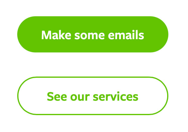
Large, button-styled links are an email design stable… and with good reason. They’re easy to see and easy to press.
A button’s link should always go to the same place as any other part of the feature. And yet it’s surprisingly common to see emails in which the button leads to a different destination than the associated image or heading. Why?
If a secondary link is essential, an outlined ‘ghost button’ is an excellent design choice. A marketing email is rarely a thing to be perused. In this fast-paced environment, effective visual cues can make all the difference.
Now that your buttons are in place, you just need some text to put on them. About that…
Say the right thing
Calls-to-action are often dull and repetitive. Find out more, buy now, or the dreaded click here. Yawn.
While a user is likely skimming over product descriptions or other paragraphs of text, a call‑to‑action is short and prominent enough to be seen in its entirety. The more specific the phrasing, the better. Shop gift cards is instantly more descriptive – and noticeable – than the generic shop now.
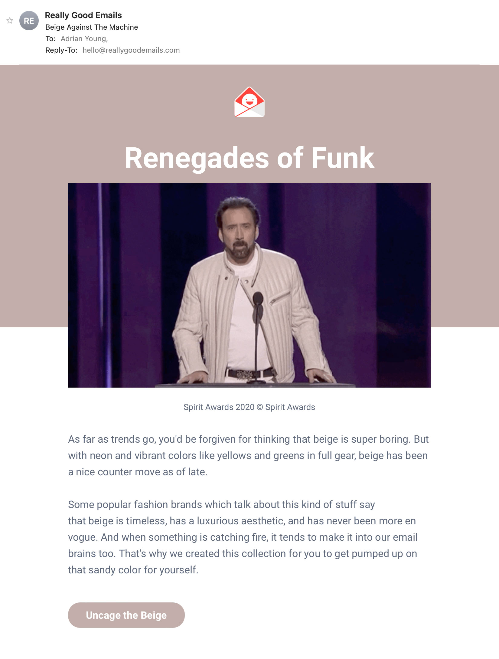
There’s also an opportunity to be creative, where appropriate. Really Good Emails are masters at this. Every email has a unique call-to-action that oozes with brand character while being relevant to the topic, such as uncage the beige or give a ship. Cheeky!
Accessibility is a guiding light
Good design and accessibility are intertwined. By following the tenets of accessibility, you are automatically on-course to producing a good email.
The implementation of links is a factor in that. Much of it comes down to common sense. Does it make sense to apply a link to this thing? Is it clear what will happen when I press it? Are there too many links to the same place? Or are there confusingly many links applied to parts of a single feature? Are clickable elements sufficiently spaced apart?
Better links, better emails
The humble link seems like something that is difficult to get wrong. But in reality it deserves as much consideration as any other aspect of email design. Plan it out, and link it through.