
Google recently caused a ruckus in the world of email marketing. As part of an update to Gmail, support for background images was (accidentally) knocked out. Oops. The result was an industry of marketers in panic.
Email developers scrambled to find a fix. Workarounds were found, and Google ultimately resolved the fault at their end. Crisis over. This incident will soon be forgotten – which is a pity, as there lessons to be learned.
Things change
This isn’t the first time such an event has occurred. Changes to email platforms are fairly regular. Sometimes for the better, sometimes for the worse. I recall at least two times when a major email platform made a change that immediately broke responsive stacking content on mobile devices.
Or how about some ancient history? In 2007, Microsoft made the infamous decision to switch its ubiquitous Outlook application from a web browser-style rendering engine… to one based on Microsoft Word.
These sort of sudden, unexpected developments vary from subtle to industry-changing. But they have a couple of things in common:
- They are beyond our control as email marketers.
- The more complex the email, the greater the chance of it being affected.
Ours is a diverse but fragile digital environment
One customer is viewing your email in Apple Mail on an iPhone 14 Pro Max in dark mode. Another is looking at it in the Gmail web app in Firefox on Windows 10. Someone else is using a little-known third party Android app on a flip phone. The point – there are countless devices, platforms, versions and personal settings to cater for.
Now add Outlook and its archaic code support to the equation. With all this in mind, it’s clear why HTML emails can only work thanks to an array of coding tricks and extensive ongoing testing. The more complex the design, the more liable it is to break now or in the future.
Overloading the medium
Like all email developers, I’ve been faced with many moments of hair-pulling frustration. Inexplicable gaps in emails, font problems, wrestling with truncation… the list goes on and on. This raises a question – why are we going to all this trouble?
Thinking specifically about the Gmail background troubles, I cannot imagine any email content in which a background image is essential. Nice, sure. Fancy, sure. But essential, no. As a means of conveying useful information to a customer, a regular image and some text will do just fine.

All of this boils down to the fact that email is far more fragile than a website. And that is not a bad thing. The trouble only starts when we try to force email beyond its capabilities.
Simplicity is key
Most email development struggles are of our own creation. Why battle for hours to achieve a particular design when the easier option is to simplify? This isn’t admitting defeat. It’s making the smart choice to design for the medium, rather than trying to shoehorn a pseudo-website into an email.
Neither does it mean making an ugly email. Simple is not a synonym of dull. A simple email can include static images, and a static image can be as eye-catching and complex as you desire. The email that houses them doesn’t need to be convoluted, and will only benefit from simplification.
Complex email design is less accessible
The hidden beauty of accessibility is that it benefits everyone. The design and coding techniques that it involves will often directly improve your overall email, or serve as a reminder to clean it up.
Complex email design is the enemy of that. It increases the chance of colour clashes, screen reader navigation difficulties and inconsistent use of text and images to communicate information. Simplicity in design means that we don’t have to strive to find clunky solutions to these problems – we circumvent them entirely.
Email code is absurd
It’s easy to forget just how ridiculous email code is. HTML data tables are used for structure. Multiple nested elements are used to achieve something that could be done with a single HTML tag on a website. Spacer objects are often required to force items into place. An assortment of tricks and hacks loosely pins everything together.
And yet we repeatedly choose to attempt complex designs in this environment. Surely the logical choice would be to have less of this clunky code, not more?
Email designers are their own worst enemy (or at least the email developer’s)
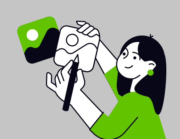
Mobile phones have some fairly decent photo editing apps. But they’re no replacement for Photoshop on a desktop computer with a mouse or tablet. The mobile apps are suited to quick, simple edits only. Trying to do anything more in-depth is convoluted if not outright tortuous.
Designing emails that look like websites is like trying to perform complex photo editing on a mobile. It’s simply not the right tool for the job.
Breaking from convention takes courage
Almost every brand sends fancy HTML emails. Companies need to adhere to brand guidelines. No-one wants to challenge the status quo.
That could be good news for you. The one who breaks convention reaps the rewards while others struggle on. Be that one!