

I like Google Fonts. What’s not to love about a vast, free-to-use, easy-to-implement collection of typefaces?
At the time of writing, there are 1,709 fonts on the platform. Here are ten of the best.

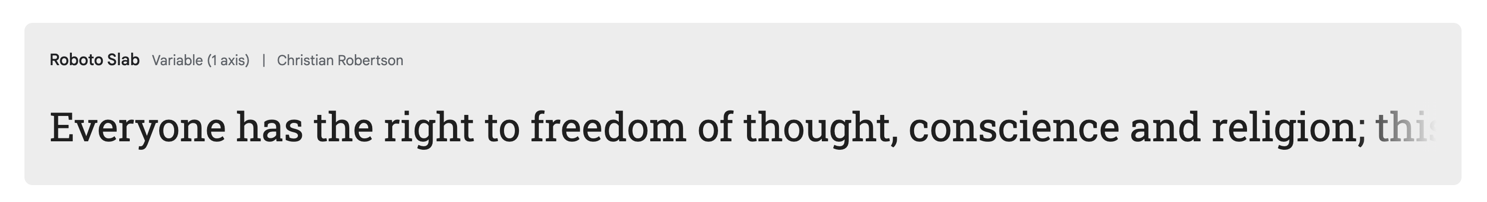
Type: slab serif
All the classiness of a serif font, with the contemporary feel of a sans-serif. Roboto Slab is a versatile font, and an alternative choice to its ever-popular cousin, Roboto.

Type: handwriting
Fonts of this category have always caused an uncomfortable conceptual clash in my mind. The digital mimicry of a human being’s penmanship can feel like typographical pastiche. Reenie Beanie, on the other hand, captures the feel of a person’s scribbled notes in convincingly organic and whimsical fashion.
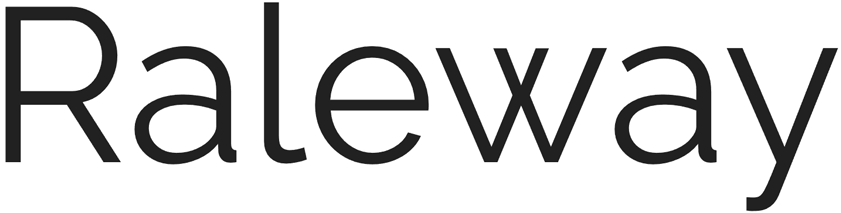
Type: sans-serif
As is the case with a lot of sans-serif fonts, Raleway brings a modern elegance to a piece of design. But while some typefaces in this category can appear a little cold and clinical, Raleway looks far more inviting.

Type: monospaces sans-serif
Sometimes you just need to GET YOUR MESSAGE ACROSS. Its heavy, all-caps nature is best suited to headings. But that little bit of softening on the letters tells your audience that you’re friendly, really!
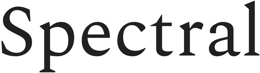
Type: serif
Don’t worry – despite the name, it’s not a cheesy Halloween font. Simultaneously traditional and modern, Spectral is an aesthetically-pleasing serif and eminently readable for longer passages.
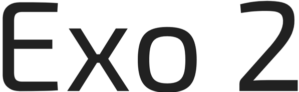
Type: geometric sans-serif
Sounds futuristic, is futuristic. Exo 2 says high-tech, but without being tacky.

Type: display serif
Just look at that wholesome rounded lettering. You could use it to write ‘DANGER’ if you really wanted… but nobody would believe you.
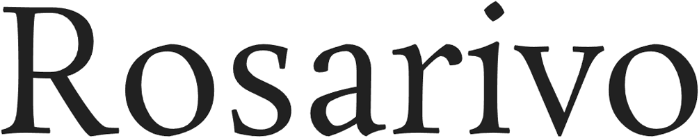
Type: serif
Looking for something a little more classical? Rosarivo’s elegant ornamentation could be just what you seek. And it’s a pretty alternative choice, with fewer than 80,000 websites currently making use of it.
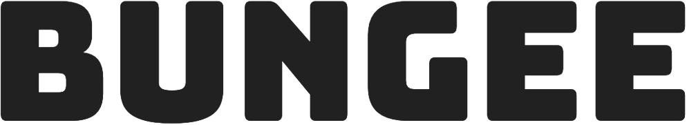
Type: display
Bungee is unashamedly BOLD. When you want a heading to grab the reader’s attention, you can do a lot worse than this font.
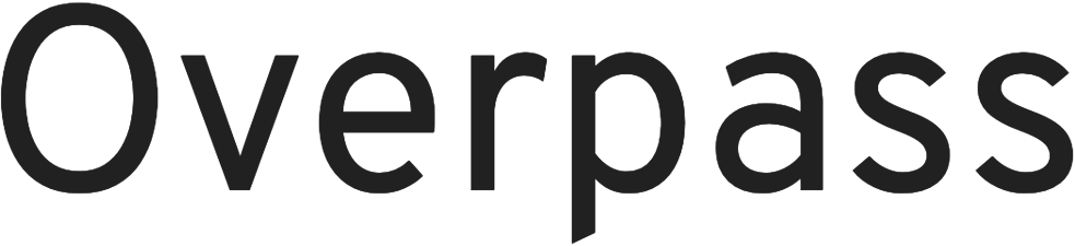
Type: monospace
The uniform spacing of a fixed-width font is ideal for a coding environment – but that certainly isn’t its only valid application. Overpass’s tall characters give it a distinctive, refreshing look.
Using Google Fonts in email
Google Fonts is an extremely convenient platform, whether you want to download a font for self-hosting or offline use, or pull it straight from Google’s servers. But we’re email people. And that means some quirkiness.
Here’s a quick guide to using a Google Font in your mailing.
Step 1:
Find your font
Step 2:
Press the big blue button
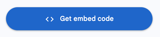
Step 3:
Get the embed code
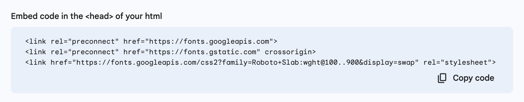
Step 4:
Copy the code
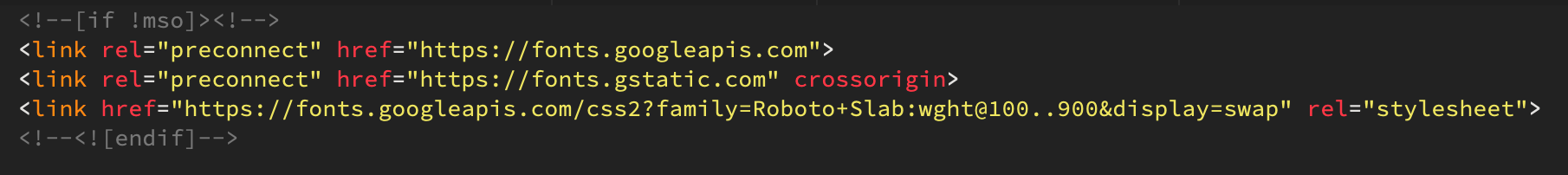
Step 5:
Stick this in your HTML file’s <head>. We like to put it directly under the <title> tag. Important: wrap it in MSO conditional comments to hide it from Outlook, thus fixing that application’s web font fallback glitch.
Step 6:
Apply the font inline where desired, with a suitable font stack of your choosing

Step 7:
Test it! Only some email applications support web fonts, so you’ll want to make sure your fallback looks good. In the case of an outlandish display font, it’s probably best to use an image with an alt tag.
And that’s it – you’re good to go. Now go and grab some fonts and give your emails a typographical facelift.