

10 typographical effects to prettify your emails
Text needn’t be plain. Modern CSS can apply all manner of visual effects to text. That makes it possible to create some eye‑catching typography without resorting to using images.
Well, all of that is true in web design. Email on the other hand has inconsistent support for CSS from one application to another. But don’t worry – that’s nothing a bit of graceful degradation can’t handle.
1. Letter spacing
CSS property: letter-spacing
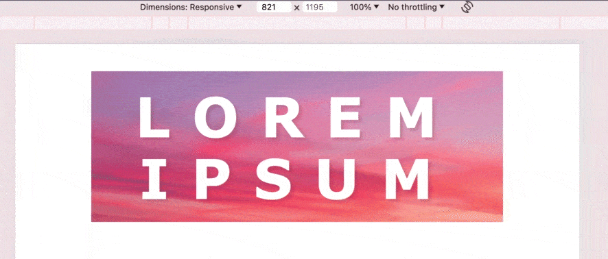
Kerning is typographical lingo for the gap between letters. Increasing the kerning is a neat way to bump up the visual impact of a text banner or heading.
Before:

After:

And the good news? It works everywhere.
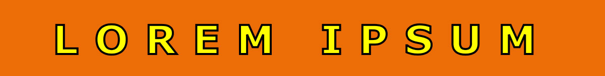
2. Drop shadow
CSS property: text-shadow
A drop shadow can add a subtle illusion of depth. Unlike letter spacing, this CSS property isn’t so widely supported in email. But it works in Apple Mail on iPhones and Macs, and that alone makes it worthwhile. With no particular fallback considerations, text shadow is a perfectly viable design option.

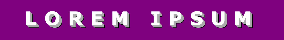
3. Outline
CSS property: text-stroke / -webkit-text-stroke
An outline can accentuate a heading or call‑to‑action. Just like drop shadows, support is not universal. So consider it a progressive enhancement and don’t rely on it for contrast!
4. Pseudo 3D
CSS property: text-shadow (again, but fancier)
Masterful coders can wield CSS like a paintbrush. Code‑based reproduction of the Mona Lisa, anyone? To create something like this, you only need bucketloads of artistic talent, abstract thinking, coding prowess and mathematical aptitude!.
These works, incredible as they are, are the endeavors of hobbyists. But the point is that CSS can do a lot more than basic styling. You can combine effects with limitless potential for creativity.
For example: you can apply as many text shadows as you like. How about layering a few to create a 3D text effect?
5. Gradient fill
CSS properties: linear-gradient / background-clip / -webkit-background-clip
Colour gradients, a once‑beloved staple of web design, can be easily applied to a background in CSS. But with just one extra property, they can also be applied directly to text. Nice.
Beware if using this technique – some email clients will recognise the gradient, but not the clipping mask – thus leaving you with a coloured block and no text. These are essentially experimental techniques in email, so some degree of fallback content may be necessary.

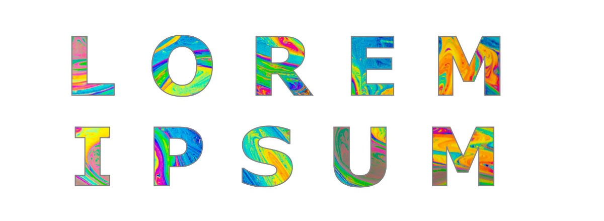
6. Texture fill
CSS properties: background-image / background-clip / -webkit-background-clip
Gradients aren’t the only thing that can be applied as a text background. You can use an image. I guess you could call it a texture.
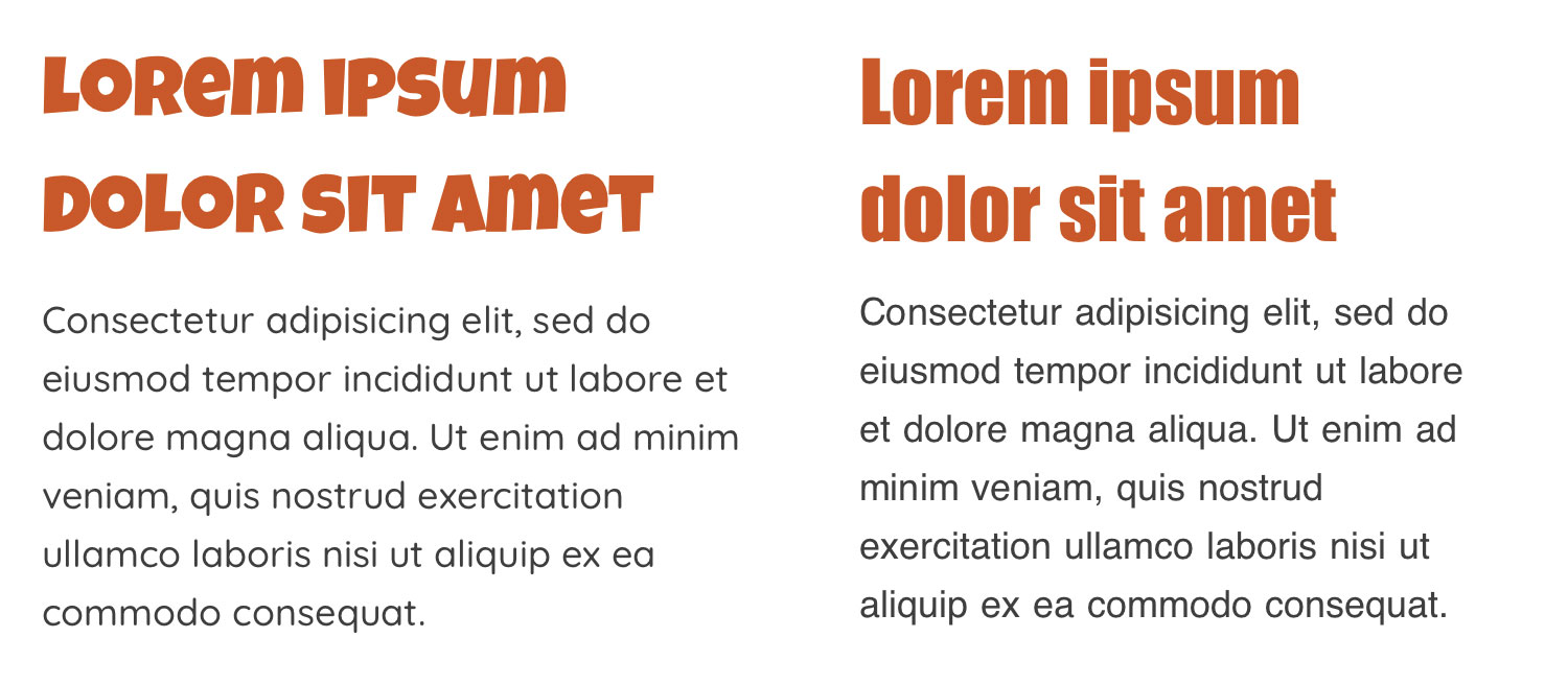
7. Web fonts
HTML element and CSS properties: <link> / font-family / @font-face
So far we’ve only looked at effects to be applied to existing text. But we’re missing a trick. A major part of typography is of course the choice of fonts.
Once upon a time, web designers were limited to a small pool of web‑safe fonts. Arial, Times New Roman and the like. The advent of web fonts meant that developers could remotely load any font under the sun onto the user’s computer… thus opening up a new world of typographical creativity.
Do web fonts work in email? The answer – as is so often the case with this medium – is sort of. Compatibility is all over the place. This article isn’t a how‑to on web fonts, so let’s note only the most important points regarding support. They work fully in Apple Mail, in an extremely limited form in Gmail, and not at all in Outlook.
Here’s a comparison of web fonts and their more prosaic fallbacks. When they work, they undoubtedly enhance an email. They also make it possible to produce designs that are more on‑brand. But the downside is that the fancier the web font, the bigger the fall! Perhaps one day all major email services will cater for them.
8. Rotation
CSS property: transform: rotate(#deg);
Text doesn’t always have to lie horizontally. A little bit of rotation can make a big visual impact.

9. Text scaling
CSS property: font-size: #vw
Huge text‑based headings can sometimes present a challenge on mobile. Multiple breakpoint‑triggered classes to resize the font can work, but it’s pretty clunky and requires some trial and error. If only there was a way to scale the text smoothly, as if in an image.
Well, there is. One of CSS’s many units of size is viewport width, or vw for short. That lets text scale relative to the screen size. It’s surprisingly well‑supported among mobile email clients.
Here’s an example, placed on a background image because, well, why not?
10. Animation
CSS properties: animation / @keyframes
CSS comes equipped with a couple of options for movement: transitions and keyframe animations. In the right hands, the latter can produce some richly complex animation. The results are far smoother than an animated GIF, and they’re not limited to that format’s paltry 256‑colour palette.
Here’s a very simple example with some skewed text. To see what can really be achieved, I recommend checking out the myriad examples on CodePen.

Is this really worth doing in email?
Maybe, maybe not. I’ve written in the past about the value of simple design for this somewhat fragile medium. But I’ve also written about all manner of experimental interactive content. Clearly those concepts are at odds.
But I believe there’s a time and place for both ends of the spectrum. There are accessibility and compatibility considerations for sure. Often an image with an alt tag will be the better choice than CSS text effects. But if you’re feeling adventurous and fancy producing an email that looks spectacular on the strongest email clients… then I reckon it’s an adventure worth having.