
Subject lines have a tough job. They’re the front line of email marketing. With just a few words, and possibly an emoji or two, they need to capture your customer’s attention and relay some useful information.
Thankfully they’re not alone out there. Your sender name plays a part. Maybe you’ve introduced Gmail annotations. And of course your trusty preheader is always there to back up your subject.
Why, then, has Apple taken steps to change how it works?
The trailing characters trick
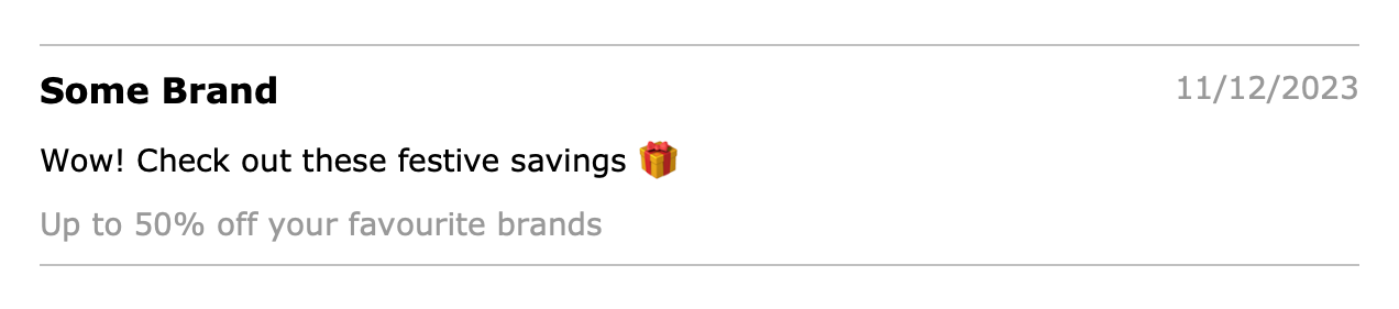
First things first. There are different ways to implement a preheader. It can be visible in the email content, usually as small print at the top. Or it can be hidden, so that it is only readable in the inbox listing and not in the email itself.
Either way, there’s a generally unwanted thing that happens – additional text content will be pulled into the preheader by default. That could be your nav bar, or main heading, or whatever comes immediately after your preheader on the page. The result is messy.

Email developers, being a crafty lot, came up with a hack to stop this happening. It doesn’t really have a name, but I like to call it the trailing characters trick. It works by adding a load of blank characters after the preheader (regular spaces won’t fool it). The effect is a neatly trimmed preheader without any unwanted junk cluttering it up.
And how is this achieved? Well, it’s not pretty. A string of unseen special characters is appended to the preheader, until enough rogue characters have been pushed out of view.
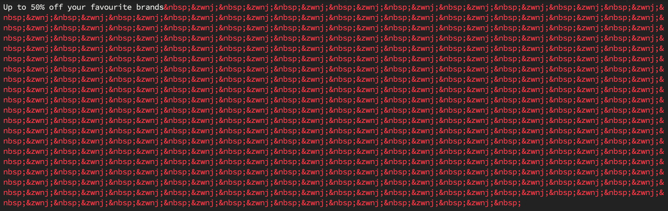
That’s a non-breaking space coupled with a zero-width non-joiner… over and over again. Email is no stranger to unorthodox development techniques, but this is a contender for the most bizarre.
Except it doesn’t work any more
During recent updates, Apple has intentionally disabled the use of this trick. It still works in some places, but not in Apple Mail on either iPhones or Mac.
There is already an alternative method that works, for now. Rumour has it that this will be short-lived, and similarly blocked in the near future. And perhaps the likes of Gmail and Outlook.com will follow suit.
So, there’s a battle taking place. Why are companies going after our precious preheaders?
Functionality reclaimed
The phrase preheader wasn’t one coined by email providers. It was invented by marketers. Email app developers and webmail services have different names for this particular piece of inbox anatomy: preview, preview text, message preview.
That terminology suggests a different purpose than a secondary subject line. It’s a quick way to see some message content without having to open the email. That lets the reader determine if it’s worth their while to open, or not. A ‘preheader’, by contrast, is an artificially injected snippet of marketing blurb. Arguably this repurposing of the message preview is hijacked functionality. That is why it’s being taken back.
And it isn’t the only example of a functionality tug-of-war in email. Marketers and email devs go to lengths to suppress auto-linking (and auto-styling) of dates and addresses. Javascript doesn’t work in email, so resourceful coders have stretched the capabilities of CSS to allow some basic interactivity. There have even been celebrations of clever mosaic-style imagery as a fallback when actual images are blocked. What the marketer wants to achieve and what the email provider allows do not always tally.
Can’t we all just get along?
Email is a digital communication format that originally mimicked a letter. Its modern pumped-up visual format has pulled the medium in a different direction. Things change, of course. Particularly in the world of technology. But while progress is good, misuse is not.
Perhaps it’s time we all stopped thinking in terms of preheaders. By beginning emails with an interesting heading and useful paragraph of text, the message preview fulfils its intended purpose again – without the need for trickery. So, it’s not goodbye after all. It’s welcome back.