Email best practice

Let Outlook be Outlook

Microsoft Outlook is notorious in the email marketing world. It doesn’t do modern HTML and CSS. It has a thing for splitting emails apart at the seams with rogue white lines. All in all, it’s a pain.

But that’s ok. Here’s why.

You can’t repair software via an HTML email

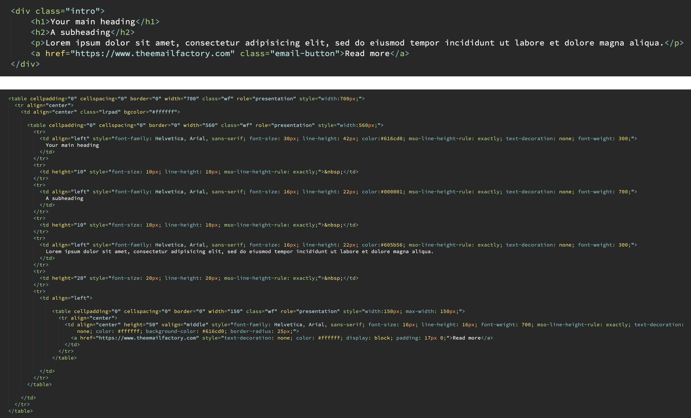
Outlook is a desktop application. The kind that’s coded in a complex language like C++ or suchlike. Oh, and it uses Microsoft Word – yes, the word processor – as its rendering engine.

A remote email developer has the following tools at their disposal: HTML, CSS and VML. None of these are programming languages. Their purpose is content and presentation. Therefore none of them can be used to re-engineer Outlook’s functionality. The best that can be done is to circumvent Outlook’s quirks and take steps to minimise their chance of occuring.

Acceptance ≠ apathy

Accepting Outlook’s limitations doesn’t mean doing nothing about them. Marketing emails should be designed and coded to degrade gracefully. That means designing and coding in such a way that your email can be progressively simplified and still look presentable.

Your reader probably isn’t using Outlook

Are you in the B2C market? It’s likely that only a tiny portion of your readership is using the desktop Windows application. Outlook has a mere 4% market share.

As you’d expect, most Outlook users will be present in the B2B sector. This however is no reason to panic. Design and develop accordingly.

Outlook can mean many things

It’s a Windows application. Plus there’s an online interface for Outlook 365. There’s also a Mac version that is quite different in every way. Oh, and there’s Outlook.com the webmail service. And its associated mobile app. With iPhone and Android flavours of course.

We’re not done yet. The Windows application has various editions. 2013, 2016, 2019 for starters. How these render your emails can even change according to screen density. Have you lost count of all the Outlooks? I have.

Your subscriber doesn’t care (so neither should you)

Email is a transient, fleeting thing. Its purpose is to communicate a message or an offer swiftly and clearly. Looking pretty is secondary.

That doesn’t mean it’s not worth the effort to design great‑looking emails. It is. It’s even worth a bit of effort to sort out Outlook problems.

But what is not worthwhile is frittering hours and hours of your time to get rid of a 1‑pixel glitch in one version of Outlook. Your customer is interested in what you have to offer. I can’t guarantee that they won’t notice a trivial rendering glitch, but I’ll bet money on the fact that they won’t care.

Example of a rogue white line in Outlook
White line: campaign-stopping crisis or trivial fact of Outlook life?

Time is money

This is business and we’re all here to make money. Investing resources on trivial matters is a poor effort‑to‑reward payoff.

If you’re sending a richly designed mailing, you’re likely to trigger an unwanted rendering glitch in at least one version of Outlook. From an email developer’s perspective, the cause is purely down to chance – as is the solution. And that solution could potentially take hours to unearth, if even possible. Accept it as a triviality and move on to something more important.

We’re stretching the medium beyond its intended capabilities

Email used to exclusively mean a letter‑like digital message sent from one person to another. Probably with some kind of hilarious cat joke, and possibly a threat that something awful will happen if you don’t forward it to ten friends. As a format, email consisted of words typed on a plain background, perhaps with a picture or two attached for download. That’s what email was.

At some point along the line, the technology became (somewhat) intertwined with the HTML and CSS code that powers the web. That afforded significant improvements in styling and branding, which is nice. But the pendulum has perhaps swung too far. It’s now common for companies to send marketing emails that resemble mini‑websites – a far cry from its electronic mail origins. Should we be surprised that it breaks?

Conclusion

Outlook isn’t all bad. Seen through the right lens, it’s a reminder to focus on content rather than decoration. Follow best practice in your emails and let Outlook do what Outlook does.

Email coding

Was Outlook right about email all along?

Ask any email marketer what their biggest bugbear is, and there’s a strong chance that they will answer Microsoft Outlook. The desktop Windows application is notoriously uncooperative with modern coding standards. It’s a place of archaic development techniques, myriad quirks and unpredictable rendering glitches. That sometimes leads to protracted development times and hair-pulling levels of frustration.

Here’s a comparison of clean web-style code versus Outlook-targeted bloat:

Comparison of web-style and Outlook coding

But I don’t think Outlook is entirely to blame. Here’s why.

Outlook is not alone

Modern web browsers, for the most part, agree on how HTML and CSS code should be interpreted. The same cannot be said for email services. The various pieces of desktop software, webmail sites and mobile applications all behave differently. Each email platform, from Gmail to Samsung to Yahoo, has its own strengths and weaknesses. The only significant exception is the ever-reliable Apple Mail. This uneven landscape is the reason for email-coding being a profession of tricks and workarounds.

While Outlook is inarguably the least code-friendly of all major email applications, it’s not alone in its patchy support for modern web-coding standards.

I’m here for the offer

I don’t open a marketing email to see brand fonts or fancy design or flashy GIFs. I open it because I think there’s something of value to me in there. That might be a special offer, or a new product that matches my interests.

And I want to absorb the information in the quickest time possible. A marketing email is rarely a thing to be perused. If I crave visual stimulation, I will look at art. If I’m in the mood for reading, I open a book.

When I open a marketing email, seeking that tempting discount, a plain-looking design or a graphical defect is not going to be a deal-breaker. It’s an irrelevance.

Email is email, the web is the web

I missed an if earlier: if I want to browse the internet, I’ll browse the internet. Email – electronic mail – used to be the digital equivalent of a posted letter. But at some point it became standard practice for marketing emails to resemble mini websites. Navigation bars, complex layouts, rich graphics, fully-blown footers. Even interactive components such as drop-down menus have become fairly commonplace.

To achieve such an email requires layers upon layers of non-standard coding techniques. To a front end web developer who is used to coding efficiently, it’s likely to look like an incomprehensible mess at first glance. I picture it as a ramshackle machine, bodged with duct tape and liable to break down at any moment. And what is all this effort for? To force a medium to do something that it was never intended to do!

Word games

Microsoft made an industry-changing decision when they released Outlook 2007. Emails would be displayed using the Word rendering engine. Yes, that’s Microsoft Word as in the word processor. And, at the time of writing, it has remained this way for all subsequent Windows editions of Outlook.

Not only does this explain the platform’s extremely limited support for modern web code, but it’s also the reason for sporadic rendering glitches. Marketing emails are often fractured by pixel-thin lines appearing as if at random. One common cause of this is content falling on Word’s unseen page breaks behind the scenes.

Example of rogue white line in Outlook email

But is this truly a flaw in Outlook, or a problem created through misuse of the medium?

Things change: part I

From time to time, email vendors update their platforms and significantly change how they interpret HTML and CSS code. Sometimes that means improvements, sometimes it means email-breaking regressions.

Here’s a good example. More than once, I’ve seen the code used to stack content on mobile suddenly stop working. The solution: yet more unorthodox coding techniques.

This is part of the reason why companies (should) regularly check their mailings on as many email services and devices as possible. An email may display perfectly today, but tomorrow could be a different story. Even the most robust HTML email template is ultimately fragile. Keeping things simple is an effective future-proofing technique.

My needs are simple

From a consumer’s perspective, Outlook is perfectly capable of everything I need a marketing email to do. Formatted text allows me to scan over an email and pick out key points such as product name and price. High resolution images show me what a product looks like. Large, clear buttons give me a means to move onto the next step – in a web environment – should I choose to.

But what about pixel-perfect design, drop shadows, cool GIFs, web fonts, animation, and other bells and whistles? I don’t need those. Such non-content is of immeasurably more concern to a marketing department than it is to a customer.

Things change: part II

And now it’s time to unravel everything I wrote above. Technology progresses, trends move on, and I don’t want to be a closed-minded Luddite.

When I claim that Outlook does all I need it to, I’m seeing things through a conventional lens. In actual fact there are several pieces of enhanced functionality that would benefit me as a customer. It would be handy to watch a movie trailer, or to listen to a snippet of an album, or check out a t-shirt in different colours… all without leaving the mailing. Just because email has traditionally been a gateway to a website doesn’t mean it must always be that way.

So, is outlook right?

I’ll pick a side – no. There are definitely lessons to be learned from Outlook’s approach to email, and it reinforces the importance of substance over style. But ultimately its resistance to modern web standards is resistance to progress in general, and holding the medium back. And if Microsoft was truly making a stand about what email should be, why equip Outlook with a diluted level of HTML and CSS capabilities rather than none at all?

Google’s AMP for Email is a determined move to transform email into a rich, fully interactive experience. The technology may not have taken off in dramatic fashion, but adoption rates are slowly growing. In any case, it would be absurd for the world of email to maintain its antiquated coding techniques forever.

There’s also a new version of Outlook on the horizon. Anticipated for late 2026, there are convincing rumours that it will at last support modern development techniques. That changes everything.

When that day comes, we’ll be given the gift of time. Instead of wrestling with rendering problems, let’s focus our efforts instead on customer-focused content and design.