Someone famous once wrote: any sufficiently advanced technology is indistinguishable from magic. And while I’m fairly certain that Adobe Photoshop isn’t secretly powered by wizards, its generative fill function really makes me start to question that.
Before we look at the wonders of which it is capable, let’s imagine a graphical challenge that we might face in day‑to‑day work.
Grass production
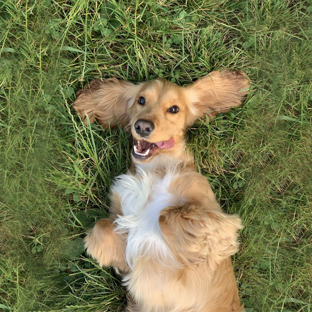
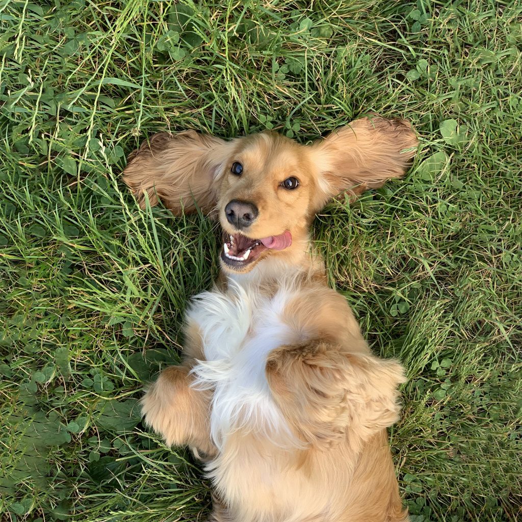
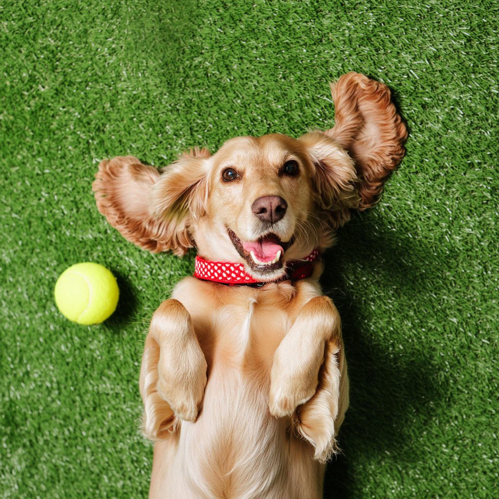
Here’s a picture of a dog:
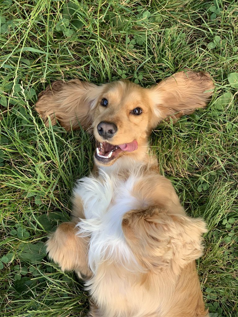
It came from Unsplash, but let’s say it actually came from a client. And it needs to fit a square‑shaped slot in a template, but they absolutely do not want to crop it. They need the full dog. Therefore we need to extend the grass at the sides.
Once upon a time, this would have meant using Photoshop’s clone stamp tool. That lets you manually ‘grab’ regions of an image, to paint in elsewhere. With some smoothing and layering – not to mention a considerable amount of patience – the results can be quite convincing. But who has time for that when deadlines are looming?
It’s not necessary in this example, but sometimes this process would entail the tricky masking of objects. Hair in particular could be a nightmare. You might even want to grab portions of other images, like a kind of pictorial Frankenstein’s monster.
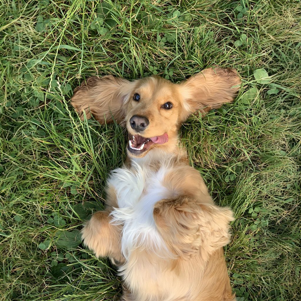
For old time’s sake, let’s complete our challenge using only the clone stamp. Here’s my somewhat rushed effort:
There is obvious blurring. It’s almost like an impression of grass rather than actual grass. A patient Photoshopper could painstakingly labour over such a task until it looks natural, but that isn’t practical in the real world of business.
We need a faster option.
Had your (content-aware) fill
In the early 2010s, Adobe introduced content‑aware fill. I always found this an oddly unassuming (if accurate) name for such a powerful tool. After all, this is a piece of software that sports a magic wand. Anyway, I digress.
Content-aware fill is an ‘intelligent’ tool that can remove items or extend images in a mostly‑automated fashion. You just need to make the selection, and optionally adjust the sampling data area. Sometimes it may take a couple of sweeps or some manual finishing touches, but essentially content‑aware fill does the work of a clone stamp without human intervention. And in a literal fraction of the time.
Here’s what it did with our dog photo:
That’s not bad. Gone is the unsightly blurring from my clone stamp version. But in its place is some fairly noticeable duplication. There are clusters of identical patterns here and there.
I’m looking for defects of course. A customer browsing a website or glancing over a marketing email is going to focus on the cute dog rather than scrutinise every blade of grass.
Even so, wouldn’t it be nice if this was perfect?
The big one: generative fill
Now for something state‑of‑the‑art. Generative fill is a recent addition to Photoshop’s toolkit and is powered by AI. Let’s try it on our photo:
No blurring. No duplication. Blades of grass and leaves have been completed in a realistic manner. You’d be hard pressed to spot anything artificial in that expanded area.
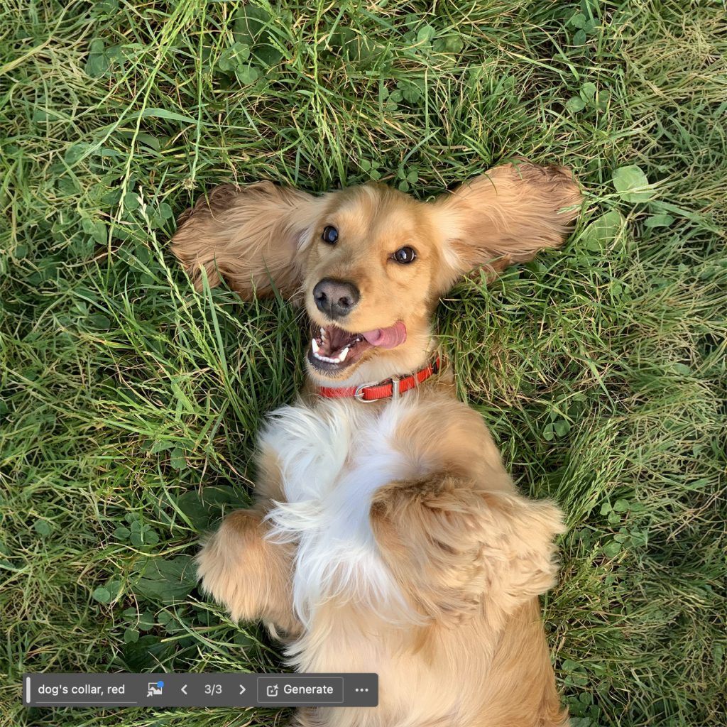
But we’re only scratching the surface of what this tool can do. While it’s possible to make a selection and click the button and trust the tool to know what to do, you can also guide it with written prompts. Should that dog really be out there without a collar? Let’s fix that.
Step one is to use the lasso tool to very roughly draw a selection around the dog’s neck. Next, we can enter a simple prompt: dog’s collar, red.
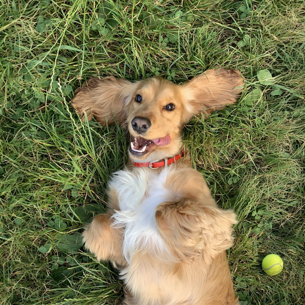
And what spaniel is complete without a ball to chase? We can provide that too:
Pushing it further
Ok, so we expanded a little bit of grass and dropped in a couple of simple objects. In this day and age of generative AI, you might say: big deal. Let’s demonstrate what this tool can really do.
Here’s another image from Unsplash:

It’s a stretch, but what if we just loved that particular depiction of corporate life and wanted to develop the image beyond that stylised crop? Well, all we need to do is bump up the height and hit the generative fill button once more:

Actual people, believably sewn on to the original image. By default, Photoshop returns three variations. They’re not always so perfect, but that’s ok – pick the one you like, or spin again. Make no mistake, this is an impressive piece of technology.
Starting from nothing
Generative fill is very closely tied to Photoshop’s generate image functionality. You don’t need a base image. You can start from scratch.
So, technically speaking, I didn’t actually have to go stock photo‑hunting in the first place. I could simply ask Photoshop for:
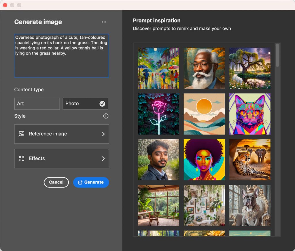
I flicked through six variations and decided on this one:
Curiously, fake turf was present in all six images. That’s an eerie preference for the artificial!
What’s next?
AI will only become further engrained in Photoshop, and software in general. Perhaps more and more tasks will be accomplished via a prompt interface rather than a traditional tool panel.
It may not be sorcery, but the distinction might not be that important when you can perform half a day’s work in seconds.