Artificial intelligence

Can ChatGPT-4 code a marketing email?

We conducted a test back in 2023 (where did the time go?) to see if ChatGPT could generate reliable code for an HTML email. The verdict then: no, it couldn’t. While some of the results were close, they weren’t nearly close enough to use in the real world.

Technology doesn’t stand still for long and things have of course moved on since then. We ran that original experiment on ChatGPT-3.5. Its successor, ChatGPT-4 has since arrived on the scene. The new version’s programming skills are better than ever, and its memory within a conversation has been considerably extended. You know what that means – it’s time to put ChatGPT’s email coding skills to the test once more.

Fair fight

We’ll follow the same steps as the original test. Scientific accuracy is important! Or at least we will start out the same way. Depending on ChatGPT’s output, the test could end up following a completely different path.

Our original test kicked off with an intentionally succinct request:

Code a responsive email template

Due to the nature of our request, the interface has switched to a development-oriented view, with a large code panel taking up most of the screen, and the chat itself shifted to a smaller area on the left. In addition, a pop-up has appeared:

Screenshot explaining ChatGPT's canvas functionality

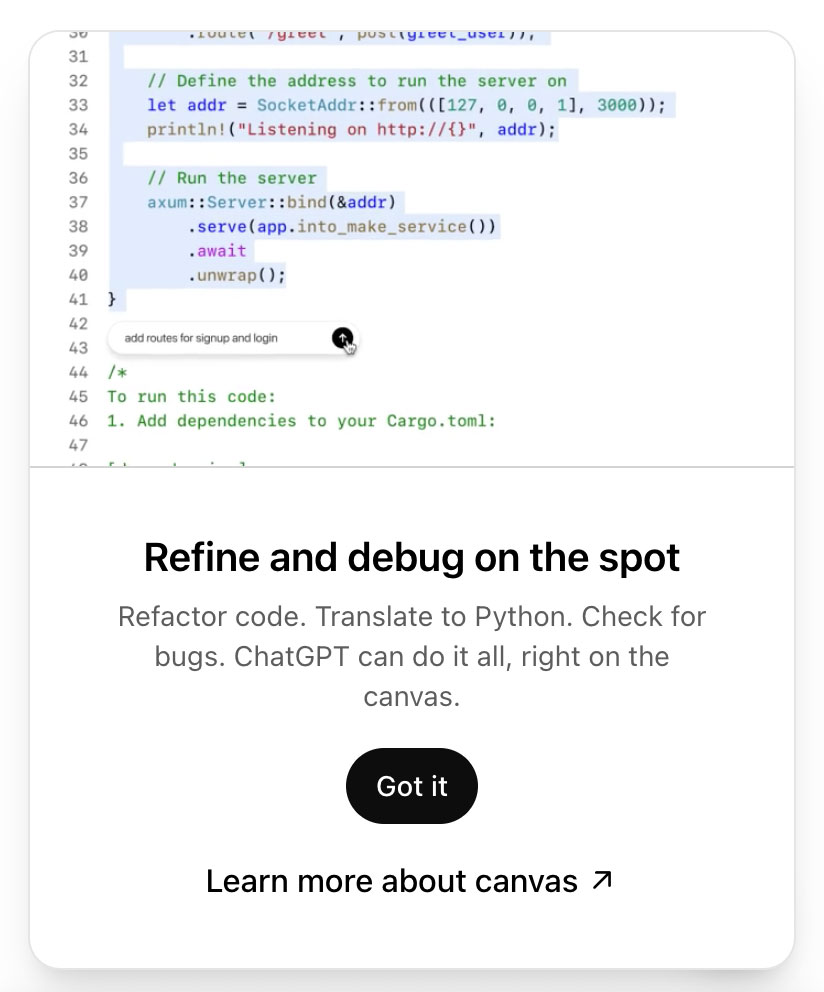
Clearly, ChatGPT is taking its coding assignment seriously. This feels much more like a development session already, rather than simply a chat about development.

Anyway, let’s see what it has given us. Unlike the first stage in the original test, it has generated some table-based code rather than email-unfriendly divs. That’s a positive development. Here’s what it looks like in a browser:

Screenshot of email in local web browser

But I can see that it’s not going to work properly. Most notable is the blue button that relies on CSS in the document head. Outlook won’t recognise that, so it’ll collapse. Here’s how it looks in Outlook 2021:

Screenshot of email as it appears in Outlook 2021

While it does fare well in other email applications, being broken in Outlook is a deal-breaker.

Result:
A more promising start than before, but still unusable.

We could take ChatGPT up on its refactoring offer here, but the code isn’t nearly usable enough to simply iron out a few kinks. We’ll start a fresh chat and be clearer about our requirements from the outset.

So let me tell you what I want

When working with any generative AI, it can be easy to forget that it is not magic. It can’t read our minds. The more detailed the instruction provided by the user, the better the chance of usable output.

With that in mind, we’re going to add a lot more detail to our prompt:

Code a responsive email template, using HTML tables for structure. Set the width to 600 pixels on desktop, with a fluid width on mobile. Include CSS classes to enable stacking of content on mobile devices. Include all known email client fixes that are still relevant. Set the page background to a light grey colour, and the email content area to white.

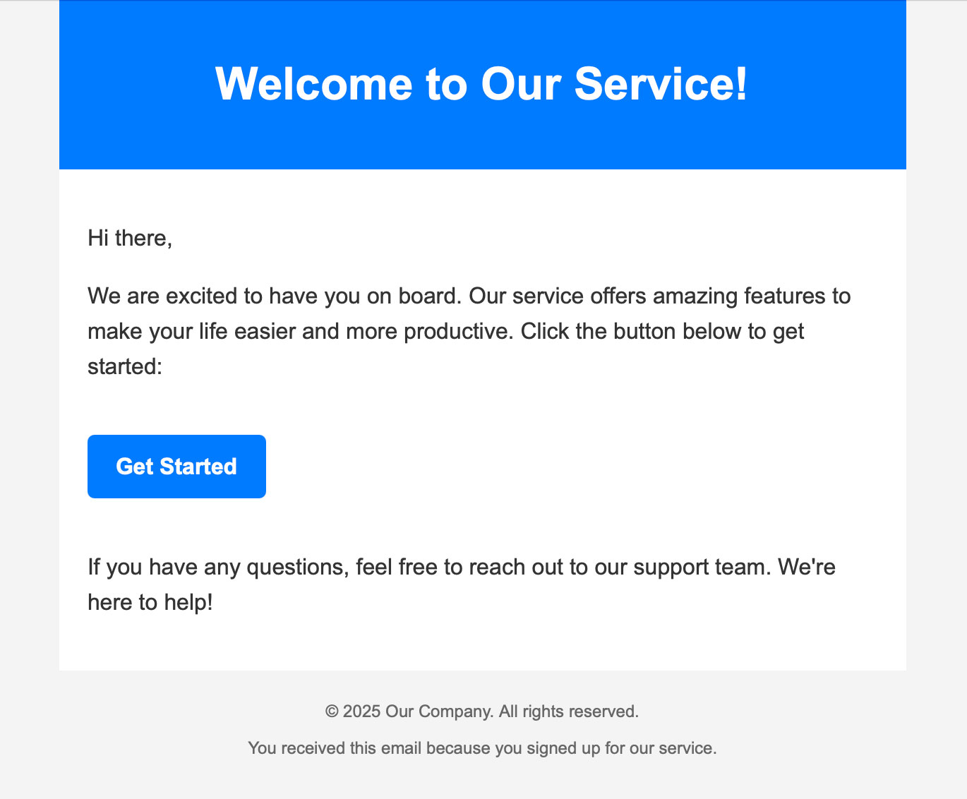
That matches word-for-word what we asked for at the second stage of the original test. The output however is better. There’s some stacking code for mobile, and a breakpoint of 600 pixels. Here it is in a browser:

Screenshot of email in local web browser

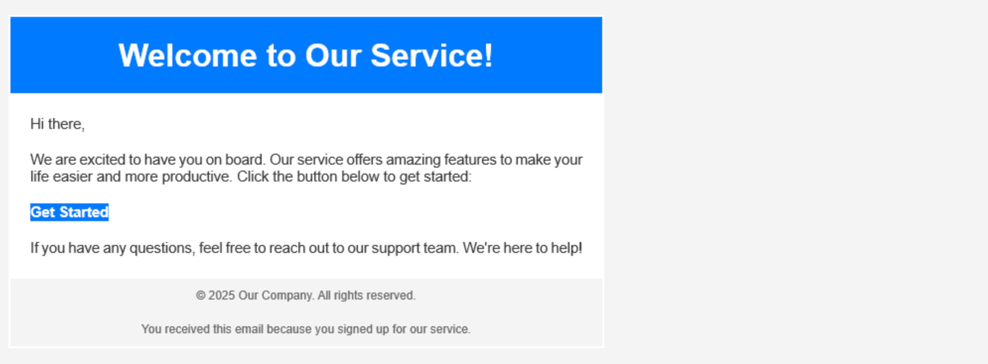
As before, I can see that the code is imperfect. But it’s not so bad that I’d skip the testing stage, so I’ll check it out via a real email test again. It renders well pretty much everywhere. iPhone Mail and Gmail apps stack as promised:

Screenshot of email as it appears in iPhone Mail

Even Outlook looks pretty good:

Screenshot of email as it appears in Outlook 2021

…at first glance. But let’s be honest, there’s not a lot going on in this template to mess up. There’s no button this time around. Did the AI decide to skip that in order to make its life easier? That’s the most accidentally human thing I’ve seen it do. There are no images or other particularly visual elements beyond some background colours.

About that – the blue area around the heading is greatly inflated in Outlook. That’s not a big deal in this simple template, but in a real email with actual graphic design elements it would mean that things break.

Result:
It’s better than stage 2 of the original test, but still not actually usable.

Working towards a goal

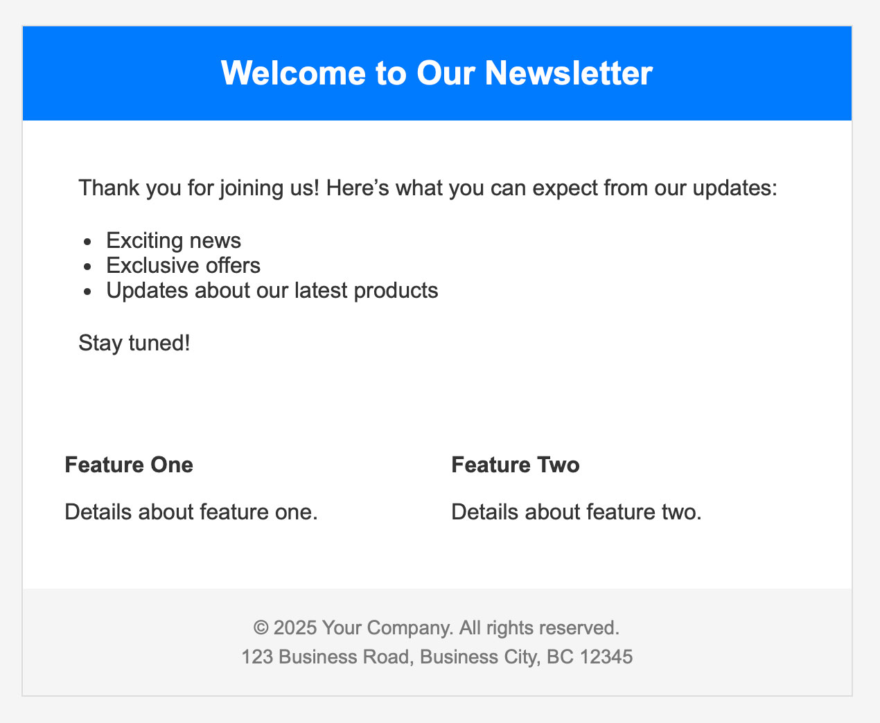
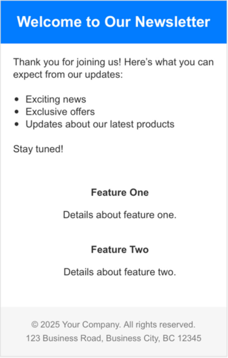
For the third step in the original test, we decided to approach the project from a different angle. Instead of asking for a base template, we instead designed a simple email for ChatGPT to recreate. Here it is:

Our mock-up email design

Before we go ahead with that, it’s worth pointing out that the overall test has already failed at this point. Our initial objective of creating a base email template is not an unreasonable one. It’s a task that might actually be assigned to a human developer. That person would be qualified to know the typical content and structure of a marketing email, without the need for a mockup for guidance.

With that said, let’s continue. While it is now possible to upload images to ChatGPT, that wasn’t so during the original experiment. So we’ll stick to words. Our prompt is a lengthy one:

Code a responsive email template, with the following requirements:
• 600 pixels wide on desktop
• Fluid width on mobile
• A page background colour of #f1f1f1
• Email content area background colour #ffffff
• A hero section with an image, heading, paragraph of text, and a button
• The hero image should be 600 pixels wide, to match the email content area
• Button should be pill-shaped, with a background colour of #a56e53 and white text
• Under the hero section should be two secondary features
• Each of these must also have an image, heading, paragraph and button
• Secondary feature images will be 290px wide on desktop, to match their containing column, and expanding to full width on mobile
• Hero text and button should be a bit larger than those of the secondary features
• These secondary features should take the form of adjacent columns on desktop, each at 290 pixels wide
• Place a 20 pixel gap between them
• The secondary features must stack into a single column on mobile
• All parts of the email should have 20 pixels of padding on each side on mobile, except for the hero image which can be full width and touching the edges of the viewport
• All body text should follow this font stack: HelveticaNeue-Light, Helvetica, Arial, sans-serif
• All body text should be colour #61524b
• All heading text should be colour #a56e53
• Use lorem ipsum placeholders for text
• Enter all hrefs as # placeholders
• Apply links only to buttons. Do not apply links to images
• Include all known, currently-relevant email client fixes
• Include CSS or HTML comments around each section to explain what it is or does
• Set a mobile breakpoint based on a max width of 639 pixels
• To ensure compatibility with Outlook and other email clients, use HTML tables for structure

And once I add some image references, it’s ready for a test run. First thing I notice when checking it in a browser is the lack of padding around text and buttons:

Screenshot of email in local web browser

Flaws or not, we’ll proceed to send it as an actual email test. Frankly, it’s not great. There are spacing and sizing problems even on iPhone Mail, the most robust of email clients:

Screenshot of email as it appears in iPhone Mail

Outlook is a total disaster with the two-column section trying to act full-width, this forcing the email to scroll horizontally.

Result:
A mess. That’s a downgrade from the equivalent step in the original test.

Here, try this

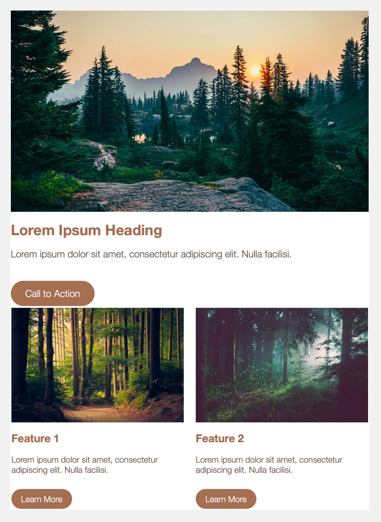
We’re an email marketing agency. That means we already have an email template and coding style of our own. So what we’ll do instead is give that base template to ChatGPT and then try to get it to recreate that mock-up. Is it sophisticated enough to pick up our coding style and apply it to the task?

The local browser result looks alright-ish. That last feature is attempting to escape the email, which is worrying.

Screenshot of email in local web browser

It’s upon looking at the code that the situation become even less promising. ChatGPT has taken our template code and effectively said nah. It has pretty much ignored our base template and used its own code. Broken code. Let’s run an email test to discover just how broken.

Here’s Gmail mobile:

Screenshot of email as it appears in Gmail mobile application

It stacks correctly but the alignment and spacing need attention. Unfortunately this is one of the better results. Gmail webmail suffers from the same ‘escaping content’ problem as the local browser preview, and as for Outlook – let’s not even talk about that.

Result:
It’s broken.

Last chance saloon

Only one step remains – providing ChatGPT with some feedback. Perhaps it can indeed refactor the code, with our guidance.

The local browser result of that looks pretty good (let’s just ignore those underlined button links):

It stacks, albeit with similar alignment and spacing troubles to previous efforts. As always, we’ll run it as an actual email test.

Oh.

Result:
We give up.

Getting nowhere fast

ChatGPT can generate code for JavaScript and PHP and various other programming languages. I even use it from time to time to help with scripting languages for different email platforms. So why is an HTML/CSS email development task failing over and over?

It’s because email code is weird. Not just weird but largely undocumented. And it’s undocumented because not everyone is on the same page about what an email actually is. Is it a simple digital letter, perhaps enclosing a picture or two? Because that’s what Microsoft Outlook expects to send and receive. Or is it a rich, CSS-laden piece of visual design? Because that’s what Apple Mail is capable of rendering. There’s a vast gulf between those polar opposites.

Not only is there no rulebook to which to refer, but ChatGPT is working blind. It’s not unusual to send multiple tests in a row when creating a new email template, checking it in the major email clients each time.

Now what?

Now nothing. Maybe some kind of custom implementation or plugin for ChatGPT could yield better email results. Or maybe it’s worth having a bash on a code-specialised AI assistant like Github Copilot.

But for now I’ve seen enough. Until such times as it’s easier to ask the machine than to do it myself, I’ll do it myself.

Email Marketing

Sweat The Small Stuff

We were recently asked to talk at an Email Marketing Summit by Figaro Digital and our C.O.O. Tony MacPherson presented on “Sweat the small stuff”. A look at all the nuances, the 1 percents that make the difference in email marketing campaigns. The attention to detail that really makes a difference to your bottom line, not a silver bullet but a long term strategic change.

Depicts a lozenge button in email

A look under the hood

So, this week with Black Friday in full throw we thought we would give you a sneaky look into what the presenter sees when you go to an event to see a talk on Email Marketing or CRM or any of the wonderful seminars out there. You can download Tony’s presentation here… However, this time we’ve left the presenters notes, the explanation, what Tony was seeing as he presented. This will explain the slides in a way just looking at them doesn’t.

Take a look and let us know your thoughts.

Email Marketing

8 ways coding skills make you a better marketer

Marketing is a profession of contrasts where the creative blends with the analytical. Scope for imagination sits alongside the need for logic.

In today’s digital world, there are few careers that cannot benefit from some coding know-how. Marketing is no exception. A little bit of programming knowledge could be the secret code to becoming a better marketer.

1. Transform your mind

Learning to code isn’t just about what you can do. It’s about the way you think. There are direct benefits from learning a particular programming language, but it’s perhaps the indirect benefits that are most valuable.

Speaking from personal experience, my approach to problem-solving fundamentally changed after learning JavaScript. When a complex challenge arises, my reaction is no longer oh [expletive], how are we going to solve this. The logic-based thinking that comes with coding can be applied to all manner of situations. A calmer thought process means less stress and more refined solutions.

2. Embrace efficiency

Who couldn’t use a little more time in the day? Repetitive (but still essential) tasks can add up and chip away at the clock, stealing away time from bigger projects.

Taking a programming approach to such jobs can make all the difference. The solution doesn’t necessarily need to involve a single line of code – just a bit of logic. Instead of manually compiling reports, is there an Excel formula that can achieve the same thing in a fraction of the time? Maybe you could record an action in Photoshop to apply a branding effect in a single click. An ounce of automation is worth a pound of manual procedure.

3. Become the toolmaker

Tailoring or modifying an existing piece of software won’t always be enough to solve your problem. For unique challenges, you sometimes need a unique tool. With programming knowledge, you can be the one to create it.

A client of ours required tracking to be hardcoded on links in a very specific manner. The syntax varies depending on the URL. What descriptors have already been used? Is there an anchor tag? Are other parameters already applied?

Manually performing such a task multiple times per day and dozens per week is both time-consuming and vulnerable to human error. The smart solution is to build a custom tool to do the job. Efficient and reliable results, along with the satisfaction and mental exercise that coding brings.

4. Master your software

It’s true what they say – once you learn one programming language, it becomes much easier to learn another. Modern CRM platforms and ESPs often come equipped with proprietary scripting languages. Salesforce Marketing Cloud has AMPscript, Oracle Responsys has RPL, and so on. These kind of scripting languages invariably open up a deeper level of dynamic content than a drag & drop interface can offer.

The syntax of these languages differs from platform to platform, but the underlying logic is very similar. Everything boils down to if this, do that. By thinking in terms of procedures and variables, you unlock your software’s full functionality – and value.

5. Talk tech

As a marketer, you may or may not ever be personally required to carry out any coding work. But even if your role is less hands-on, I’m willing to bet that you need to communicate with developers regularly. Knowing what is technically possible and how it can be achieved is a major advantage. A new project is off to a great start when everyone is working from the same technical foundation.

6. Unify the channels

There are lots of specialities in marketing, including our favourite: email. Specialised however is not synonymous with isolated. A strong marketing strategy combines multiple channels.

Theory is one thing, but technical understanding completes the picture. An email developer can benefit greatly from knowing a programming language that lets them build web content or process data. A custom API can connect software systems and make sophisticated multi-channel strategies possible. Your programming knowledge can be the bridge between channels and applications.

7. Become a journey planner

Multi-channel marketing is a concept that goes hand-in-hand with customer journeys. Any decent CRM or ESP software will include a workflow-based editor that lets you funnel and personalise the path that each customer follows. These can become enormously complex, often combining drag & drop rules with internal and external scripting.

Learning programming act as a logical conditioning for the mind. Use that power to plan, analyse and fine-tune complex customer journeys.

8. Stay at the cutting edge

Digital marketing is a fast-moving field. It can be challenging to stay on top of the latest developments. But with a coding foundation, it becomes easier to keep up… and maybe even be a pioneer.

I’ve seen a number of technical landmarks in email marketing over the years. Responsive design, product recommendations, live images, interactivity, Gmail annotations, AMP for Email, AI-generated content – the list goes on. Adoption rates can often be slow. Teach yourself some technical skills on the side and you can be the one to keep your brand at the digital forefront.

Crack the code

One of the beautiful things about coding is that you absolutely do not need to know a language inside-out before you can start putting it to good use in the real world. In fact, real projects are an essential part of the learning process. With just a moderate understanding of a single programming language, you can improve yourself as a marketer and make a real difference in a relatively short space of time.

Your choice of language doesn’t even matter. Python, PHP, JavaScript, whatever you fancy. They all have practical applications and cognitive benefits. So jump in, learn some code, and power up your marketing.

Email best practice

Email accessibility: are you leaving anybody out?

Communication. That’s what email is all about. The same is true whether you’re using it to apply for a job, or to seek help from customer services… or to market your product to thousands of customers.

Marketing emails typically go to lots of different people using lots of different devices. Your objective is to convey an equally intelligible message to all of them. That brings us to the concept of accessibility.

Defining email accessibility

Firstly, here’s what accessibility is not:

  • An inconvenience
  • An afterthought
  • Exclusively a matter of visual impairment

And now for what it is. Mozilla (the developers behind the Firefox web browser) describe accessibility as: the practice of making your websites usable by as many people as possible.

Applying this thinking to our favourite medium, it means emails that can be easily understood, navigated and interacted with. We want our mailings to render optimally in any application on any gadget. They must impart a clear message and invite a defined action from the customer. And accessibile emails are open to people whatever their level of physical ability.

Email accessibility is a huge topic, encompassing many human and technical factors. Let’s take a look at some of them.

Clarity in message, design and function

A marketing email usually performs two main functions:

  • Communicates a message to your customers.
  • Invites them to take action in response.

Concise copy and a user-friendly structure support those objectives. Worry not – that doesn’t mean your email needs to be sterile and unimaginative. There’s still plenty of scope for characterful writing and vibrant imagery. The art is in creating an eye-catching design that supports your message rather than overwhelming or obscuring it.

Accessible copywriting begins with the subject line. Good, honest information beats vague open-bait every time.

Image of good and bad versions of an email subject line

I like big buttons and I cannot lie

There’s a tendency in email marketing to go link-crazy. Every heading, every subheading, every image, every block of text… and even empty space – all clicking through to web pages. That usually means ambiguous destinations and multiple links to the same places. The technical term for this is a mess.

The solution: buttons. Big ones. Big ones with clearly defined calls-to-action. Your customer should know in advance what sort of content to expect upon pressing it. And don’t forget to include plenty of breathing space around those buttons. You don’t want links to different places squashed up against each other, especially on touch-screen devices.

Don’t get left in the dark

Dark mode took off a few years ago, and remains a popular display option among those who care about things like battery life and corneas.

It can have a dramatic effect on the way your email is rendered. And often not in a good way. Images can be camouflaged against recoloured backgrounds, or left floating in unsightly squares.

Email being email, the rendering methods for dark mode are not consistent from one email application to another. It therefore requires an assortment of coding and imagery techniques to create dark mode-friendly mailings. Dark mode-specific CSS classes are possible. PNG format images with border effects help them stand out, should they be unexpectedly displayed atop a dark background.

Comparison of a logo as seen in light and dark modes

The technical details are a complex topic for another day. But let’s be clear on the objective – you want to optimise your email for dark mode, not override your user’s preferences.

So many apps, so many devices

Sorry in advance, but I’m about to throw a bunch of words at you. Here goes.

Desktop computers, laptops, tablets, mobiles. Screen sizes, model versions, display settings. Desktop software, webmail services, mobile apps.

My point: there are many software and hardware combinations out there, and your marketing emails could be viewed on any one of them. You want your email to be just as legible on a dusty old laptop running Microsoft Outlook 2016 as it is on a brand-new iPhone.

Responsive email – i.e. that which is coded to fit to any screen size – is the answer. It’s standard practice nowadays, but that absolutely does not mean that it is always handled adequately. All too often, mobile rendering remains a secondary concern – leading to visual problems like tiny text and confusingly mismatched imagery. We’ve written extensively about responsive email in the past, but let’s sum up some of the most important points:

  • Plan your responsive design from the outset. The mobile layout should never be a secondary consideration.
  • Support for HTML and CSS in email is extremely varied and somewhat limited. An email developer must understand how to code effectively for all major devices and email services.
  • Be prepared to simplify an overly-ambitious design. Fanciness for the sake of fanciness is not in the spirit of accessibility.

Even if you’re confident that your email is perfection itself, always include a link for it to be viewed in a web browser.

Hear me out: your emails could be confusing to screen readers

I mentioned earlier that accessibility is not all about visual impairment. It is however an extremely important aspect, and will largely be the focus of the remainder of this article.

A screen reader is a piece of assistive software that will audibly describe the content of an application, web page… or indeed an email. You probably have a screen reader right in front of you right now. Press COMMAND + F5 if you’re on a Mac, or CTRL + WIN + ENTER if you’re on a Windows PC. While the use of a screen reader takes time to master, this will give you a helpful insight into how a visually impaired person might be interacting with your content.

As technically incredible as screen readers are, it is unfair to expect them to do all the work. A website must be designed and coded in a way that a screen reader can navigate and interpret. The W3C Web Accessibility Initiative (WAI) publishes extensive guideance on this topic, and a lot of the advice carries over to email.

Let’s take a look at some ways to develop emails with screen readers in mind.

Write semantic code

Do you shop in supermarkets? They have signage to help you find your way around the array of aisles. ‘EGGS’ here, ‘HOUSEHOLD ESSENTIALS’ over there. If those signs didn’t exist, your shopping experience would be a lot more frustrating. An email without semantic code is a bit like a supermarket without signs.

Semantic email code can be defined as meaningful HTML tags. These are the basic elements behind the scenes that make up a mailing. Here are a few important ones:

  • <header>
  • <nav>
  • <section>
  • <article>
  • <h1> (the main heading on the page)
  • <h2> to <h6> (increasingly minor headings – seriously, I don’t think I’ve ever gone past h3)
  • <p> (a paragraph)
  • <strong> (bold text)
  • <em> (italic text)
  • <footer>

But there are also multi-purpose, non-descriptive HTML elements:

  • <div>
  • <span>
  • <table> (for the presentational purposes of email, that is)

Those last three are far from invalid. But it’s easy to be lazy in web and email development alike, and rely on them too heavily. In fact it’s actually somewhat rare to code particularly semantically in email.

But guess what – descriptive HTML tags help screen readers know what’s what. Say your main heading is just sitting there in a generic <span> tag. A screen reader won’t know that it’s any more significant than any other text that happens to be floating about on the page. If it’s wrapped instead in an <h1> tag, the screen reader will announce it as “heading level 1”. Now the user better understands what is being communicated. Construct your entire email with semantic code and you communicate useful information to those who can’t see it.

Similarly, sequence is important. Screen reader users will often be using a keyboard to navigate through the email. By default this will jump from item to item in the order they appear in your code. Make sure it makes sense.

And while there is actually a way to override this sequence, doing so is so far removed from best practice that we will discuss it no further! Far better to construct an email that follows a logical sequence in content and structure.

Mark your bricks as bricks

Modern websites are constructed with the finest materials available – divs, spans and all sorts of CSS-styled goodness.

Emails are built using a more… rustic method. They use HTML tables for structure, just as web pages did once upon a time.

When a screen reader encounters a table, it assumes that it is a table of data. Something like this:

Image of a table showing populations of capital cities

A screen reader may therefore produce confusing results when dealing with the structural table of an email. There’s an easy fix for this. Just apply the following HTML attribute to all of the tables that comprise your email:

role="presentation"

Congrats – you’ve just told screen readers what your tables are for, and made your email immediately more accessible.

Let text be text

When you write a text message to a friend, do you take a screenshot of it and then send it as an image? Unless you’re charmingly eccentric, I suspect the answer is no.

The same principle applies to email. And yet countless companies – sometimes even the biggest of corporations – produce marketing emails in this roundabout manner. Paragraphs of text are drawn up in a design application, saved as JPEGs and dumped into HTML emails. Why?

This practice is so widespread that phrases such as ‘live text’ have sprung up. Let’s get out of that way of thinking. It’s just text.

There are probably multiple factors at play here. Brand guidelines and typography. A desire to achieve complex layouts in a medium that doesn’t make it easy. Or it could be the it’s-always-been-done-this-way mentality.

Accessibility and usability trump all of those things. There are all sorts of reasons to use proper text. It renders sharply and at a consistent size, whereas images shrink and grow. Users can zoom in without the letters becoming blurred. Chunks of text can be selected and copied. And it’s the purest form of copy for screen readers to detect.

Web fonts are reasonably well supported in email these days, so you don’t even need to lose your brand typeface. Now all of the boxes are ticked.

Animated comparison of text and image versions of the same content being scaled

Pictures speak a thousand words

But only if you let them. And you should probably cut that down to a handful of helpful, descriptive words.

HTML comes equipped with a thing called alt tags. That’s short for alternative. These tags allow you to attach text content to any image on the page. We can use them to describe what is pictured or relay copy from a heading. Normally the alt tag goes unseen.

They are however of critical importance for users who cannot see your image. That might be someone who has chosen to turn pictures off, or perhaps the file has failed to load, or it could be a person with a visual impairment.

Take a look at a few examples:

Overhead aerial photograph of a hotel's outdoor pool, surrounded by trees and rooftops

alt="Overhead aerial photograph of a hotel's outdoor pool, surrounded by trees and rooftops"

Watercolor painting of a pink flower in a plain background

alt="Watercolor painting of a pink flower on a plain background"

Example heading saying SALE NOW ON

alt="SALE NOW ON"

Without these descriptions, the content of these images would be completely concealed to a screen reader user. By typing just a few words, you have produced an immeasurably more inclusive email.

One more thing – emails often include some purely decorative or spacer images. Just leave the attribute as alt="", and screen readers will know to ignore them.

Self access-ment

We’ve covered a reasonable amount here, but this is a topic too broad to fully explore in a single article. There are plentiful accessibility resources online, even for the relatively niche branch that is email.

Among those are tools to analyse the accessibility of your web page or email. Some of these are commercial products, but there are also some handy free ones.

Paste in your email code at accessible-email.org and you’ll see an instant report with suggestions for improving accessibility.

You might also wish to try WAVE – web accessibility evaluation tool. As the name states, this is intended for web pages. But much of the feedback also applies to email, so there’s nothing to stop you popping a ‘view online’ link in there.

Perhaps most useful of all is a simple checklist. That’ll let you score your emails consistently according to your particular requirements.

Here’s to more inclusive emails

Making your emails accessible is a complex task – but it doesn’t need to be an extra one. Accessibility standards are intertwined with email best practice. By putting accessibility at the core of your design and development process, you automatically produce better emails all round. Everybody benefits.

Perhaps the key to accessibility isn’t to think of it as a separate subject at all, but simply the act of making a good email.