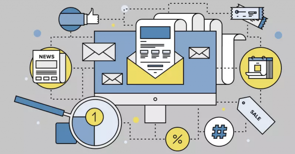
You can do all sorts of things with the checkbox hack. But not all of them are useful. For the unfamiliar, the checkbox hack is a clever CSS trick that makes it possible to build interactive emails.
All email content must be useful to the customer, and interactive content is no exception. So, forget about those gimmicky drop-down nav menus product carousels. Let’s aim instead for the kind of interactivity that enriches our emails.
1. Rotatable products
It’s common on a retail websites to be able to view products from multiple angles. But in email there’s usually only a single, static product shot. It doesn’t need to be that way.
By assigning animation triggers to left and right arrows on either side of an image, you can let the user rotate a product right there in the email. Drop in a few frames of animation for each of the quarterly rotations and you can achieve an effective illusion of movement.
For our demo, I grabbed a mug from the kitchen. But just imagine this technique used for cars or any other product where every angle matters.
2. Colour selector
On the subject of cars – they tend to come in a variety of colours. So too do clothes, phones, items of furniture, toasters… and so on. You can guess where this is going.
Place some colour swatches next to the product image and let the user browse all colours before committing to a website visit. This isn’t just a cosmetic effect. Whilst swapping out the image, you can also swap the link, thus directing the customer straight to their chosen colour variation on your web page.
3. Multiple choice quiz
But maybe your customer isn’t so sure about what they want. Why not guide them? A multiple-choice quiz is the perfect way to present the customer with a result based on their personal interests… and you don’t even need any prior data. In fact, you can even use it to start building up a customer profile by tracking the links. How good is that?
Our demo uses a topic close to my heart: dogs. There are 18 possible combinations of answers, each leading to a specific breed of dog. This technique could of course be used for any topic under the sun. Perfect holiday destination, perfect perfume, perfect anything-you-like.
4. Randomiser
Oh, about those holiday destinations – sometimes it’s fun just to spin the globe and discover somewhere completely new. Well, you can do that in email too. Engage your customer’s curiosity with randomisation.
Here’s how it works: you can secretly cycle a series of identical-looking buttons. The random factor is time – i.e. when the user clicks the button. Dress that up in some fancy animation and you’ve created an engaging piece of content based on the element of surprise.
We’ve chosen holiday destinations for our demo, but as always you could pick any topic you like. The possibilities are endless.
What else can you think of?
Done right, interactive content can really bring an email to life. With a bit of imagination, the medium of email can be transformed into something incredible. (Just don’t forget that fallback content for non-compatible email apps!)
Are those pesky email applications messing with your design? You didn’t want that address to be automatically linked to Maps, and you certainly never asked for telephone numbers to be underlined! It’s time to squash the bugs.
The battle begins
Overriding a piece of email software’s functionality often isn’t a simple task. The only tools at our disposal are HTML, CSS and a bit of imagination. Email development forums are awash with questions and suggestions on this topic, plus a graveyard of now-defunct solutions. There’s much trial & error, and the successful method usually amounts to some kind of hacky trick.
Here’s an example. Some versions of the Outlook mobile app will recognise and auto-link dates and times to the user’s calendar. This also turns the associated copy blue. One effective solution is to secretly break up the text with an invisible special character called a zero-width non-joiner. Congratulations – you have successfully tricked an application into losing functionality!
Don’t fight functionality
But why would anyone want to do that? The fact that there’s often no easy ‘fix’ for these ‘problems’ says a lot. The problem does not lie within the application’s functionality. It lies within the sender’s design and objectives.
Suppressing a piece of functionality is not in the spirit of accessibility. And to be frank, it’s not the sender’s decision to make. Nobody likes it when a website blocks or forces the opening of links in new tabs. A similar etiquette applies to the world of email.
Design around it
Addresses are another type of content that could be auto-linked and coloured blue. If they’re sitting on a coloured background, that could result in an ugly clash and illegible text. The solution: place them on a white background instead. Cosmetics do not trump usability.
Outlook has helpfully linked that address to the maps application. Should we break that… or change our background colour instead?
Reallocate the effort
I mentioned trial & error earlier. That means editing code, uploading it to an email platform, sending tests, and checking them on real devices and/or previewing services. All of this all takes time. But this is not a task that deserves it.
Imagine what could be created in that time rather than destroyed. Optimum email designs. Improved accessibility. Better content. Don’t squash the ‘bugs’ – give them a better habitat instead.
Google recently caused a ruckus in the world of email marketing. As part of an update to Gmail, support for background images was (accidentally) knocked out. Oops. The result was an industry of marketers in panic.
Email developers scrambled to find a fix. Workarounds were found, and Google ultimately resolved the fault at their end. Crisis over. This incident will soon be forgotten – which is a pity, as there lessons to be learned.
Things change
This isn’t the first time such an event has occurred. Changes to email platforms are fairly regular. Sometimes for the better, sometimes for the worse. I recall at least two times when a major email platform made a change that immediately broke responsive stacking content on mobile devices.
Or how about some ancient history? In 2007, Microsoft made the infamous decision to switch its ubiquitous Outlook application from a web browser-style rendering engine… to one based on Microsoft Word.
These sort of sudden, unexpected developments vary from subtle to industry-changing. But they have a couple of things in common:
They are beyond our control as email marketers.
The more complex the email, the greater the chance of it being affected.
Ours is a diverse but fragile digital environment
One customer is viewing your email in Apple Mail on an iPhone 14 Pro Max in dark mode. Another is looking at it in the Gmail web app in Firefox on Windows 10. Someone else is using a little-known third party Android app on a flip phone. The point – there are countless devices, platforms, versions and personal settings to cater for.
Now add Outlook and its archaic code support to the equation. With all this in mind, it’s clear why HTML emails can only work thanks to an array of coding tricks and extensive ongoing testing. The more complex the design, the more liable it is to break now or in the future.
Overloading the medium
Like all email developers, I’ve been faced with many moments of hair-pulling frustration. Inexplicable gaps in emails, font problems, wrestling with truncation… the list goes on and on. This raises a question – why are we going to all this trouble?
Thinking specifically about the Gmail background troubles, I cannot imagine any email content in which a background image is essential. Nice, sure. Fancy, sure. But essential, no. As a means of conveying useful information to a customer, a regular image and some text will do just fine.
All of this boils down to the fact that email is far more fragile than a website. And that is not a bad thing. The trouble only starts when we try to force email beyond its capabilities.
Simplicity is key
Most email development struggles are of our own creation. Why battle for hours to achieve a particular design when the easier option is to simplify? This isn’t admitting defeat. It’s making the smart choice to design for the medium, rather than trying to shoehorn a pseudo-website into an email.
Neither does it mean making an ugly email. Simple is not a synonym of dull. A simple email can include static images, and a static image can be as eye-catching and complex as you desire. The email that houses them doesn’t need to be convoluted, and will only benefit from simplification.
Complex email design is less accessible
The hidden beauty of accessibility is that it benefits everyone. The design and coding techniques that it involves will often directly improve your overall email, or serve as a reminder to clean it up.
Complex email design is the enemy of that. It increases the chance of colour clashes, screen reader navigation difficulties and inconsistent use of text and images to communicate information. Simplicity in design means that we don’t have to strive to find clunky solutions to these problems – we circumvent them entirely.
Email code is absurd
It’s easy to forget just how ridiculous email code is. HTML data tables are used for structure. Multiple nested elements are used to achieve something that could be done with a single HTML tag on a website. Spacer objects are often required to force items into place. An assortment of tricks and hacks loosely pins everything together.
And yet we repeatedly choose to attempt complex designs in this environment. Surely the logical choice would be to have less of this clunky code, not more?
Email designers are their own worst enemy (or at least the email developer’s)
Mobile phones have some fairly decent photo editing apps. But they’re no replacement for Photoshop on a desktop computer with a mouse or tablet. The mobile apps are suited to quick, simple edits only. Trying to do anything more in-depth is convoluted if not outright tortuous.
Designing emails that look like websites is like trying to perform complex photo editing on a mobile. It’s simply not the right tool for the job.
Breaking from convention takes courage
Almost every brand sends fancy HTML emails. Companies need to adhere to brand guidelines. No-one wants to challenge the status quo.
That could be good news for you. The one who breaks convention reaps the rewards while others struggle on. Be that one!
Just because you can do something doesn’t necessarily mean that you should! It’s an old adage and one many email marketers would do well to consider before embarking on their email marketing strategy.
If we start from what is possible the prospect of drawing up an email marketing strategy, budget, resource and timelines is daunting. I like to start from the other end, not what is possible but what does the business need. It sounds simple and the oft flippant response is more sales but that doesn’t always hold true. So start with a blank canvas and decide your business’s short, medium and long term goals. They may all turn out to be the same – sales, sales and more sales.
If that’s the case your email marketing strategy is a fairly simple one. Build product led emails and send them to everyone on your list as often as you can. Automate basket and browse abandonment, cross sell in sales notifications and dispatch notices. Sounds simple doesn’t it? But in truth this approach, even if your end goal is more sales, tends to be a short term solution. Data apathy, data churn, price marginalisation, stock management, all tend to make this approach, in isolation, one that’s unsustainable long term.
Email drives sales
So what to do, as in truth the ultimate goal of any marketing comes down to sales. We dress it up as brand awareness, customer retention, brand engagement, social media presence – but ultimately all marketing has one goal and that’s to drive long term revenues. So, if we accept that we need to plan our email marketing to fulfil long term revenue targets. This is done using a combination of sales and value-added content which engages the customer as well as sells to them. In essence you need to become the trusted source in the inbox. This has its challenges because marketers have an irrational fear of being seen as spammers. In his book, “Fear and Self-Loathing in Email Marketing”, Dela Quist says: “It is time, for legitimate email marketers – who bend over backwards not to be seen as spammers – to stop feeling so guilty about something they don’t even do”. It really is okay to send an email a day, or even two if you have something new and interesting to say.
In order to understand how best to use email we first need to look at how the long term goal is achieved.
List growth
New customer acquisition, grow the number of people you can realistically sell your products and services to. The more people on your list who look like the other people on your list the better.
List retention
This is like the silver bullet. Grow your list using customer acquisition tools and reduce the churn in your database. Increase the time someone stays a customer then the return on your initial CPA becomes exponential.
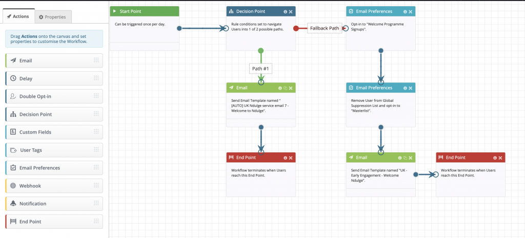
Automation
Automate touchpoints to deliver relevant and timely content. Keep your user engaged, recognise special life events and deliver new purchase user guides/vlogs/updates.
Example email automation workflow
Loyalty and incentive programs
Make your user feel special, make them part of your inner circle.
Targeted communications
Segmentation in the data based on generic product offerings. Utilising the one-to-one marketing tools available to you to customise your one-to-many emails.
One too many sales emails
Don’t be frightened of emailing everyone in your base every time you have something to say. The idea of one-to-one marketing is in truth not achievable because you’re just not sure what I want next. It’s okay to assume I want something I looked at, just don’t assume I don’t want something else as well or instead.
Next, we will look at how we utilise the strategies outlined above to maximise our customer relationship and ultimately drive higher, long term revenues.
Let’s take a look at how you go about implementing some of the ideas mentioned. It’s time to flesh out the opportunities afforded by the medium of email marketing.
List growth
How do you go about growing your list? You can do this in many different ways, each one having their own level of effectiveness. The standard tools available are:
Newsletter sign-ups:
Have a clear and obvious way of letting people sign up for emails, hiding your newsletter sign up at the bottom of the contact page is almost apologetic. You’ve paid for the eyeballs, now try and capture them. Place the sign up somewhere obvious. Also, look at using downstream popups to incentivise sign up.
White paper downloads:
Put your valuable content behind a simple sign up to access a download page. In old fashioned sales you’re always taught to get a name for a name. No difference here, you have valuable content, the price of which is an email address.
Competitions:
Run competitions on your site, and in your existing email encourage people to sign up to be entered. If possible, give away experiential prizes rather than material ones. People are much more likely to enter a money can’t buy competition.
Referrals:
Incentivise your base to refer people like them to sign up for the newsletter or sales emails. Remember, people know people like them, if they enjoy your emails so will some of their friends.
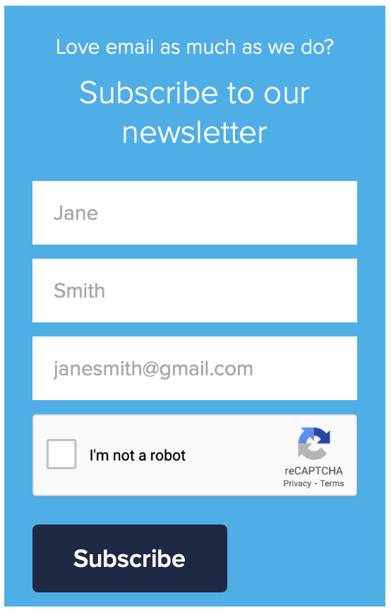
Example sign-up page
Point of purchase:
Be it on or offline, when someone makes a purchase it is the perfect time to ask permission to market to them via email. Make sure your staff do this routinely if on the phone or face to face in store. Make sure your site has a very obvious sign up tick box available when checking out. If at all possible also advertise text to email gateways in store and incentivise those.
Rented lists:
As long as you manage your expectations, renting lists can still be an effective way of building your database.
List retention
List retention for me is the silver bullet, if you can reduce your churn while at the same time growing your list you should be looking at exponential growth in revenues. Email on Acid believe in a “70/20/10” rule for brand emails. This means 70% of emails should be educational demos, tips, storytelling or advisory information. 20% should “centre on content from thought leaders, creating a feeling across your list that your brand is giving them exclusive access to content” and the remaining 10% should be product-focused. This rule is said to establish valuable relationships with your customers making them feel important, which they are! The more important they feel, the more engaged with the brand they will be.
Automation
Take some of the workload away and automate as many of your emails as possible. There are many tools available to help you collect site side data, send an API call to your email platform and subsequently trigger a timely email reminder. These types of communication tend to have the greatest open and click rates and the highest ROI.
The sort of things you can try are…
Welcome/acquisition:
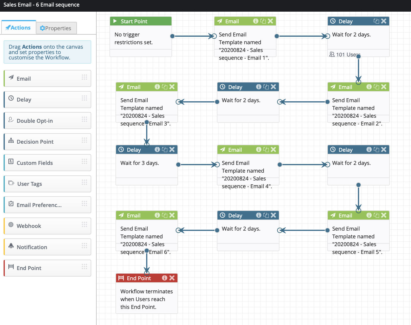
Welcome programs work best when they come as a series of emails which lead the recipient down various paths of action dependent on whether they open and click a particular email or take a specific site side action.
display block workflow
Basket abandonment:
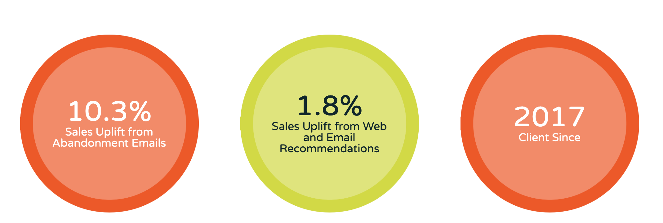
Someone has put a product in their basket on your site but not completed the purchase in a timely fashion. Post that data to your email automation tool, most of those on the market (ours included) can handle this easily. This data will then populate a predefined template and trigger an email to the recipient encouraging them to complete their purchase. Fresh Relevance in their Rip Curl case study show in excess of 10% of those customers receiving a basket abandonment email go back to purchase the item.
basket abandonment uplift from Fresh Relevance
Browse abandonment:
Almost identical to Basket Abandonment, Browse Abandonment happens when you implement business rules such as “identified email address has viewed a product 3+ times without going further, trigger this template with this personalisation in it”. These type of emails are seen to generate in excess of 3% increase in sales.
Event led:
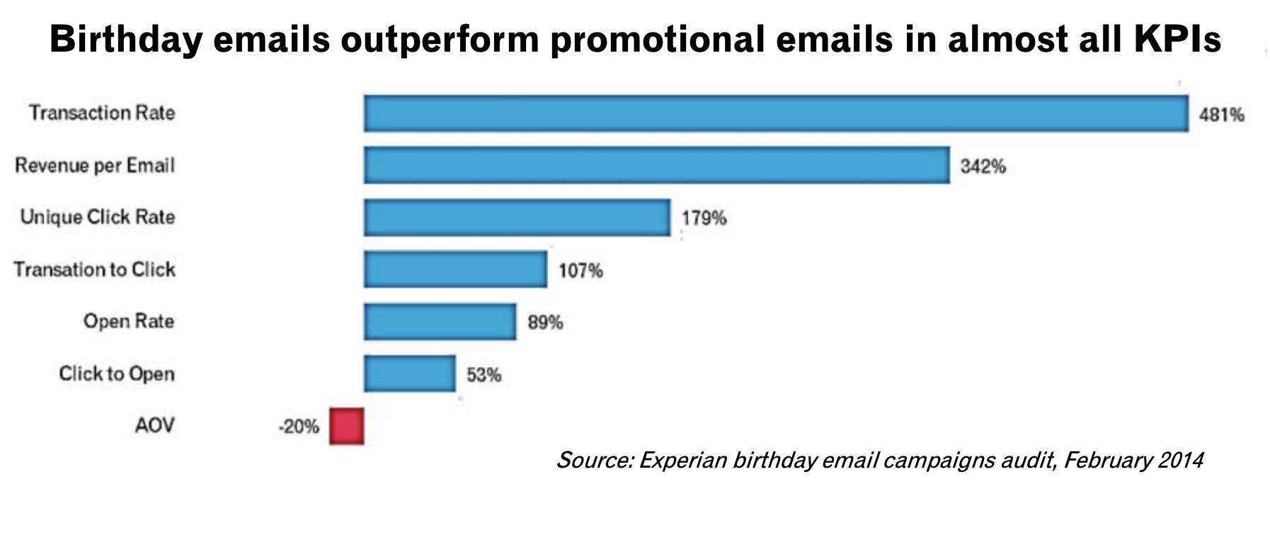
Birthdays, anniversaries, insurance renewals, these type of emails just sit there in the background and trigger daily depending on when someone matches the criteria. This is a simple but effective way of increasing your brand loyalty and triggering clicks back to your site. In their birthday email, Audit Experian said birthday emails out perform promotional emails in nearly all KPIs
Experian Birthday Emails Campaign Audit KPI’s
Cross Sell:
Not only should you cross sell in your order confirmation emails but also dispatch notifications, delivery confirmation and in truth, any other order point of contact. Forrester Research found a 10% increase in AOV on purchases where a recommendation was clicked on.
I am just scratching the surface of what’s possible with automation, essentially, if you can whiteboard the process we can implement an automation program that will sit in the background and increase your revenues from email.
Loyalty and Incentive programs:
This is just an extension of the Nectar, Clubcard, MyWaitrose (other loyalty cards are available) card you have in your wallet but in an online format. Richer Sounds do this very well at point of sign up. You’re encouraged to be a VIP and you’re told what you’ll get by becoming one. It helps with both list growth and list retention.
Targeted communications:
Your email platform will almost certainly have the functionality to segment based on any data held within your database. You can then send targeted communications to people based on the products they’ve previously bought, those they’ve browsed, those that compliment previously purchased products, the list is almost endless. You can do many different targeted emails or if you can code using the dynamic tags, or outsource that bit to an agency like us, you can build one email that dynamically inserts the relevant targeted element based on the data. It is also possible to use some of the personalisation tools out there to scrape in particular offers from your website in real time and drop them into the dynamic personalised section of the email.
The takeaway
The possibilities and the opportunities afforded to you by utilising the tools available and the skills of a professional email marketing company can have a material effect on your bottom line. It is no coincidence that the companies who have fared better in the current pandemic are the ones whose online presence and email marketing programs are constantly pushing the boundaries, whereas the ones that have struggled were slower to embrace the opportunities afforded them by the technologies available.
Artificial Intelligence (AI) has long been a topic of discussion, with most debates focussing on its potential to surpass human capabilities. However, it is crucial to shift the focus from comparing AI to human excellence towards understanding how AI can enhance individual skills and abilities. So I was pleased to read a recent interview with Neil Tennant of the Pet Shop Boys. He highlighted the value of AI as a tool to assist and improve creative processes – even for him!
Neil Tennant’s viewpoint aligns with the idea that AI can be a valuable resource even for established musicians and artists. He cites the example of a song, "Forest Floor," which the Pet Shop Boys never finished. Tennant suggests that if AI had been available at the time, he would have used it to generate multiple versions of the chorus, potentially uncovering an unexpected gem. This demonstrates how generative AI can act as a creative catalyst and assist artists/experts in overcoming writer’s block or exploring new avenues.
The real question: does AI make me better?
Often, discussions surrounding AI revolve around its ability to outperform humans in specific fields. However, the true value of AI lies in its capacity to amplify individual potential. When we reframe the question to focus on what AI can do for us, the possibilities become apparent. This mindset shift opens up new opportunities for marketers, designers, and generalists who may lack specialized expertise in certain areas. By leveraging AI, individuals and organizations can level up their skills and accomplish tasks that were once time‑consuming or costly to outsource.
AI as a levelling-up opportunity
The potential of AI to level up individuals in various fields is evident, especially for jobs requiring multiple skills – marketing being a prime example. If you are a marketer who also has responsibility for email, or an email marketer who lacks specialized expertise in an aspect of the role or have limited resources at your disposal, leveraging generative AI to enhance their skills, produce quality content, and maximize their productivity.
AI in copywriting
Copywriting plays a vital role in marketing, and AI‑powered generative models have proven to be valuable aids in this domain. While there are skilled copywriters who excel without AI, many marketers can benefit from using AI to generate and refine copy. By providing a straightforward brief to AI language models like ChatGPT, marketers can swiftly create subject lines, short‑form copy, bullet points, and newsletters, all while maintaining control over the desired tone. This collaborative approach allows individuals to become better email marketers and enhances their overall productivity.
SubjectLinePRO for instance, is a valuable tool I use that harnesses the power of ChatGPT to assist in writing and then testing compelling subject lines. Several other AI‑powered solutions are available in the market, offering similar benefits. These tools empower marketers with limited copywriting skills to craft engaging content more efficiently and effectively.
AI in image creation
The process of sourcing images for articles or marketing materials can be time‑consuming and expensive. AI‑powered image creation tools, such as Bing Image Creator, have revolutionized this aspect of content creation. Marketers can now generate their own images based on their envisioned concepts, saving time and eliminating the need to rely on external designers. Although having a skilled designer will still result in superior outcomes, AI empowers individuals – like me, who lack that luxury to produce higher‑quality visuals that effectively convey their ideas.
Images created by Dela Quist using Bing Image Creator
AI in email coding & deployment
While generative AI is a powerful ally, certain aspects of marketing particularly email, still require caution. Challenges related to email deliverability, rendering and accessibility across various email clients necessitate expertise or collaboration with coding specialists. Agencies like The Email Factory (who I recently joined as a NED) specialise in optimizing email design and build to ensure rendering consistency and compliance with industry standards. In terms of email deployment, segment creation etc. I am yet to see a tool that performs those functions.
By recognizing the areas where AI is yet to reach its full potential, marketers can make informed decisions about when to insist on expertise.
Conclusion
Generative AI’s role in the creative process is not to replace human expertise but to augment and empower individuals in their respective fields. By adopting a mindset that focuses on AI’s capacity to enhance personal abilities, rather than comparing it to the best human talents, we open ourselves up to a world of opportunities. Neil Tennant’s perspective, along with real‑life experiences, supports the argument that AI is a tool for levelling up and improving individual skills. Marketers in general, Email Marketers in particular, can benefit from AI‑powered solutions for copywriting and image creation, enabling them to excel in their roles without extensive specialization. Embracing AI as an enabler rather than a competitor will ultimately lead to personal growth and professional advancement in the evolving landscape of marketing.
This article and associated images were produced by me using #chatgpt ChatGPT and #Bing Image Creator.
Black text, white background. That’s been the go‑to colour scheme on websites and emails for a long time. After all, it emulates the printed typography of a book or newspaper.
But a digital display isn’t a piece of paper. That’s why some bright spark came up with the idea of dark mode – an inversion of the default colour schemes of old. And there’s a point to it beyond ‘because we can’. Light text on a dark background is easier on the eye, especially in a dimly‑lit environment. It’s also easier on battery life. Whereas ink comes with a material cost in physical media, light comes with an energy cost on a screen.
The use of dark mode is entirely optional. You can generally switch from light to dark whenever you like, or set your device to react automatically based on light conditions. Most modern operating systems, lots of applications and some websites cater for dark mode.
We’re not here to talk about any of those. Email is our thing. Let’s take a closer look at how dark mode affects email, how to design for it, and how to code for it.
Don’t be afraid of the dark
There’s an important point to set down from the outset: the objective is to optimise your emails for dark mode, not to override your reader’s settings.
That means we all need to be flexible with our brand guidelines. Whether your customer has a visual requirement for dark colours or simply prefers them, user prerogative trumps everything else.
If Google isn’t afraid to invert its brand colours, none of us should be!
Discover the dark mode landscape
Rendering quirks and the tricks to get around them are at the heart of email development. The handling of dark mode maintains these traditions.
Some email services allow full control – you get to set the dark mode colouring. Others ignore your styling and force a dark colour scheme of their own. Some offer partial control, and a few don’t support dark mode at all. The challenge is to design and code an email that looks good on all of them.
It’s important to note that those services which apply their own dark mode colours are not a lost cause. You can and should still optimise your design so that they look as good as possible. Familiarity and consistency ward off unsightly surprises and the wasted time of trial & error.
Don’t be vexed by text
Warning: please excuse the rant‑like nature of this paragraph. It’s frustratingly common in email to see images used to display copy. There has never been a convincing reason to do so. Images‑of‑text instead of actual text is often a way to foist a brand font or elaborate design on users. And one that comes at the expense of accessibility, usability and best practice.
Dark mode is one more reason to use text. Image‑based text can lead to a messy, partially inverted email in dark mode. Real text puts the email developer in the driving seat. Some email services support web fonts, so it’s still possible to show brand fonts to a reasonable percentage of your audience. Other accounts will fall back to standard fonts of your choice.
Let’s be (partially) transparent
Email supports a handful of image formats. JPEGs are common, and best‑suited to photographic content such as product shots. GIFs are also popular, and handy for simple images such as icons, or for short animations.
Somewhat less widely used are PNG images. Which is a pity, because their built‑in transparency support is a dark mode designer’s best friend. Let’s take a logo as an example. Save your logo as a JPEG and it could end up sitting in an unsightly white box against a dark background. Utilise the PNG format instead and it’ll automatically let the background colour shine through. If your logo itself is dark, it could be lost against a darkened background. A white outline or glow effect – invisible on light mode – can counteract that.
Here’s how a logo might look in various light and dark mode setups
It’s worth noting that GIFs also have a transparency capability… but it’s limited. It’s an all‑or‑nothing deal – a single colour can be set as fully transparent. While that can be useful in some situations, it doesn’t allow for the smoothly‑blended curves of a PNG.
Code for the mode
It’s time to get coding. First up, you need to explicity enable dark mode in email. That’s a two‑step process. Add the following HTML <meta> tags in the <head> of your document:
These colour modes can now be targeted via media queries. Not only does that mean you can set up specific custom colours for dark mode, you can even swap images.
There’s an important reminder in that prefers‑color‑scheme syntax! We should always bear in mind that light or dark mode is a user preference.
Give it a go
We could go on about the technicalities of dark mode all day. But let’s now put it to the test.
Below is a simulated email. It’s interactive – try the controls to see how it looks in various states of light and dark mode.
Note: this demo approximately simulates light and dark conditions in email. Specific email services and devices will have their own rendering quirks. This simulation is set to automatically disable the use of swapped images on forced dark mode, so some switches will be tripped automatically.
Simplicity keeps things… simple
The more complex the design, the more work will be involved in making it dark mode‑friendly. That raises a question: is that design essential, or can it be stripped back? I like to find the answer in a second question: does the design help to relay information to the customer, or is it a box‑ticking exercise for the marketing department?
In light of that way of thinking, the best solution is often to simplify the design rather than piling on more and more CSS code.
Final thoughts
Dark mode is a good thing. It’s a piece of functionality in the spirit of accessibility and respects the user’s autonomy.
As with all things development, you don’t need to work from scratch every time. An email template and snippet‑based coding style mean consistent results.
Despite that, surprisingly few companies are actively supporting dark mode in email or even the web. By designing for dark mode, you are helping to lead the way.
Perhaps it isn’t light work, but it’s definitely the right work.
Email is a fantastic graphical way of communicating with others. But so often in email design the primary function of an email is forgotten. It may be time for a fresh look at user experience in email.
Sure, some emails are just to pass on information, but nearly every single other email is about selling. It is currently impossible to complete a purchase with just an email but this is no bad thing, it streamlines the email’s function. The email exists solely to drive traffic to a web page.
The email exists solely to drive traffic to a web page.
Email is not website-lite
This key idea is so often lost in email design. Often it is closely tied to reproducing a similar or lesser version of a website instead. I think this is a terrible waste of space, and poor design that doesn’t challenge the ways email should look.
Instead of the ubiquitous ‘view in browser’ link, the logo, and a site navigation bar, why don’t designers just go straight into some products? The Subject line, Pre-subject line, From address and Friendly From address could all be used to establish the brand. The ‘view in browser’ link doesn’t have to be at the top. Lastly the navigation bar is just a poor version usually of what is on the site. Furthermore it nearly always links away from the main campaign … which is the primary purpose of the email!
Emails are ephemeral messages, they focus on what’s happening now. Including links in a navigation bar at the top of an email design just takes the user away from the sale that is happening now. This is a bad user experience. It’s equally bad for the sender because the click has been wasted. The purpose of the email was to get the user to go to the sale section and now they have clicked something else in the navigation bar.
Link with purpose
Emails also need to consider where they are driving traffic to. If it is easy for people to complete a purchase from nearly any page, that’s great. However if the email can misdirect users to contact pages or other areas of the site before the reader has even seen the primary content of the email, that’s not great. There would be an argument to say the content is incorrectly ordered.
Large full-width images are also a component that can affect the overall user experience of an email. First, it must be said stated that they are necessary and often provide some much needed beauty and spectacle to a design. However, they can be tiresome to scroll through and take up a lot of space for a single link. Consider their use carefully.
Text links form the backbone of the internet and were the first types of link on the internet. In email design, however, designers don’t always stick to the rules and sometimes only use bold links or just colour them differently. Always apply underlines to text links. Format them with sufficient font size and line height so that they can be clicked easily. Unfortunately, it is not uncommon to find many text links all squished into a paragraph of small text. This makes it very hard on some smaller screens to click the link you intended.
The primary message must be the focus in order to provide a good user experience in email design. Links that might scatter users all over the website should be kept to a minimum and collected at the bottom of the email. Analysis of email heat-maps always show the vast majority of clicks happen toward the top of an email. They gradually decrease as you move further down the email. With this in mind, email designers should focus on making the primary message content of the email as close to the top as possible. Migrate all other types of content towards the bottom.
The courage to break convention
This could mean a layout that reverses the content order completely would be a better email design. Start with the products you want to focus on, then any other content and finally add the branding and any footer content necessary. This would be designing in a manner that takes into account where the most clicks happen and relying on people to know who sent them the email. This is a step designers have so far been too scared to take.
To this date I have not encountered a brand that has been brave enough with their email design to use such a forward thinking approach. There are some examples, though, where brands do drop superfluous components such as navigation bars, however I have never seen one brand completely flip the email design.
Design for clarity, not confusion
Individual components in email design often provide terrible user experience. For example, an email might be trying to sell a high cost item. Instead of solely linking to that product, the email links to all sorts of other things relating to that product. For example, the product might be a new car. Rather than taking the clicker to the new car page it links to the car accessories page. It can be argued that at least the user is on the website, but the point of the email was to sell the car. The goal wasn’t to sell windscreen wipers for their existing car. Polluting the layout with complementary links to add-ons or related products only decreases the traffic to the main intended link.
To have the best user experience in email design, the email’s components need to be concise and link to a single location. Prioritise content order and remove superfluous components. Subject lines and From addresses should factor into the email design. Place recurring content at the bottom of the email.
Does MPP solve a problem that didn’t exist… or worse?
Apple’s Mail Privacy Protection (MPP) sounds like a good thing, yes? I mean who wouldn’t want to protect their email privacy? Over 89% of Apple iPhone users are on iOS 15 or above and according to Campaign Monitor over 97% have adopted MPP. You’d have to be mad not to want Apple to help you with that!
MPP represents a juxtoposition of ideas
Well this email marketer might just be howling at the moon because as I see it Apple hasn’t really fixed anything. Nothing was broken. All that was happening was machines were keeping track of which emails you opened so that marketers could use that data at a macro level to offer you more and better stuff or new and better deals. They could determine which email addresses were disengaged. That information could then be used to either stop marketing to you (probably a good thing if you are no longer interested) or they could incentivise you to re-engage with them. That means bigger and better offers. Surely you’d be mad not to want that? Now those two views are juxtaposed.
They’re behind you
Masking your IP address means the marketer doesn’t know where you are. Now, this is a good thing only if you owe them money and or are stepping out on your partner who happens to also be an email marketer. Otherwise all masking your IP address does is stop the marketer sending you deals for a coffee at your local Starbucks, other coffee establishments are available.
There’s gold in them there emails!
Email marketers have a choice – ignore the open mail stats as the soft metric they are or ignore MPP. Guess what? The key goals haven’t changed. At its most basic, email has one job – to drive traffic and ultimately revenue. Email marketers are still tasked with the basic KPI’s they had before MPP. So which of the two options do you think they took?
If it helps, email is a cheap commodity with a ridiculous ROI. So, tasked with the same targets, they have ignored MPP and now if you opened your email or if Apple did it for you, they’re sending you the follow up. I’m guilty of it myself. Our automated campaigns go on a time-sensitive basis starting from the opening of an email, whether MPP did it or the user did it. The result is more users are getting more email, not less. And that email is less targeted because it often relates to an email you didn’t open yourself. The marketer doesn’t know that. Rather than risk losing those that did open the email, and that will be on average maybe 20-30% of the MPP users, they’ll email them all.
The right to forget who you are
Guess what some of the more responsible marketers do? They follow best practice in order to keep their data set clean. That means removing people who haven’t opened an email in a fixed time period. That might be 3 months, 6 months, or perhaps a year. No one who has adopted MPP has been removed by these people in the last year. That’s not because they don’t want to. But how can they tell who actually is engaged and who isn’t?
Summation
So I’ll continue to howl at the moon and thank Apple for thinking this through and solving a problem… that didn’t exist. Be careful what you wish for, people!