Technology

Breaking the tabit: the fight against tab-hoarding

An obscure piece of JavaScript code. A how‑to guide on making money through affiliate marketing in 2022. A hard‑to‑find film that I might watch, one day. A now‑outdated comparison of the best web hosting services. An instruction manual for the combi‑boiler. These are just a few examples of the assorted junk that could be found clogging up my web browser.

That’s because I was a chronic tab hoarder. You might be one too.

What is tab-hoarding?

Tabs are a standard piece of functionality in many modern computer applications, and particularly in web browsers. They’re a good thing. Maybe you’re about to buy something and want to compare several retailers for the best price. Perhaps you’re cross‑referencing multiple sources for an essay. Or you might be following a web development tutorial, with instructions open in one tab and your project in another.

But there’s a dark side: excessive, long‑term collection of tabs. Or tab-hoarding as it’s commonly known. A tab‑hoarder doesn’t just flit between a couple of tabs concerning their current task, but instead stockpiles hundreds of tabs for future reference. These are things that they might return to. But, you know, probably won’t.

Example of tab-hoarding
Does your browser look something like this?

Why is it bad?

At its peak, my tab empire spanned multiple applications across multiple devices. It was bolstered by clusters of operating system folders, and a daily barrage of personal reminders.

Together, these items form a vast but fragmented to‑do list. An overwhelming one that will never be cleared. That’s a stressful thing.

And you know what else is stressful? The fear that at any time, human error or technical mishap will wipe out a portion of this eternal backlog. And it does happen. This misuse of tabs creates a fragile house of cards. Upon its collapse ensues a frantic effort to regather what was lost.

There’s another problem: technological dependence. Not every tab is necessarily something that a person plans on actively doing, but perhaps a piece of information deemed potentially useful for the future. Tab‑hoarding trains the brain to lean on a digital crutch. Computer on, brain off.

It’s time to settle the tab

I conquered my tab-hoarding, but only after an essential first step: awareness. Throughout years of this behaviour, the only resistance was subsconscious. A nagging but easily‑ignored whisper. Consciously‑speaking, I wasn’t particularly aware that what I was doing was harmful. The amassing of tabs, although frequently a hassle, was simply standard procedure.

The catalyst came when setting up Firefox on a new computer. Immediately upon installation I rushed to find the option to retain open tabs rather than forget them. The fact that is was not the default setting made me pause for a moment. Why is it not? Am I doing this wrong?

That behavioural evaluation led to a conclusion: tab-hoarding is bad. I realised that I would never need to come back to 99% of the screen‑cluttering tabs in my collection. And the few that I did would be important enough to remember. At that point it became surprisingly easy to close all tabs and similar items on my other devices, and avoid starting a fresh batch on the new PC. The feeling of relief was palpable.

Of course, the tab-saving urge revisits from time to time. That means a risk of relapse. But it’s a small one. The hard part is already done. The impulse to save a tab soon evaporates when the question is asked: will this act improve my life, or make it worse?

What do the experts say?

In short: lots of things. Tab-hoarding has been associated with anxiety and procrastination. It’s often attributed to a concept familiar to marketers: FOMO – the fear of missing out.

Tab-hoarding is part of a much larger topic: the impact of computers and the internet on the malleable human mind. Dr Larry Rosen explores this subject in detail in his book, iDisorder. Our always‑online world has transformed the way we communicate and acquire information, but does it also foster addiction and compulsivity?

The rapidly‑developing digital age represents just a tiny speck so far in human history. Only time will tell what it truly means for human development.

Email Design

It’s just a [colour] theory

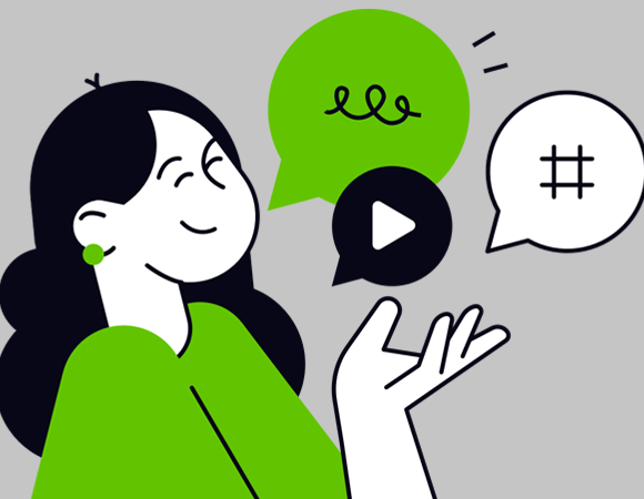
Do you work in marketing? Then there’s a good chance you’ll have seen a colour theory chart like this one:

Colour theory chart

There are a few variations kicking about, and they can often be found doing the rounds on LinkedIn. These charts all follow much the same pattern: emotions are grouped by colours, and an assortment of brand logos are cherry-picked as examples.

The trouble is that it doesn’t take much scrutiny to spot weaknesses in the logic or think of contradictions. Ferrari with its yellow logo is in the optimism and warmth group, but I doubt anyone would argue against exciting and bold as better descriptors. Even their cars are rosso corsa. Or what about BBC News? It does have a red logo, and yet would seem more at home in the blue sector of emotions.

So, it’s easy to poke holes in this. Does that mean that colour theory (in marketing) is all wrong?

The age of oversimplification

The answer is no. It’s not all wrong. Things are rarely so black and white.

But we’ve inadvertently highlighted the problem. Social media is the land of brevity and bite-sized absolutes. Content candy is addictive, and reality is inconveniently complex. On an algorithm-driven platform like LinkedIn, engagement is valued above education.

Armchair psychology

On the topic of education: professional psychology is a field that demands years of study. I can’t claim to know the precise stats, but I’m willing to bet that ninety-nine point something percent of marketers are not qualified psychologists. Marketing techniques like split testing can certainly yield insight into customer behaviour but I would hesitate before labeling Monday’s A/B test as a psychological study.

Colour psychology is a subject that can fill a 764-page, professor-authored book. Is it possible to condense such an expansive topic into a meme-sized infographic?

Hue are you?

Let’s go back to a design and marketing perspective on this. Colour is certainly an intrinsic element of branding. It’s often a simple way to differentiate competing brands within a particular sector at a glance.

Back in the day, the big three UK mobile networks were Orange, O2 and Vodafone. The orange one, the blue one and the red one. I can’t say I ever thought of them as the friendly one, the dependable one and the passionate one.

The scope of these colours extends beyond the logos. Their websites and marketing in general predominately feature each colour. It’s colour-coded brand recognition.

A visual key change

Brands can capitalise on this colour familiarity. If there’s an important announcement to be made – perhaps a product launch or an off-topic statement – a one-off change of palette can be an effective attention-grabber.

Context is everything

Colour associations vary depending on context. A blue sky is positive, but feeling blue is not. Green can signify safety, but you wouldn’t want to be green around the gills.

Likewise, the colour of a brand’s logo or a piece of advertising is just one factor in the overall mood. An important one, of course, but one that contributes alongside typography and shape and imagery and tone of voice.

True colours

There is certainly an element of truth to these simple colour charts, but design is a broad, complex topic. It deserves better insight than like-farming posts for social media. The real world is far more colourful.

Email Marketing

Copycatwriting: 5 marketing cliches to put in the bin

Words are powerful. They help to define your brand’s personality. In email marketing, the right phrasing can make the difference between open and ignore.

But sometimes copywriting is more copy and less writing. How many times have you seen the following phrases recently?

Just for you

A spectacular summer sale – just for me, and me alone? Well, don’t I feel special! Call me a skeptic, but I suspect it’s actually for me and your 799,999 other subscribers.

Just/only for you crops up pretty regularly in email marketing. Nine times out of ten, it’s used in a context where it is both meaningless and absurd. Dishonest too, but that particularly unfortunate quality is usually drowned out by the silliness. Most times when I see this phrase, I’m not even sure what exactly the brand is pretending to be true.

‘You’ may be the magic word of advertising, but a misplaced ‘just for you’ is more hooey than Houdini.

[Verb] your [adjective]

Find your incredible! Discover your awesome!

Cease your unimaginative, more like. It’s ok to creatively bend the rules of English. Copywriting wouldn’t be much fun if we always had to stick steadfast to a strict set of rules. But when the linguistic rule‑bending is an act of copycatting rather than innovation, then it starts to look less like cool copywriting and more like grammatical incompetence. Write your something new.

Don’t miss out

Yes, I know: FOMO. Truth be told, I have never been comfortable with this concept. It’s ethically questionable, and I suspect that the modern shopper is more aware than ever of the sales tricks up a brand’s sleeve. This is particularly true when a sender hits their audience with the same panicky phrases time and time again. Overuse diminishes effectiveness.

That’s my personal position on the matter but the stats tell a different story, for now. The numbers tell us that FOMO works. CXL‘s research reveals that a countdown timer, for example, can push up conversions by more than 300%. Urgency sure brings in the money.

But ‘don’t miss out’ is bottom‑of‑the‑barrel FOMO. It’s generic and ignorable. Motivators such as offer end dates and limited stock give people a real reason to act. ‘Don’t miss out’ is copywriting fluff.

Click here (to)

The computer mouse was invented in the 60s, came into popular use in the 80s and became a household essential in the 90s. People have been clicking things for a while.

In well‑designed email (or even an adequately designed one), the clickable elements are self‑evident. Plastering CLICK HERE on a button tells the user precisely nothing. It’s a lever labelled pull me. Thanks, I know how to use it, but I’d love to know what it does before committing to the act.

Click here also pops up regularly in passages of text. Click here to see the full terms and conditions, click here to download the PDF. In this context, the phrase is merely redundant but in such a way that it gives a mailing an unfortunate ‘My First Marketing Email’ quality.

Image of QWERTY keyboard with 'Press me to type' added above every letter key.

Maximise / power up / supercharge…

Wow, this company doesn’t just promise to increase our sales. They’re going to ultrarocketblast them. Let’s give them our money, right now!

Over-the-top choices – or inventions – of verbs are an extreme side effect of the sell the benefits principle. But there are a couple of problems with this phrasing: it’s been done to death, and it was never that great in the first place. Human beings simply do not talk like that.

Keep the actions grounded in authenticity, incorporate some demonstrable stats, and let the numbers speak for themselves.

What’s good copywriting?

This article probably reads as a list of my least favourite pieces of copywriting. And that’s because it is. Copywriting is a creative endeavour and that always brings subjectivity into play.

For me, the best email copywriting is a blend of directness and true inventiveness. I see few brands pulling it off. But those that do, send the emails I look forward to opening. Maybe yours is one of them.

Business

Communication: take a long, hard look at this soft skill

Time is money, right? And it’s so much quicker to write “the email” than it is “2024‑06‑13 – US – Loyalty members – jackets mailer”.

But is everyone who reads the message guaranteed to know, specifically, which email is being referred to? Probably not.

Specificity is an investment

It’s easy to be lazy when typing. Decades of text‑messaging and social media have encouraged brevity. Often we’ll skip words entirely and opt instead for digital hieroglyphics like 💯 or 🙌.

In the workplace, however, lazy communication is a problem. Misinterpretations and misunderstandings lead to errors. Errors cost time and money.

Initial detail is the pre‑emptive remedy. It may take a little longer to write crystal‑clear instructions, but the time saved in the long run is an invaluable payoff.

As a bonus, your correspondence history becomes more searchable. That’s handy when the need arises to trawl through old messages.

Get to the point

An excessively polite, near‑submissive tone plagues a lot of communication in the modern workplace. Euphemisms and other softeners tend to obfuscate the true meaning. Vague communication is bad communication.

Don’t ask: “I just want to check the ETA on the display ad design?”. Say: “we need the display ad by 3pm, please”. Succinctness is a world away from rudeness. If anything, padding and softening inadvertently demonstrates less respect, not more. Sensibilities are rarely so delicate.

Stick to the subject

Conversation about Thing A should remain in the thread about Thing A. If someone starts talking about Thing B in there, the convo is muddied.

This ties in with the concept of specificity. If you send an email message on the topic of “tomorrow’s promotion”, that will very quickly become today’s promotion, and then yesterday’s promotion. Good luck finding that message again in the future.

New is the new old

Good communication doesn’t only pertain to messages sent between colleagues. Naming conventions and folder structures can also benefit greatly from clarity and consistency. I can’t tell you how many times I’ve picked up an existing project, only to find an incomprehensible dumping ground of files.

Messy boxes and documents

Relative terms, most notably new, are to be avoided. New is only new until the next version comes along, at which point the label becomes a misnomer. Better to go with version numbers than new, really new, and really really new.

Tools of the trade

Email isn’t the only kid on the block. Communication and organisational tools like Microsoft Teams, Slack, Alfred and Monday.com are popular. Their functionality varies, but they all have one thing in common: they can make your life easier.

Some communication‑enhancing features include:

  • Projects: Keep discussions automatically on‑topic and save yourself the bother of referring to project names over and over again.
  • Pinned messages: Need to make everyone aware of some important changes? Stick a note to the appropriate channel.
  • Reminders: Want to ask Dave something when he comes back from holiday? Set yourself, or him, a reminder.
  • Message templates: If you repeatedly send similar messages, a customisable message template is just the thing.

Good brief!

Project briefs (and lists of changes) deserve attention to detail. The more information provided up‑front, the fewer questions asked later. Oh, and watch out for instruction intertwined with content. That’s a messy crossover that happens surprisingly often.

Write it down

I’m a huge fan of documentation. We’ve all seen people leave companies and take important knowledge with them. None of the remaining employees are familiar with a particular project, and nothing was ever put down in black and white. Cue a mad scramble to piece together clues and figure it out.

Communication processes can and should also be documented. By giving your teams a communication framework to operate from, everything is consistent, and the machine runs smoothly.

Corporate jargon vs plain English

We’re all familiar with the comically stilted and metaphor‑laden nature of ‘business speak’. Many of us consider it a pet peeve, and yet it continues to flourish in the workplace. Many perfectly good plain English phrases have been permanently replaced by strangely artificial and sometimes grammatically‑incorrect alternatives.

While it’s true that specialist fields develop unique lexicons, corporate speak isn’t really that. And it comes with problems. Often the wording is fancier but less specific than the plain English equivalent. I’ve seen it cause non‑native speakers to question the rules of English that they had so carefully learned.

The history and psychology of corporate jargon is a topic worth reading about. It’s not likely to go away any time soon and there’s a fair amount of pressure to talk the talk. But those who have the courage to break free may be rewarded with a smoother, more authentic, more understandable communciation experience.

A little too creative?

Creative is an adjective. Or at least it used to be. In a modern business context, it has been repurposed as a noun.

What does it mean? Well, that depends. Not only is the nounified creative used to refer to a piece of design work, but also to the designer who produced it. Assuming that the word also retains its original adjective functionality, you might just see a creative creative creating a creative creative.

It’s unfair to point the finger exclusively at the corporate world for this practice. Nouning is not a recent phenomenon, and neither is its cousin, verbing. Language changes naturally over time.

Change, however, does not necessarily mean improvement. The dictionary‑approved usage of literally to mean figuratively, for example, is quite blatantly a barrier to understanding. When the definition of a word is so blurry that its meaning can only be discerned through context and tone, that is surely a problem. Let’s not foster confusion.

Linguistic elasticity is wonderful for creative writing and liberating in informal everyday speech. But in a task-driven business environment, does it leave too much to interpretation?

It’s good to share bad news

Mistakes happen. We all make them. But we don’t always admit to them.
When things go pear‑shaped, and you just so happen to be to blame, it’s decision time: own up or attempt to bury it. The trouble with the latter is that most times, everyone else can quickly figure out what happened. That leads to tension and distrust. A mistake is an accident, but dishonesty is a choice. On the rare occasion when the truth is not so apparent, time is wasted investigating what went wrong.

An employee’s willingness to own up isn’t solely determined by their personality, but by the workplace environment. The focus should be on resolution and development, not punishment. A culture of openness and honesty takes the pressure off staff and reduces the chance of stress-based mishaps in the first place.

End transmission

Communication is considered a soft skill, but that term downplays its importance. Poor communication isn’t simply a nuisance. It’s a significant drain on a company’s resources, and a major source of stress for employees.

Every business, big and small, can benefit from a communication review. Unclog your company’s information arteries, and the rewards could be substantial.

Artificial intelligence

The magic of Photoshop’s generative fill

Someone famous once wrote: any sufficiently advanced technology is indistinguishable from magic. And while I’m fairly certain that Adobe Photoshop isn’t secretly powered by wizards, its generative fill function really makes me start to question that.

Before we look at the wonders of which it is capable, let’s imagine a graphical challenge that we might face in day‑to‑day work.

Grass production

Here’s a picture of a dog:

Stock photograph of a dog lying on grass

It came from Unsplash, but let’s say it actually came from a client. And it needs to fit a square‑shaped slot in a template, but they absolutely do not want to crop it. They need the full dog. Therefore we need to extend the grass at the sides.

Once upon a time, this would have meant using Photoshop’s clone stamp tool. That lets you manually ‘grab’ regions of an image, to paint in elsewhere. With some smoothing and layering – not to mention a considerable amount of patience – the results can be quite convincing. But who has time for that when deadlines are looming?

It’s not necessary in this example, but sometimes this process would entail the tricky masking of objects. Hair in particular could be a nightmare. You might even want to grab portions of other images, like a kind of pictorial Frankenstein’s monster.

For old time’s sake, let’s complete our challenge using only the clone stamp. Here’s my somewhat rushed effort:

Stock photograph of a dog lying on grass. Photoshop's clone brush has been used to manually extend the grassy background

There is obvious blurring. It’s almost like an impression of grass rather than actual grass. A patient Photoshopper could painstakingly labour over such a task until it looks natural, but that isn’t practical in the real world of business.

We need a faster option.

Had your (content-aware) fill

In the early 2010s, Adobe introduced content‑aware fill. I always found this an oddly unassuming (if accurate) name for such a powerful tool. After all, this is a piece of software that sports a magic wand. Anyway, I digress.

Content-aware fill is an ‘intelligent’ tool that can remove items or extend images in a mostly‑automated fashion. You just need to make the selection, and optionally adjust the sampling data area. Sometimes it may take a couple of sweeps or some manual finishing touches, but essentially content‑aware fill does the work of a clone stamp without human intervention. And in a literal fraction of the time.

Here’s what it did with our dog photo:

Stock photograph of a dog lying on grass. Photoshop's content-aware fill has been used to manually extend the grassy background

That’s not bad. Gone is the unsightly blurring from my clone stamp version. But in its place is some fairly noticeable duplication. There are clusters of identical patterns here and there.

I’m looking for defects of course. A customer browsing a website or glancing over a marketing email is going to focus on the cute dog rather than scrutinise every blade of grass.

Even so, wouldn’t it be nice if this was perfect?

The big one: generative fill

Now for something state‑of‑the‑art. Generative fill is a recent addition to Photoshop’s toolkit and is powered by AI. Let’s try it on our photo:

Stock photograph of a dog lying on grass. Photoshop's generative fill has been used to manually extend the grassy background

No blurring. No duplication. Blades of grass and leaves have been completed in a realistic manner. You’d be hard pressed to spot anything artificial in that expanded area.

But we’re only scratching the surface of what this tool can do. While it’s possible to make a selection and click the button and trust the tool to know what to do, you can also guide it with written prompts. Should that dog really be out there without a collar? Let’s fix that.

Step one is to use the lasso tool to very roughly draw a selection around the dog’s neck. Next, we can enter a simple prompt: dog’s collar, red.

Stock photograph of a dog lying on grass. Photoshop's generative fill has been used to manually extend the grassy background, and add a red collar on the dog

And what spaniel is complete without a ball to chase? We can provide that too:

Stock photograph of a dog lying on grass. Photoshop's generative fill has been used to manually extend the grassy background, add a red collar on the dog, and place a tennis ball next to the animal

Pushing it further

Ok, so we expanded a little bit of grass and dropped in a couple of simple objects. In this day and age of generative AI, you might say: big deal. Let’s demonstrate what this tool can really do.

Here’s another image from Unsplash:

Cropped stock photo of two businesswomen at a desk

It’s a stretch, but what if we just loved that particular depiction of corporate life and wanted to develop the image beyond that stylised crop? Well, all we need to do is bump up the height and hit the generative fill button once more:

Cropped stock photo of two businesswomen at a desk, expanded with Photoshop's generative fill to show their faces

Actual people, believably sewn on to the original image. By default, Photoshop returns three variations. They’re not always so perfect, but that’s ok – pick the one you like, or spin again. Make no mistake, this is an impressive piece of technology.

Starting from nothing

Generative fill is very closely tied to Photoshop’s generate image functionality. You don’t need a base image. You can start from scratch.

So, technically speaking, I didn’t actually have to go stock photo‑hunting in the first place. I could simply ask Photoshop for:

Photoshop's generative image panel, being prompted to create: 'Overhead photograph of a cute, tan-coloured spaniel lying on its back on the grass. The dog is wearing a red collar. A yellow tennis ball is lying on the grass nearby.'

I flicked through six variations and decided on this one:

Photoshop-generated image of a tan-coloured spaniel lying on its back on grass, next to a tennis ball

Curiously, fake turf was present in all six images. That’s an eerie preference for the artificial!

What’s next?

AI will only become further engrained in Photoshop, and software in general. Perhaps more and more tasks will be accomplished via a prompt interface rather than a traditional tool panel.

It may not be sorcery, but the distinction might not be that important when you can perform half a day’s work in seconds.

Artificial intelligence

What does AI mean for human creativity?

Great art is special. Despite the gratuitous overuse of superlatives on the internet, very few works can truly be described as awesome. A masterpiece is a rare thing, as it should be.

In order to produce a work that merits such a lofty accolade, the artist must possess a world‑class level of skill and talent. Nobody can compose a symphony for the ages or brush a Louvre‑worthy painting without first dedicating thousands of hours to mastering their craft. In short, it is hard work.

But what if it wasn’t?

The age of generative AI

When I first heard about Midjourney, I was intrigued. A platform in which you could type anything that pops into your imagination, and it will conjure up an image? It sounded too good to be true.

And in a way it was. After the initial novelty wore off, the glitch‑riddled results became tiresome. With the site’s communal nature, it quickly became apparent that the vast majority of requested images were inane dross. Keanu Reeves eating a bowl of baked beans? Hold my sides!

Things have moved on since then. Midjourney is much improved. In addition to drawing pictures, there are generative AI applications that can answer questions, offer advice, assess your writing, tell stories, generate code, create a logo, compose music, and produce full‑motion video. The creative results are usually blatantly unconvincing and have a telltale artificiality, at least without some post‑processing. Nonetheless, we’re talking about a technology in its early stages and one that is developing rapidly.

AI-generated illustration of a robot painting a picture

Technology’s role in art

Generative AI is far from the first catalyst for a technology‑versus‑talent debate. The camera was considered a threat to painters. Why go to all the messy palaver of a canvas and paints when you can simply press a button and capture a scene in an instant? Electronic music was – and sometimes still is – criticised as a rigid and soulless form of aural creativity.

But for every detractor, there is an advocate. There’s a convincing case to be made for the use of the tool being what matters, rather than the existence of the tool itself. Few would deny that Ansel Adams is a masterful photographer, or that Vangelis is a talented musician who had the vision to explore modern technology.

There’s another important point: despite initial fears, these new technologies did not replace their more traditional cousins. It seems silly now to imagine that synthesisers might have made acoustic instruments obsolete. There’s plenty of room in the creative world for painting and photography, both analogue and digital.

Art versus design

Art is subjective, and not only in terms of personal tastes. The very nature of art is a matter for eternal debate. Arguably the most important single value of art is expression. Expression of thoughts, and ideas, and emotions. These are innately human qualities that a computer cannot replicate. Not yet at least.

Design, on the other hand, represents a more functional dimension of creativity. There’s usually a defined objective, in contrast to the nebulous experience of art. While there is often an overlap between the disciplines, design is more clinical, and art is more interpretive.

Tearing down barriers

The challenge with any creative endeavour is taking the vision in your head and making it a reality. Skill therefore is a barrier. By virtue of being difficult to produce, a work of creativity is worthy of our attention.

But not everyone has the time, natural aptitude or even physical ability to become a great painter or musician or moviemaker. I doubt many people would consciously want to block someone’s desire to create. Therefore a more accessible point of entry is surely a good thing. Generative AI offers a means of creation from pure imagination, without a long and arduous path of learning.

Imperfectly perfect

Many years ago, I had an impromptu conversation with a stranger in a bar about AI‑generated movies. It was largely what if. At that point in time, I didn’t really expect to see such a thing become a reality in my lifetime.

One of the talking points was the concept of tailoring an existing film to personal preferences. I’m sure we’ve all watched films that were so close to greatness, were it not for a few niggling flaws. Well, what if a computer could refine it? Out with the immersion‑breakingly overblown finale, in with the ending of your dreams. It’s perfect now, right?

But is computer‑generated perfection really a desirable goal in art? Flaws are part of the human condition. Art is a thing to be discussed, warts and all. If everything is ‘perfect’, nothing is special.

A creative tipping point

We’ve established that technology in itself doesn’t negate artistry. A paintbrush or a violin is a piece of technology. Even the scratching of a mammoth into a cave wall requires a tool. So, unless we consider anything beyond melodic human wailing to be cheating, technology is a part of art.

Generative AI can often serve as a creative aid. Output can be influenced, refined and repurposed. That demands human creativity. And if there’s a human at the helm, then the finished work will still carry some kind of meaning. Something is being expressed.

But what happens when the tool becomes so sophisticated that the need for human input is thoroughly diluted? Right now we can tell a computer what we want it to generate. Maybe next we will only need to think it. Perhaps the technology will advance to the point that we can skip even that mental exertion, and instead wait to be served creations that the computer already knows to be to our liking. At some point, the balance swings towards computer-generated rather than computer-aided. Perhaps we are already past that point.

The WALL‑E warning

From Metropolis to The Terminator to Black Mirror, our storytelling has often incorporated themes about the dangers of technology. But the one that stands out to me as the most prescient is Pixar’s WALL‑E. For those that haven’t seen it, it depicts a future in which humans live a coddled but empty life. Machines cater for mankind’s every need, creating an existence of pure consumption while human connection and knowledge are lost.

Back to the real world. Current AI technology is primitive compared to the examples we’ve seen in fiction. Artificial general intelligence (AGI) has yet to be achieved, and perhaps never will. Nonetheless, it’s not unfeasible to imagine AI advancing to the point where our technological dependence becomes a serious concern. Creativity is just one aspect of our lives that is already influenced by AI. And while it’s correct to say that it is human ingenuity that brought us to this point in the first place, that is too indirect a factor when considering the potential long term effects.

The best of both worlds

AI isn’t going away. Humans by nature push forward and strive for more. Onwards and upwards!

But it’s always nice to ‘get away from it’. Modern life takes place in the digital world to an unhealthy degree. Maybe it’s time to turn off the computer, dust off the old drawing pencils set, and create something a little more pure.

Email Marketing

10 typographical effects to prettify your emails


10 typographical effects to prettify your emails

Text needn’t be plain. Modern CSS can apply all manner of visual effects to text. That makes it possible to create some eye‑catching typography without resorting to using images.

Well, all of that is true in web design. Email on the other hand has inconsistent support for CSS from one application to another. But don’t worry – that’s nothing a bit of graceful degradation can’t handle.

1. Letter spacing

CSS property: letter-spacing

Kerning is typographical lingo for the gap between letters. Increasing the kerning is a neat way to bump up the visual impact of a text banner or heading.

Before:

After:

And the good news? It works everywhere.

2. Drop shadow

CSS property: text-shadow

A drop shadow can add a subtle illusion of depth. Unlike letter spacing, this CSS property isn’t so widely supported in email. But it works in Apple Mail on iPhones and Macs, and that alone makes it worthwhile. With no particular fallback considerations, text shadow is a perfectly viable design option.

3. Outline

CSS property: text-stroke / -webkit-text-stroke

An outline can accentuate a heading or call‑to‑action. Just like drop shadows, support is not universal. So consider it a progressive enhancement and don’t rely on it for contrast!

4. Pseudo 3D

CSS property: text-shadow (again, but fancier)

Masterful coders can wield CSS like a paintbrush. Code‑based reproduction of the Mona Lisa, anyone? To create something like this, you only need bucketloads of artistic talent, abstract thinking, coding prowess and mathematical aptitude!.

These works, incredible as they are, are the endeavors of hobbyists. But the point is that CSS can do a lot more than basic styling. You can combine effects with limitless potential for creativity.

For example: you can apply as many text shadows as you like. How about layering a few to create a 3D text effect?

5. Gradient fill

CSS properties: linear-gradient / background-clip / -webkit-background-clip

Colour gradients, a once‑beloved staple of web design, can be easily applied to a background in CSS. But with just one extra property, they can also be applied directly to text. Nice.

Beware if using this technique – some email clients will recognise the gradient, but not the clipping mask – thus leaving you with a coloured block and no text. These are essentially experimental techniques in email, so some degree of fallback content may be necessary.

6. Texture fill

CSS properties: background-image / background-clip / -webkit-background-clip

Gradients aren’t the only thing that can be applied as a text background. You can use an image. I guess you could call it a texture.

7. Web fonts

HTML element and CSS properties: <link> / font-family / @font-face

So far we’ve only looked at effects to be applied to existing text. But we’re missing a trick. A major part of typography is of course the choice of fonts.

Once upon a time, web designers were limited to a small pool of web‑safe fonts. Arial, Times New Roman and the like. The advent of web fonts meant that developers could remotely load any font under the sun onto the user’s computer… thus opening up a new world of typographical creativity.

Do web fonts work in email? The answer – as is so often the case with this medium – is sort of. Compatibility is all over the place. This article isn’t a how‑to on web fonts, so let’s note only the most important points regarding support. They work fully in Apple Mail, in an extremely limited form in Gmail, and not at all in Outlook.

Here’s a comparison of web fonts and their more prosaic fallbacks. When they work, they undoubtedly enhance an email. They also make it possible to produce designs that are more on‑brand. But the downside is that the fancier the web font, the bigger the fall! Perhaps one day all major email services will cater for them.

8. Rotation

CSS property: transform: rotate(#deg);

Text doesn’t always have to lie horizontally. A little bit of rotation can make a big visual impact.

9. Text scaling

CSS property: font-size: #vw

Huge text‑based headings can sometimes present a challenge on mobile. Multiple breakpoint‑triggered classes to resize the font can work, but it’s pretty clunky and requires some trial and error. If only there was a way to scale the text smoothly, as if in an image.

Well, there is. One of CSS’s many units of size is viewport width, or vw for short. That lets text scale relative to the screen size. It’s surprisingly well‑supported among mobile email clients.

Here’s an example, placed on a background image because, well, why not?

10. Animation

CSS properties: animation / @keyframes

CSS comes equipped with a couple of options for movement: transitions and keyframe animations. In the right hands, the latter can produce some richly complex animation. The results are far smoother than an animated GIF, and they’re not limited to that format’s paltry 256‑colour palette.

Here’s a very simple example with some skewed text. To see what can really be achieved, I recommend checking out the myriad examples on CodePen.

Note: this is a GIF-based recording of a CSS animation!

Is this really worth doing in email?

Maybe, maybe not. I’ve written in the past about the value of simple design for this somewhat fragile medium. But I’ve also written about all manner of experimental interactive content. Clearly those concepts are at odds.
But I believe there’s a time and place for both ends of the spectrum. There are accessibility and compatibility considerations for sure. Often an image with an alt tag will be the better choice than CSS text effects. But if you’re feeling adventurous and fancy producing an email that looks spectacular on the strongest email clients… then I reckon it’s an adventure worth having.

Email best practice

Have a think about that link

Links are a cornerstone of the web. After all, the HT in HTML stands for HyperText. And HyperText is a fancy way of saying text with links.

Marketing emails are of course also based on HTML. And marketing emails also largely revolve around links. They’re a fundamental aspect of the medium. Better get them right, then!

Think like a customer

You built your email. So you know where everything is and what everything does. Your customer, on the other hand, is viewing your mailing without this inside knowledge.

Before linking anything that isn’t a call‑to‑action, ask yourself: is the destination obvious? It makes sense to link a product image or your brand logo, as their role is self-explanatory. But links applied to section headings or paragraphs of text or decorative images don’t necessarily have a clear purpose. If in doubt, leave it out.

Stay focused

An email should have a purpose. That purpose should be apparent at a glance. If an email is instead saturated with links, that purpose becomes diluted. Multiple secondary links result in a confusing user experience and muddied mailing reports.

There’s a balance to be struck between options and aimlessness. While an email may be made up of multiple stories and products, each of those items should link to a single place. Focused, fast, and fit for the medium.

Button up

Large, button-styled links are an email design stable… and with good reason. They’re easy to see and easy to press.

A button’s link should always go to the same place as any other part of the feature. And yet it’s surprisingly common to see emails in which the button leads to a different destination than the associated image or heading. Why?

If a secondary link is essential, an outlined ‘ghost button’ is an excellent design choice. A marketing email is rarely a thing to be perused. In this fast-paced environment, effective visual cues can make all the difference.

Example of a primary button alongside a ghost button.

Now that your buttons are in place, you just need some text to put on them. About that…

Say the right thing

Calls-to-action are often dull and repetitive. Find out more, buy now, or the dreaded click here. Yawn.

While a user is likely skimming over product descriptions or other paragraphs of text, a call‑to‑action is short and prominent enough to be seen in its entirety. The more specific the phrasing, the better. Shop gift cards is instantly more descriptive – and noticeable – than the generic shop now.

There’s also an opportunity to be creative, where appropriate. Really Good Emails are masters at this. Every email has a unique call-to-action that oozes with brand character while being relevant to the topic, such as uncage the beige or give a ship. Cheeky!

Screenshot of a Really Good Emails mailing.

Accessibility is a guiding light

Good design and accessibility are intertwined. By following the tenets of accessibility, you are automatically on-course to producing a good email.

The implementation of links is a factor in that. Much of it comes down to common sense. Does it make sense to apply a link to this thing? Is it clear what will happen when I press it? Are there too many links to the same place? Or are there confusingly many links applied to parts of a single feature? Are clickable elements sufficiently spaced apart?

Better links, better emails

The humble link seems like something that is difficult to get wrong. But in reality it deserves as much consideration as any other aspect of email design. Plan it out, and link it through.

Email Marketing

Email: the big picture

Email is a wonderful marketing medium. Its ROI is legendary. One might go so far as to say that it’s the best marketing channel. They might even be right – but there’s a better way to look at it.

A component of a larger machine

What’s the best meal in a restaurant you’ve ever had? Compliments to the chef! Of course, the (head) chef isn’t alone in the kitchen. There’s a sous chef. And a saucier. In fact, there’s a whole team’s worth of culinary talent.

We can keep zooming out. The waiter who delivered exceptional service, the interior designer who cultivated the perfect ambience, the couriers who delivered fresh ingredients, and the farmers who produced them. Remove any part of the equation and it all falls apart.

Email marketing is also a part of a bigger picture. The most effective marketing campaigns are those in which multiple channels actively work together. But even when this hasn’t been consciously planned, it’s still happening to some degree. An email engager wasn’t always a subscriber. They arrived via your website or social media or by some other non-email means. That raises a question.

Who gets credit?

Attribution in marketing can be seen through tunnel-vision. It’s a little too easy to give exclusive credit to the most recent link in the chain. The truth of attribution is that it’s often more fuzzy than focused.

Even when a clear click-to-conversion can be tracked from a particular email, who’s to say that a series of emails hasn’t influenced that decision? Maybe there wasn’t even anything particularly tempting about that latest email, but it happened to serve as a convenient conduit to your website.

We haven’t even left the scope of email and this is already becoming blurry. There are broader factors to consider, such as your social media activity, or web content, or external influences like third party reviews or good old-fashioned word-of-mouth. A complex series of events leads up to every conversion. The marketing report may assign success to Wednesday’s email, but it’s worth taking a step back and considering the full story.

Clicks aren’t everything

It goes without saying that clicks are one of the key indicators of an email’s performance. After all, the goal of a marketing email is usually to drive traffic to a landing page. A click therefore seems like the email’s final goal, before Team Website takes the baton.

By that theory, all clicks could be considered equal in value. Except they aren’t. An enthusiastic clicker might be disappointed by the content they’re met with online. Is that a weak landing page’s fault, or a misleading email? Most likely some hard-to-measure ratio of the two.

Are conversions therefore the best way to measure an email’s success? Maybe, but not the only one. A non-clicking opener has potential latent value, as does a non-purchasing clicker. As humans we often think in absolutes, but reality is rarely so black and white. Sales may be the most direct way to gauge an email’s performance, but its real contribution to your brand runs deeper.

The depth of design

Design is another aspect of email that is easy to oversimplify. An email’s design isn’t just its layout and colours. It’s the whole shebang. Copy, imagery, links – they’re all intertwined.

Even the subject line isn’t as isolated or single-purpose as it may appear. Its influence extends beyond the initial open, and perhaps beyond the scope of that one email. Words are a big part of your brand’s personality.

Design considerations like responsive layouts and dark mode and accessibility should not be treated as standalone concepts. It’s far better to make an accessible design… than to make a design accessible.

Back to reality

It’s easy to preach. In the real world and the hubbub of business, there isn’t always the luxury of stopping to think about the big picture. It might even come across as an excuse. Hey, this email had a terrible click rate… but at least it raised awareness!

Nonetheless, it’s worth pausing from time to time to consider how everything fits together. There’s a causal chain. Nothing is random. No two things are truly distinct. These concepts aren’t only relevant to email or marketing or business, but to every aspect of our existence.

Artificial intelligence

6 ways to spot AI-authored copy

Generative AI can do some amazing things. It’s a painter and musician and coder and, of course, author.

How good it is at performing those roles is a topic up for debate. AI artwork regularly drifts into accidental surrealism, with superflous human limbs and bizarre fusions of objects.

But what about AI-generated copy? While the glitches can be glaringly machine-like in a picture, they’re more subtle in a passage of text. Here’s how to spot them.

Repeat offence

My father was an avid reader and writer. He’d often take a keen interest in the essays that I wrote for school. One of his most useful pieces of advice was to avoid repeating myself.

He was right. Repetition weakens writing. A lack of variety in phrasing can make an article dull. Redundancy labours a point through duplication. Human authors do their best to avoid these.

A computer on the other hand will be unlikely to police itself to nearly the same level. Snippets on a topic will be pulled from here and there and this and that to build an article. There’s a strong probability that key points will be repeated over and over and over*.

*Sorry, blatant repetition, I know.

Yesterday’s news

Generative AI platforms are trained on huge sets of data. Unless the platform in question has live access to the internet, its knowledge base only extends as far as the last update. The platform would not be privy to latest developments on any given topic.

Old news is unengaging at best and misleading at worst. Humans and search engines alike favour high quality, original content. Out-of-date doesn’t necessarily mean no longer correct. It can simply be information that has become so commonly known that further publication is redundant. Customers prefer personalised email to non-personalised!? Hold the front page!

Get your facts right

If you’re using a generative AI tool to produce or aid articles, never take it for granted that the software knows what it’s talking about. Because, technically speaking, it does not know what it is talking about. It algorithmically reproduces and combines content from multiple sources – which can include information that is no longer true, or perhaps has never been.

As a reader, keep an eye out for factual errors and especially contradictions. If it smells fishy, trust your instincts and verify the information elsewhere.

What’s the story?

A good quality article written by a human has a story-like flow. There’s a beginning and a conclusion. Computer-generated articles on the other hand often hit an abrupt end.

And what’s a story without a message? A good story makes you think and feel something. A robotic author literally feels nothing, so why should you as a reader?

Don’t you dare

Language models by default are clinically impartial. A platform won’t automatically spit out a controversial opinion that makes you stop in your tracks. It’ll compile a collection of neutral statements of fact.

You can coax it out of its formal shell of course with prompting. The results are perfect – if you’re aiming for a plasticky have a nice day flavour.

A human’s opinion piece carries real emotion and real sentiment. Even an article that you fervently disagree with can be an excellent read. There’s a human-to-human spark that is missing with AI.

It just feels… off

You’ve probably heard about the uncanny valley. It’s a term often applied to computer-generated or animatronic simulations of human faces. Our brains are acutely conditioned to recognise faces with their every nuance and motion. It would take something very special to fool us.

AI-authored articles often fall into a linguistic uncanny valley. Attempts at personality are injected jarringly, equivalent to writing “LOL” in the middle of a legislative document. Instead of a human voice shining through the words, there’s a perceptible artificiality to those written by a computer.

Image of mannequin faces that demonstrate the uncanny valley effect.
This, but in words.

How much does it matter?

If we read something and enjoy or learn from it, does it matter if a computer wrote it? What if it was only computer-aided? Platforms like ChatGPT can be very useful as idea generators.

Is it ok if the text is a piece of marketing blurb rather than an opinion piece? How about a social media post, or a response to? Can there be any value to fiction or poetry conjured through ones and zeroes?

Ultimately it’s up to each of us as individuals to decide how we feel about AI, but it’s hard to deny that authentic human content is going to become rarer. With that in mind, it can’t hurt to be able to tell the difference.