Please don’t take this the wrong way – I don’t want to pick on Gmail. It is certainly not alone among email clients in its patchy support for CSS code. But what makes Google’s webmail service stand apart from the likes of Outlook.com or Yahoo is its significant market share. How it handles email doesn’t just affect Gmail users – it affects an industry.
CSS is the technology that styles the web. It determines layouts and colours and fonts and pretty much any visual aspect of a web page. It’s been growing in its abilities since its introduction in the mid-90s. That’s great news for web developers. But for email developers the support for modern CSS is so inconsistent that it’s usually best to stick to the basics.
It’s high time for that to change. Here are a few reasons why.
A slap in the typeface
Once upon a time, there were two ways to display copy on a web page:
- Pick from a limited selection of standard system fonts – Verdana, Arial, Times New Roman and the like.
- Use an image.
Thankfully that changed with the advent of web fonts. These days, web developers can use any font they like. Custom fonts can be loaded up in milliseconds and displayed on the user’s computer. That ticks the boxes for branding and accessibility alike.
Google, as it happens, has played a starring role in the advancement of web fonts. Google Fonts is a wonderful online resource that makes a huge range of fonts freely available. You don’t even need to download and host them – they can be pulled seamlessly from Google’s servers, even for commercial purposes.
It’s therefore even more glaring that Google’s own Gmail service doesn’t properly support web fonts*. While Apple Mail users get to see your web‑fontified email in all its on‑brand glory, Gmail users are left with a more pedestrian version with fallback system fonts.
* Gmail in a browser allows a limited selection of some Google Fonts only, so any externally-hosted fonts are out of the question. The Gmail app on iPhone and Android doesn’t allow web fonts of any kind.
Dark matters
Let’s talk about Apple Mail again. For anyone not in the know, this iPhone and Mac software is the gold standard among email apps. One of the many great things about it is its support for dark mode. As an email marketer, you have full control over how your email looks if a user has their device set to dark. Once again, that’s perfect both for accessibility and branding.
Not so in Gmail. Here the visual rendering of an email in dark mode is somewhat unpredictable. The software forces a dark colour scheme of its own, and it’s not always pretty. Worse, your images are left untouched, resulting in a nasty partially‑inverted mailing. And while there are some techniques to help mitigate that, it’s a long shot from the full control afforded by Apple’s email client.
A moving experience
CSS doesn’t just place things on the page, it can also move them around. This is a silky‑smooth form of motion that stands in contrast to the frame‑based animation of a GIF. In the hands of a skilled designer, CSS‑based animation can bring a web page to life.
Email isn’t quite there yet. While CSS animation does work in some applications, Gmail is not one of them. The lack of universal support means that it must be implemented in such a way that its absence doesn’t break anything. With Gmail’s backing, this kind of animation would open up a world of creative options.
Get your interact together
Interactivity on a website is handled by Javascript. Javascript doesn’t work in email, full stop. But there’s a little trick in CSS that makes user interaction possible. The technique is often referred to as the checkbox hack. With some creative coding, CSS can be stretched far beyond its intended purpose and turn an email into a richly interactive experience.
Once again, this content is limited primarily to Apple Mail. In such an interactive email, traditional fallback content must be provided for less advanced applications. And that’s a pity. Because if Gmail was to support this kind of interactivity, then we’re talking about the transformation of an entire medium.
It would be remiss not to mention AMP Email at this point. Google has already attempted to implement interactivity in email but in a controversional manner that involves proprietary code and a registration process. The AMP Email format has neither taken off nor been scrapped, and its fate remains to be seen.
See it in action
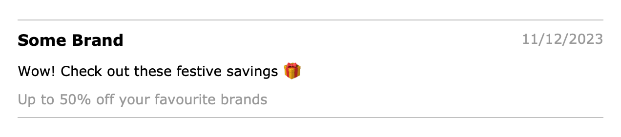
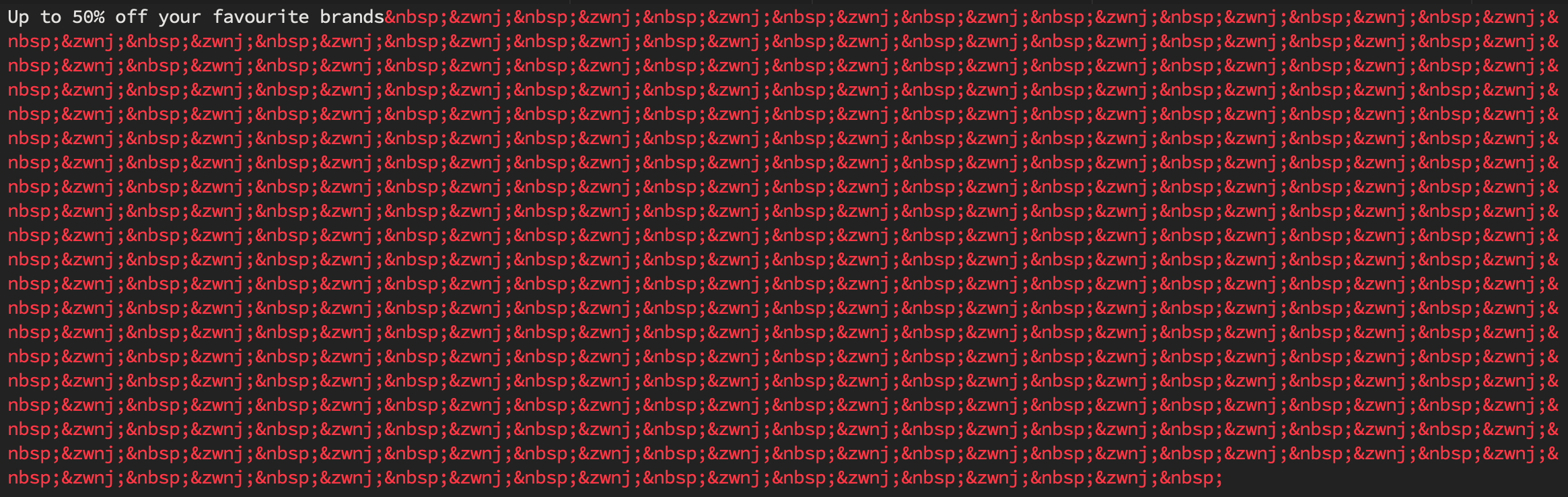
All of this is easier to show than it is to describe. So here’s a recreation of an email as it might appear in Apple Mail and Gmail:
Say yes to CSS
Nobody wants to see email being neglected. Apple, Google, Yahoo and others have taken steps in recent years to protect their customers and improve the email experience.
It’s therefore particularly noticeable that the front end of email has been left behind with such inconsistent support for modern coding standards. Google would help to lead the way by bringing Gmail’s CSS compatibility up-to-date. It would mean better coding standards, better accessibility, better everything. Instead of fallback content, maybe it’s time to jump forward.