Email best practice

Simple email design for a fragile medium

Google recently caused a ruckus in the world of email marketing. As part of an update to Gmail, support for background images was (accidentally) knocked out. Oops. The result was an industry of marketers in panic.

Email developers scrambled to find a fix. Workarounds were found, and Google ultimately resolved the fault at their end. Crisis over. This incident will soon be forgotten – which is a pity, as there lessons to be learned.

Things change

This isn’t the first time such an event has occurred. Changes to email platforms are fairly regular. Sometimes for the better, sometimes for the worse. I recall at least two times when a major email platform made a change that immediately broke responsive stacking content on mobile devices.

Or how about some ancient history? In 2007, Microsoft made the infamous decision to switch its ubiquitous Outlook application from a web browser-style rendering engine… to one based on Microsoft Word.

These sort of sudden, unexpected developments vary from subtle to industry-changing. But they have a couple of things in common:

  • They are beyond our control as email marketers.
  • The more complex the email, the greater the chance of it being affected.

Ours is a diverse but fragile digital environment

One customer is viewing your email in Apple Mail on an iPhone 14 Pro Max in dark mode. Another is looking at it in the Gmail web app in Firefox on Windows 10. Someone else is using a little-known third party Android app on a flip phone. The point – there are countless devices, platforms, versions and personal settings to cater for.

Now add Outlook and its archaic code support to the equation. With all this in mind, it’s clear why HTML emails can only work thanks to an array of coding tricks and extensive ongoing testing. The more complex the design, the more liable it is to break now or in the future.

Overloading the medium

Like all email developers, I’ve been faced with many moments of hair-pulling frustration. Inexplicable gaps in emails, font problems, wrestling with truncation… the list goes on and on. This raises a question – why are we going to all this trouble?

Thinking specifically about the Gmail background troubles, I cannot imagine any email content in which a background image is essential. Nice, sure. Fancy, sure. But essential, no. As a means of conveying useful information to a customer, a regular image and some text will do just fine.

Comparison of a resort image with overlaid text and with text underneath

All of this boils down to the fact that email is far more fragile than a website. And that is not a bad thing. The trouble only starts when we try to force email beyond its capabilities.

Simplicity is key

Most email development struggles are of our own creation. Why battle for hours to achieve a particular design when the easier option is to simplify? This isn’t admitting defeat. It’s making the smart choice to design for the medium, rather than trying to shoehorn a pseudo-website into an email.

Neither does it mean making an ugly email. Simple is not a synonym of dull. A simple email can include static images, and a static image can be as eye-catching and complex as you desire. The email that houses them doesn’t need to be convoluted, and will only benefit from simplification.

Complex email design is less accessible

The hidden beauty of accessibility is that it benefits everyone. The design and coding techniques that it involves will often directly improve your overall email, or serve as a reminder to clean it up.

Complex email design is the enemy of that. It increases the chance of colour clashes, screen reader navigation difficulties and inconsistent use of text and images to communicate information. Simplicity in design means that we don’t have to strive to find clunky solutions to these problems – we circumvent them entirely.

Email code is absurd

It’s easy to forget just how ridiculous email code is. HTML data tables are used for structure. Multiple nested elements are used to achieve something that could be done with a single HTML tag on a website. Spacer objects are often required to force items into place. An assortment of tricks and hacks loosely pins everything together.

And yet we repeatedly choose to attempt complex designs in this environment. Surely the logical choice would be to have less of this clunky code, not more?

Email designers are their own worst enemy (or at least the email developer’s)

Mobile phones have some fairly decent photo editing apps. But they’re no replacement for Photoshop on a desktop computer with a mouse or tablet. The mobile apps are suited to quick, simple edits only. Trying to do anything more in-depth is convoluted if not outright tortuous.

Designing emails that look like websites is like trying to perform complex photo editing on a mobile. It’s simply not the right tool for the job.

Breaking from convention takes courage

Almost every brand sends fancy HTML emails. Companies need to adhere to brand guidelines. No-one wants to challenge the status quo.

That could be good news for you. The one who breaks convention reaps the rewards while others struggle on. Be that one!

Email personalisation

Do you even know me? Watch out for these email personalisation pitfalls

It’s ready. Your beautifully designed, flawlessly coded email is one click away from being fired off to thousands of customers.

There’s just one problem: everyone is about to receive the same message. No, the forename which has been shoehorned into the subject line doesn’t count. It’s spray-and-pray dressed up as one-to-one.

Email marketing deserves to be more sophisticated than that. And it can be. We live in an age of dynamic content, data science and machine learning. To the benefit of customer and business alike, it’s possible to send expertly tailored content based on a person’s purchasing and browsing activities.

But even a richly personalised email programme can sometimes trip up. Read on for a list of personalisation perils – and what to do about them.

First name faux pas

The most basic form of personalisation – addressing someone by name – is laden with a surprising number of potential blunders. A marketing email isn’t a casual message between friends, so it’s important to avoid these embarrassing errors.

First of all, there’s the prospect of getting the name wrong. Let’s say Christopher was in a hurry when he signed up to your newsletter, so he entered his first initial rather than forename. Pierre happened to have caps lock active while submitting the form. And Helen accidentally typed her title into the wrong box. Regardless of who is to blame, it’s not going to look good when you greet them with an enthusiastic "Hello C!", "Hello PIERRE!" or "Hello Mrs!".

Then there’s sentence structure. The injection of a first name will often call for additional punctuation in order to be gramatically correctly. An absent comma can completely transform the meaning of a phrase. I once received an email which promised: "This weekend only: enjoy 25% off Adrian!". 25% off me? I’m not even sure what that means but I’m pretty sure I’m not going to enjoy it.

Next up is first name overload. I sometimes receive emails – particularly those which are part of welcome programmes – which are peppered with my first name. It’s in the subject line, the headline and a couple of times in the message body for good measure. Such overuse comes across as forced and artificial – and it’s no substitute for genuinely customised content.

WHAT TO DO INSTEAD:
Address the customer by name once and put some controls in place to make sure it’s validated and presented appropriately.

By means of SQL processing or dynamic rules in your ESP, you can filter out invalid values such as initials and titles. Likewise, you can add or remove commas to ensure that a sentence reads correctly with or without a first name. You can even convert names to title case using CSS. Pierre will be grateful that you’ve stopped yelling at him.

Meaningless exclusivity

I’ve lost count* of how many times I’ve been presented with the subject line "Exclusive offer for you, Adrian!" or some variant thereof. For example, one time I was offered a free greetings card – just for me – by an online gifts retailer. That could only mean one of two things:

A: They thought of me as a really special customer
B: It wasn’t really just for me

Considering that I hadn’t bought anything from this particular company since my first purchase over half a year prior, I suspect that I wasn’t their star customer. That only leaves option B. The offer had been introduced with a lie. Not a good start if they were hoping to build rapport.

Ok, so calling it a lie is a touch melodramatic. It’s a throwaway attention-grabber akin to advertising puffery. But taken literally, it’s untruthful. Whether that’s enough to deter someone from opening the email depends on the individual. Some won’t notice, some won’t care. But on some level, consciously or not, customers might realise that the brand isn’t being entirely honest with them.

(* I wasn’t really keeping count. I have better things to do, such as writing articles complaining about it.)

WHAT TO DO INSTEAD:
Be honest. If an offer is open to everyone and their mother, drop the empty claims of exclusivity in favour of the offer details. "Adrian, get a free card when you spend £15" works for me.

Of course, if you’re running a promotion which is only open to a particular group – your Gold tier customers or top reviewers perhaps – then that is absolutely worth shouting about.

The illusion of personalisation

I recently conducted an experiment. By opting in to a multi-channel retailer’s mailing list and taking care not to venture beyond the homepage, I wanted to discover what sort of offers I’d be sent.

Some non-personalised marketing emails landed in my inbox over the weeks which followed. These included promotions which were broad in scope and liable to appeal to a general audience. That made sense.

After a while, ostensibly tailored offers started to creep in. These were presented as ‘Deals for You’ and pushed very specific products. Their proposed SIM card for an obscure model of mobile phone was a real stab in the dark and I can safely say that I’d never even thought about organic air fresheners for cars before. But there they were, served up as items of relevance to me.

The moral of the story: if an email isn’t personalised, don’t pretend that it is.

WHAT TO DO INSTEAD:
Only use phrases which suggest hand-picked products if you genuinely possess enough data to build a customer profile. Split your lists or use dynamic headlines to switch the copy to something more apt for people with no browsing or buying history. Phrases such as "popular with other customers" and "trending now" make great headlines for dynamic content and encourage your customer to explore.

Algorithm blues

I’d like to share an anecdote about an email personalisation calamity. Yes, I am a riot at parties.

A colleague of mine once ordered several items of classic literature which were required reading for her daughter’s university studies. A few days later, she received an email with some personalised recommendations. Unfortunately these suggestions happened to be precisely the same works of literature albeit from different publishers. Oops. She didn’t take them up on their offer.

The company in question usually does a world-class job when it comes to personalisation so this incident is an unfortunate hiccup. Nonetheless, it serves to illustrate the dangers of assuming that your AI-generated content always hits the mark.

WHAT TO DO INSTEAD:
Test it. Set up dummy accounts and put through dummy orders. If nonsensical recommendations crop up then it’s time to adjust the settings.

Better still, why not consult members of staff who you know to also be customers? You can’t get a much more authentic picture than that.

A/B tests are your friend here too. Measuring personalised versus non-personalised or different personalisation rules against each other will yield significant insight into customer engagement.

Yesterday’s news

Common sense dictates that you would only send a sale email while the offer is still running or a final few email while there is stock remaining. But what happens if someone opens the email a little too late and unwittingly clicks through to your website only to discover the bad news? Disappointment – that’s what happens. That’s a risk inherent to static emails since you have no control over them once they’re out the door.

Let’s consider another scenario. You’re issuing single-use discount vouchers to your VIP customers. To encourage as many conversions as possible, you’ll also be sending a reminder and last chance message. But to whom are you sending these follow-up emails? Crying "don’t miss out!" at a person who has already redeemed the voucher could leave them feeling undervalued as a customer. Nobody wants to feel like just a number.

WHAT TO DO INSTEAD:
Dynamically-rendered images to the rescue. By generating an image at the moment of open, your email automatically stays bang up-to-date – even after it has landed in your customer’s inbox.

Sale finished? Strike through the headline and drop in an alternative message encouraging people to check out your other great offers. Using a service like Movable Ink or Fresh Relevance, you can even monitor the stock of individual products and update your mailing post-send.

As for who you’re sending emails to – that’s where effective tracking and segmentation comes into play. Check your mailing reports and exclude customers who have already taken you up on an offer. Fantastic – now you’re no longer pestering your most loyal customers.

Forgetting that the customer is always right (about the customer)

Do you know who is the leading expert on me? It’s me.

Retailer X may have collated and harnessed lots of data regarding my activities as a consumer but their subsequent product recommendations are still essentially an educated guess.

We don’t always know why someone looked up a particular item. There’s room for misinterpretation. Let me share an example from personal experience.

I am not a fan of comic book movies. But I am a fan of my home town’s successes. That’s why, when The Avengers was being filmed in Edinburgh, I kept an eye on media coverage of the proceedings.

Ever since, cinematic superhero-related articles have been cropping up in my newsfeed. To the data mechanisms behind the scenes, this is a logical conclusion. To me, it’s an irrelevance to be ignored.

WHAT TO DO INSTEAD:
Use a preference center. An old-school tick-the-box form may lack the futuristic glamour of AI but it remains a crucial tool in the email marketer’s belt. What better way to send the right content to the right people than by letting them choose? Combine that with machine learning and you have the recipe for truly personalised emails.

Ignoring the age of AI

Artificial intelligence – whether or not the technology deserves such a grand title – is here to stay. Machine learning gives us the power to track customer interests and predict their behaviour. Today that means content such as product recommendations, which are great of course, but soon it could mean entire emails designed from the ground up for individual customers. AI already has a significant role in email marketing, and that will only continue to grow. Be ready!

Conclusion

Any email marketing programme worth its salt must incorporate some level of personalisation. Customers expect relevant content. And they expect it to be correct.

This isn’t just hearsay – the statistics back it up. Picking some figures from Segment’s 2017 State of Personalization Report, we can see that 37% of customers will be deterred from buying something and as many as 23% will unsubscribe if a brand gets information wrong when sending them direct marketing. That’s nearly a quarter of your mailing list who are prepared to up-and-leave if your data isn’t spot on.

Get it right however and you’ll be basking in the flipside of those stats. A third of consumers will feel inclined to give you a positive review following a personalised shopping experience. 44% are likely to come back for more. And half of the shoppers out there have made an unplanned purchase on the strength of a relevant product recommendation.

It’s fair to say that good quality email personalisation is complex, both strategically and technically. But you’re not in it alone. There are tools and services to help with every aspect, including specialist areas such as browse abandonment or product review invitations.

Once of all the personalisation pieces are in place, your emails will leave customers with a comforting thought: "they really do know me".

Artificial intelligence

Is ChatGPT your next email developer?

There are two ways to build a marketing email:

  • Hand-coding
  • WYSIWYG editors

We swear by the former, not only for quality but also for speed. But what if there’s an even better, quicker way?

Enter ChatGPT. Much hype has surrounded the AI platform’s ability to code. It can conjure up HTML and CSS in seconds. So too can it generate Javascript functions or back-end PHP or even truly hardcore programming such as C++. Whether or not it does it correctly is a different matter.

Let’s not worry about that just now. We’re here to put AI email development to the test, so let’s find out if ChatGPT can put together a responsive mailing.

The quirky world of email development

If you work in email marketing in any capacity, you likely already know that it requires some unusual coding techniques. There are lots of devices and email services out there, and they have widely different ideas about how HTML and CSS should be interpeted. In order to construct a mailing that looks presentable on all of them, the developer needs to be aware of these limitations and inconsistencies and the arsenal of tricks to work around them.

Has this niche set of knowledge made its way to ChatGPT? We’ll start with a bare bones request.

Prompt:

Code a responsive email template

Result:

Unusable!

ChatGPT has produced a very basic HTML document with some styling, but I wouldn’t call it an email template. It doesn’t include any means of stacking content on mobile, and the structure is based on HTML div elements rather than tables. While divs are the building blocks of a web page, tables remain the most reliable method for email.

On the plus side, it has picked an inbox-friendly width of 600 pixels. And it’s nice to see that accessibility has been implemented via an image description and a proper heading tag.

My request was extremely minimalistic. I need to do my part here too, and that means being more specific about what is needed.

A little lot more instruction

Take two. We don’t want divs, so let’s tell ChatGPT to use tables. There are some basic universal requirements in responsive email, so we’ll nudge it in the right direction regarding those.

Prompt:

Code a responsive email template, using HTML tables for structure. Set the width to 600 pixels on desktop, with a fluid width on mobile. Include CSS classes to enable stacking of content on mobile devices. Include all known email client fixes that are still relevant. Set the page background to a light grey colour, and the email content area to white.

Result:

Better… but still broken beyond repair.

This time it has used tables for structure, so that’s a major improvement. It has also set a breakpoint. That’s the backbone of responsive email code and the point at which mobile-specific styling is triggered. There’s some kind of attempt at stacking code, but I can see at a glance that it isn’t going to work. We’re also missing the usual pile of fixes that make an HTML email possible.

A rethink is needed.

A different approach

Here’s what we’re going to do: hand code a simple email, and then provide ChatGPT with detailed directions in order to recreate it. This is a reverse way to approach our project, but perhaps if ChatGPT has a more defined goal it will be able to produce a usable template.

Our email will have a main image, intro paragraph and a button. Under those will be a couple of secondary features laid out side-by-side on desktop, and stacking on mobile. For the sake of this test, let’s forget about any header and footer.

Image of our intended email layout

Now for our prompt. It’s going to be a long one. Let’s give ChatGPT a fighting chance and focus primarily on structure rather than styling.

Prompt:


Code a responsive email template, with the following requirements:
• 600 pixels wide on desktop
• Fluid width on mobile
• A page background colour of #f1f1f1
• Email content area background colour #ffffff
• A hero section with an image, heading, paragraph of text, and a button
• The hero image should be 600 pixels wide, to match the email content area
• Button should be pill-shaped, with a background colour of #a56e53 and white text
• Under the hero section should be two secondary features
• Each of these must also have an image, heading, paragraph and button
• Secondary feature images will be 290px wide on desktop, to match their containing column, and expanding to full width on mobile
• Hero text and button should be a bit larger than those of the secondary features
• These secondary features should take the form of adjacent columns on desktop, each at 290 pixels wide
• Place a 20 pixel gap between them
• The secondary features must stack into a single column on mobile
• All parts of the email should have 20 pixels of padding on each side on mobile, except for the hero image which can be full width and touching the edges of the viewport
• All body text should follow this font stack: HelveticaNeue-Light, Helvetica, Arial, sans-serif
• All body text should be colour #61524b
• All heading text should be colour #a56e53
• Use lorem ipsum placeholders for text
• Enter all hrefs as # placeholders
• Apply links only to buttons. Do not apply links to images
• Include all known, currently-relevant email client fixes
• Include CSS or HTML comments around each section to explain what it is or does
• Set a mobile breakpoint based on a max width of 639 pixels
• To ensure compatibility with Outlook and other email clients, use HTML tables for structure

Result:

Nice try… sort of.

In order to test this properly, I’ve saved a local copy and manually added my image references. Here’s how it looks in a browser:

Image of ChatGPT's email as seen in a web browser

At first glance, that isn’t too bad. The general layout, colouring and sizing are all correct. So too are the button shapes, and the secondary features switch to a single column on mobile as requested.

But there’s some strange overlapping going on. Our images are offset to the right, and sit partially over the grey background. This in turn causes some unwanted horizontal scrolling on mobile.

Behind the scenes, the true extent of the errors comes to light. It has reverted to a div-based structure, and uses some CSS code that won’t work universally in email.

Nonetheless, for the sake of completeness I’d like to test this as an actual email. It works, more or less, on iPhones and the Gmail app. Webmail is a mixed bag. Outlook however is where it all falls apart:

ChatGPT's email as seen in Outlook 2019

Outlook is the primary reason that email development requires such unorthodox coding methods. A lot of code that works just fine on a website, simply isn’t recognised by Outlook. Here we can see that the adjacent columns have failed and the pill-shaped buttons are reduced to tiny rectangles. To fix that would entail a complete recode.

No need to re-invent the wheel

So far, ChatGPT has failed to code a responsive email from scratch. To add some faux drama, let’s say our make-believe client is becoming impatient waiting for our make-believe email.

It’s time for a last ditch effort. At The Email Factory we already have a tried & tested template. We don’t need a new one. How about we give our base template to ChatGPT and then ask it to complete some content within that framework?

Result:

Now we’re getting somewhere.

But that doesn’t mean success. This time the template works reasonably well in a browser and even in Outlook, although the dodgy buttons are still present. The secondary features however don’t expand to full width on mobile:

ChatGPT's email using our template, as seen on an iPhone

That can however be easily fixed manually. In fact, it may be feasible to fix everything in this code rather than to start again. But I don’t want to do it myself, as that defeats the purpose of this experiment. Instead I’ll tell ChatGPT what needs to be corrected.

A few pointers

Final try. I’ve fed back some information to ChatGPT for it to make the necessary changes.

Result:

A huge step backwards.

Well, that was a big let-down. Instead of applying some finishing touches to the template, the layout has exploded. It no longer stacks on mobile. The code is now full of Microsoft conditional statements – a technique that should only be used sparingly and under specific circumstances. And the buttons? Still ugly in Outlook:

ChatGPT's corrected email as seen in Outlook 2019

Maybe with painstakingly detailed prompting and a lot of patience we could finally achieve a working email. But we’re already far beyond the point of convenience.

The current state of play

In my experience so far, ChatGPT has only done one thing consistently: fail. And I don’t only mean within the limited scope of this one project. I’ve had similar results when trying to generate marketing copy or website code. The output is usually along the right lines but ultimately too broken to actually use.

It’s clear that I set my expectations too high. The tales of ChatGPT’s near-miraculous capabilities were captivating, so perhaps the reality was always going to be disappointing. If there’s a perfect way to illustrate ChatGPT’s close-and-yet-so-far nature, it’s to ask it for an anagram.

Prompt:

Tell me an anagram of "The Email Factory"

Result:

The Fairy Comet Elf

I’ll save you the bother of checking that – it’s wrong. Trying to recreate that manually, letter by letter, results in this:

The Email Fctory e f

Re-evaluating our AI email development experiment

This project is arguably unfair from the outset. ChatGPT is a language model. Just because it can output code doesn’t mean it is a coder, or even knows what programming is.

Even so, it’s widely known that ChatGPT can generate code. So, despite all the mistakes and unusable templates, the fact that it can make a somewhat reasonable attempt is impressive.

Where do we go from here?

ChatGPT and AI in general are progressing at an incredible pace. It wouldn’t surprise me if everything I’ve written about AI email development above is laughably antiquated one year from now.

Perhaps when that time comes, I’ll prompt it to:

Write an article about how you surpass human email developers

Email coding

Was Outlook right about email all along?

Ask any email marketer what their biggest bugbear is, and there’s a strong chance that they will answer Microsoft Outlook. The desktop Windows application is notoriously uncooperative with modern coding standards. It’s a place of archaic development techniques, myriad quirks and unpredictable rendering glitches. That sometimes leads to protracted development times and hair-pulling levels of frustration.

Here’s a comparison of clean web-style code versus Outlook-targeted bloat:

Comparison of web-style and Outlook coding

But I don’t think Outlook is entirely to blame. Here’s why.

Outlook is not alone

Modern web browsers, for the most part, agree on how HTML and CSS code should be interpreted. The same cannot be said for email services. The various pieces of desktop software, webmail sites and mobile applications all behave differently. Each email platform, from Gmail to Samsung to Yahoo, has its own strengths and weaknesses. The only significant exception is the ever-reliable Apple Mail. This uneven landscape is the reason for email-coding being a profession of tricks and workarounds.

While Outlook is inarguably the least code-friendly of all major email applications, it’s not alone in its patchy support for modern web-coding standards.

I’m here for the offer

I don’t open a marketing email to see brand fonts or fancy design or flashy GIFs. I open it because I think there’s something of value to me in there. That might be a special offer, or a new product that matches my interests.

And I want to absorb the information in the quickest time possible. A marketing email is rarely a thing to be perused. If I crave visual stimulation, I will look at art. If I’m in the mood for reading, I open a book.

When I open a marketing email, seeking that tempting discount, a plain-looking design or a graphical defect is not going to be a deal-breaker. It’s an irrelevance.

Email is email, the web is the web

I missed an if earlier: if I want to browse the internet, I’ll browse the internet. Email – electronic mail – used to be the digital equivalent of a posted letter. But at some point it became standard practice for marketing emails to resemble mini websites. Navigation bars, complex layouts, rich graphics, fully-blown footers. Even interactive components such as drop-down menus have become fairly commonplace.

To achieve such an email requires layers upon layers of non-standard coding techniques. To a front end web developer who is used to coding efficiently, it’s likely to look like an incomprehensible mess at first glance. I picture it as a ramshackle machine, bodged with duct tape and liable to break down at any moment. And what is all this effort for? To force a medium to do something that it was never intended to do!

Word games

Microsoft made an industry-changing decision when they released Outlook 2007. Emails would be displayed using the Word rendering engine. Yes, that’s Microsoft Word as in the word processor. And, at the time of writing, it has remained this way for all subsequent Windows editions of Outlook.

Not only does this explain the platform’s extremely limited support for modern web code, but it’s also the reason for sporadic rendering glitches. Marketing emails are often fractured by pixel-thin lines appearing as if at random. One common cause of this is content falling on Word’s unseen page breaks behind the scenes.

Example of rogue white line in Outlook email

But is this truly a flaw in Outlook, or a problem created through misuse of the medium?

Things change: part I

From time to time, email vendors update their platforms and significantly change how they interpret HTML and CSS code. Sometimes that means improvements, sometimes it means email-breaking regressions.

Here’s a good example. More than once, I’ve seen the code used to stack content on mobile suddenly stop working. The solution: yet more unorthodox coding techniques.

This is part of the reason why companies (should) regularly check their mailings on as many email services and devices as possible. An email may display perfectly today, but tomorrow could be a different story. Even the most robust HTML email template is ultimately fragile. Keeping things simple is an effective future-proofing technique.

My needs are simple

From a consumer’s perspective, Outlook is perfectly capable of everything I need a marketing email to do. Formatted text allows me to scan over an email and pick out key points such as product name and price. High resolution images show me what a product looks like. Large, clear buttons give me a means to move onto the next step – in a web environment – should I choose to.

But what about pixel-perfect design, drop shadows, cool GIFs, web fonts, animation, and other bells and whistles? I don’t need those. Such non-content is of immeasurably more concern to a marketing department than it is to a customer.

Things change: part II

And now it’s time to unravel everything I wrote above. Technology progresses, trends move on, and I don’t want to be a closed-minded Luddite.

When I claim that Outlook does all I need it to, I’m seeing things through a conventional lens. In actual fact there are several pieces of enhanced functionality that would benefit me as a customer. It would be handy to watch a movie trailer, or to listen to a snippet of an album, or check out a t-shirt in different colours… all without leaving the mailing. Just because email has traditionally been a gateway to a website doesn’t mean it must always be that way.

So, is outlook right?

I’ll pick a side – no. There are definitely lessons to be learned from Outlook’s approach to email, and it reinforces the importance of substance over style. But ultimately its resistance to modern web standards is resistance to progress in general, and holding the medium back. And if Microsoft was truly making a stand about what email should be, why equip Outlook with a diluted level of HTML and CSS capabilities rather than none at all?

Google’s AMP for Email is a determined move to transform email into a rich, fully interactive experience. The technology may not have taken off in dramatic fashion, but adoption rates are slowly growing. In any case, it would be absurd for the world of email to maintain its antiquated coding techniques forever.

There’s also a new version of Outlook on the horizon. Anticipated for late 2026, there are convincing rumours that it will at last support modern development techniques. That changes everything.

When that day comes, we’ll be given the gift of time. Instead of wrestling with rendering problems, let’s focus our efforts instead on customer-focused content and design.

Email Design

Can AI design a marketing email?

AI is a big deal at the moment. And by “the moment”, that likely means from this point onwards in human existence.

We’ve previously talked about AI’s skills as a copywriter and its influence on email marketing in general. Now it’s time to look at another major branch of AI content generation: imagery.

The journey begins

Midjourney is one of the most advanced and best-known AI image generators in the market. If you’re not familiar, let me explain – it’s a form of digital magic that needs to be seen to be believed.

Picture something in your head. Anything. Now type it into Midjourney’s prompt bar. Within seconds, it will generate four images based on your input. How about:

a Jaguar E-Type parked next to the Eiffel Tower in the rain

Four AI-generated images of a Jaguar E-Type in front of the Eiffel Tower

Incredible, right? Pictured unmistakably are the vehicle, landmark and weather conditions of my choice. But after the initial wow factor has worn off, it doesn’t take much scrutiny to spot the flaws. In one picture the Jag is making a nuisance of itself in the face of oncoming traffic. In another there’s not one Eiffel Tower, but two. This is a landmark that surely doesn’t need any more replicas!

As a user, there are several options at this point. We can spin again and get four brand new images based on our original prompt. Or we can ask Midjourney to create variations of what it’s already generated. Maybe we’d like to do some manual editing in Photoshop, feed the image back to Midjourney and ask it to work from that. Perhaps we’d prefer to rewrite our prompt and be a little more specific.

But let’s move on. We could play with whimsical pictures of this and that all day, but we’re here to examine Midjourney’s potential visual contribution to email marketing.

An a-eye for design

We’re going to test this from two distinct angles:

  • Overall email layout
  • Individual images

I should preface this by saying that Midjourney clearly isn’t intended for the design of websites or emails. It’s a tool with an artistic bent (and one that gives it a distinct character from its rivals). Nonetheless, let’s see what it can do as a source of design inspiration.

We’ll work with purpose. Our goal is to design an email for a make-believe travel company. Its brand colours are a sunny blue and a beachy tan. Those can sit on a traditional white background, with body copy rendered in an eye-pleasingly contrasting dark grey. AI can’t read our minds (yet), so my request is quite specific:

Marketing email for a travel company. Beach imagery. White background. Dark grey text. Use of colours #6084f7 and #c1aa60

And here’s what it came up with:

Four email layouts created by AI

TO TE MAIAY THI – do you know what language that is? It’s mangled English. And that’s an indicator as to how AI image generators work. The output is a visual echo, based on countless source images that have been fed in. That’s why it’s not uncommon to see distorted intepretations of brand watermarks or artist signatures. As with all AI products, we’re seeing the results of complex algorithms rather than any real intelligence.

But can we make use of these mock-up emails? Of the four images above, option 1 is the most useful. It may have largely disregarded my colour choices, but in terms of layout and volume of content it’s the most plausible as an email. Now we’ll conjure up some imagery to bring it to life.

It’s a kind of image-ic

The big beach image from our layout mock-up is pretty nice:

AI-generated image of a beach

That picture is of too low resolution to use in its current form but thankfully Midjourney is a flexible tool. I’m going to feed the image back to the platform, along with some instructions:

[beach.jpg] panoramic illustration of a yacht next to a tropical beach with palm trees and rocks --ar 11:4

That ‘ar’ tag at the end is a way to define the aspect ratio of our images. We don’t want the default square shape in this case, so I’ve picked dimensions that suit a long strip-like image.

Here’s the result:

Four AI-generated images of beaches

I like option 4. So let’s upscale it to a useable resolution, and I’ll modify the colours a little in Photoshop to make it more on-brand.

Final, modified version of an AI-generated beach image

We have a layout. We have a main image. Now we can move onto the final step.

Assembly required

Let’s put the AI-generated components into an actual email. If this was a real commercial mailing, we’d have generated many more trial layouts and images, and made a lot more edits along the way. Working with AI tools feels a bit like the infinite monkey theorem. Spin and spin again until we finally get the result we had in mind.

But what we have here is good enough for experimental purposes. Here’s the final product:

Is it a revolutionary design? No. Could the main image be better? Yes. The point isn’t perfection but progress.

Some final thoughts on AI email design

AI content-creation tools are becoming more sophisticated and widespread. It’s not far-fetched to see image generators becoming an everyday tool that lets marketers conjure up fresh, on-brand graphics in seconds.

In answer to the opening question – can AI design a marketing email – my verdict is sort of. It can certainly help. But at the current rate of progress, who knows what it’ll be capable of a year from now.

Email Design

How to make light work of dark mode

Black text, white background. That’s been the go‑to colour scheme on websites and emails for a long time. After all, it emulates the printed typography of a book or newspaper.

But a digital display isn’t a piece of paper. That’s why some bright spark came up with the idea of dark mode – an inversion of the default colour schemes of old. And there’s a point to it beyond ‘because we can’. Light text on a dark background is easier on the eye, especially in a dimly‑lit environment. It’s also easier on battery life. Whereas ink comes with a material cost in physical media, light comes with an energy cost on a screen.

The use of dark mode is entirely optional. You can generally switch from light to dark whenever you like, or set your device to react automatically based on light conditions. Most modern operating systems, lots of applications and some websites cater for dark mode.

We’re not here to talk about any of those. Email is our thing. Let’s take a closer look at how dark mode affects email, how to design for it, and how to code for it.

Don’t be afraid of the dark

There’s an important point to set down from the outset: the objective is to optimise your emails for dark mode, not to override your reader’s settings.

That means we all need to be flexible with our brand guidelines. Whether your customer has a visual requirement for dark colours or simply prefers them, user prerogative trumps everything else.

Google homepage in its light and dark versions
If Google isn’t afraid to invert its brand colours, none of us should be!

Discover the dark mode landscape

Rendering quirks and the tricks to get around them are at the heart of email development. The handling of dark mode maintains these traditions.

Some email services allow full control – you get to set the dark mode colouring. Others ignore your styling and force a dark colour scheme of their own. Some offer partial control, and a few don’t support dark mode at all. The challenge is to design and code an email that looks good on all of them.

It’s important to note that those services which apply their own dark mode colours are not a lost cause. You can and should still optimise your design so that they look as good as possible. Familiarity and consistency ward off unsightly surprises and the wasted time of trial & error.

Don’t be vexed by text

Warning: please excuse the rant‑like nature of this paragraph. It’s frustratingly common in email to see images used to display copy. There has never been a convincing reason to do so. Images‑of‑text instead of actual text is often a way to foist a brand font or elaborate design on users. And one that comes at the expense of accessibility, usability and best practice.

Dark mode is one more reason to use text. Image‑based text can lead to a messy, partially inverted email in dark mode. Real text puts the email developer in the driving seat. Some email services support web fonts, so it’s still possible to show brand fonts to a reasonable percentage of your audience. Other accounts will fall back to standard fonts of your choice.

Let’s be (partially) transparent

Email supports a handful of image formats. JPEGs are common, and best‑suited to photographic content such as product shots. GIFs are also popular, and handy for simple images such as icons, or for short animations.

Somewhat less widely used are PNG images. Which is a pity, because their built‑in transparency support is a dark mode designer’s best friend. Let’s take a logo as an example. Save your logo as a JPEG and it could end up sitting in an unsightly white box against a dark background. Utilise the PNG format instead and it’ll automatically let the background colour shine through. If your logo itself is dark, it could be lost against a darkened background. A white outline or glow effect – invisible on light mode – can counteract that.

Fictitious Travel logo shown in various light and dark mode variations
Here’s how a logo might look in various light and dark mode setups

It’s worth noting that GIFs also have a transparency capability… but it’s limited. It’s an all‑or‑nothing deal – a single colour can be set as fully transparent. While that can be useful in some situations, it doesn’t allow for the smoothly‑blended curves of a PNG.

Code for the mode

It’s time to get coding. First up, you need to explicity enable dark mode in email. That’s a two‑step process. Add the following HTML <meta> tags in the <head> of your document:


<meta name="color‑scheme" content="light dark">

<meta name="supported‑color‑schemes" content="light dark">

And then create a new <style> sheet, separate from your existing responsive styles. Now add a couple of root selectors to define light and dark mode:


:root {
color‑scheme: light dark;
supported‑color‑schemes: light dark;
}

These colour modes can now be targeted via media queries. Not only does that mean you can set up specific custom colours for dark mode, you can even swap images.


@media (prefers‑color‑scheme: dark) {
.email‑background {
background‑color: #313336 !important;
}
.darkmode‑show {
display: block !important;
width: auto !important;
overflow: visible !important;
float: none !important;
max‑height: inherit !important;
max‑width: inherit !important;
line‑height: auto !important;
margin‑top: 0px !important;
visibility: inherit !important;
}
.darkmode‑hide {
display: none !important;
}
}

There’s an important reminder in that prefers‑color‑scheme syntax! We should always bear in mind that light or dark mode is a user preference.

Give it a go

We could go on about the technicalities of dark mode all day. But let’s now put it to the test.

Below is a simulated email. It’s interactive – try the controls to see how it looks in various states of light and dark mode.

Note: this demo approximately simulates light and dark conditions in email. Specific email services and devices will have their own rendering quirks. This simulation is set to automatically disable the use of swapped images on forced dark mode, so some switches will be tripped automatically.

Simplicity keeps things… simple

The more complex the design, the more work will be involved in making it dark mode‑friendly. That raises a question: is that design essential, or can it be stripped back? I like to find the answer in a second question: does the design help to relay information to the customer, or is it a box‑ticking exercise for the marketing department?

In light of that way of thinking, the best solution is often to simplify the design rather than piling on more and more CSS code.

Final thoughts

Dark mode is a good thing. It’s a piece of functionality in the spirit of accessibility and respects the user’s autonomy.

As with all things development, you don’t need to work from scratch every time. An email template and snippet‑based coding style mean consistent results.

Despite that, surprisingly few companies are actively supporting dark mode in email or even the web. By designing for dark mode, you are helping to lead the way.

Perhaps it isn’t light work, but it’s definitely the right work.

Email coding

Modules vs snippets in email development

As an email marketer, you probably don’t go back to the drawing board every time you create a mailing. Email layouts are saved as templates, and recurring components are stored as content blocks. There’s more than one way to do that. Let’s compare the email development merits of modules versus code snippets.

Some email development definitions

Modules are recurring template components stored on an email platform.

Code snippets are shorthand phrases defined by a developer that trigger pre-built chunks of code.

Modules and snippets therefore serve the same purpose. But the means to get there is very different. That deserves a closer look.

Module methodology

A module is essentially a standalone HTML file that can be dropped into a larger template. It might be a banner, or a stacking product section, or an intro with a hero image and a button. Whatever you like, it can be moduled.

Diagram of a project

That module is hosted in a library on your email platform. You can copy, edit and select any module for use in individual mailings. The specifics vary but you’ll generally perform this task via a graphical user interface. There often needs to be some additional programming using your platform’s scripting language.

Next, there’s usually a master template which has modules slotted into preset positions. These can of course be moved around or removed or added to as required.

So, that’s modules. Now for snippets.

Snippet style

The phrase ‘hand-coding’ is sometimes misunderstood. A developer will not sit and type thousands of lines of syntax in their entirety. Modern development environments support all manner of production shortcuts.

Among these shortcuts are code snippets. There’s more to these than simple blocks of code. A developer can set a snippet’s variables and cursor locations, thus producing a piece of code that can be navigated and edited in seconds.

Developer working on a laptop

Thinking about email development specifically, one example of a snippet could be a call-to-action button. By typing a pre-determined phrase – let’s say ’embttn’ – the developer triggers the snippet. Within moments, the text, link, colour, size and border can be set.

And the winner is…

I’ve kept the tone neutral(-ish) so far, but now it’s time to pick a side. By just about any reasonable measure, there’s a clear winner: snippets.

Here’s why:

Understanding

A skilled developer will work primarily in a code editor like Sublime or VSCode. Raw code may look daunting compared to the friendly GUI of an email platform, but ultimately that interface only fragments and obscures what is going on behind the scenes. When a new user needs to familiarise themself with the setup, it becomes a puzzle to be pieced together.

Speed

Working with modules means navigating through multiple pages and menus in an email platform. It is never quick. Working with snippets on the other hand is lightning fast. I’ve seen build durations reduced from all-day to an hour as a result of switching to snippet-based coding. There is no comparison.

Cohesion

Snippets mean far fewer sources of content for an email, and a more consistent format. Often an entire template can exist in a single file. Dynamic content written in your email platform’s scripting language can go there too, peacefully co-existing alongside HTML and CSS.

Flexibility

We’ve already covered the flexibility of snippets themselves. But there’s a related benefit – it means the developer can work in their environment of choice, rather than the one presented to them by an email platform. The advantage of a familiar and custom-configured comfort zone cannot be understated.

Final thoughts

To pit modules against snippets is part of a larger battle – drag & drop email builders versus hand-coding.

We are biased, of course. But with good reason. As a company of email developers, we’ve seen the comparative disadvantages of module-based configurations. There are situations in which errors can go unseen months or years. But the fault is buried somewhere in a maze-like setup that potentially no one person understands fully.

Hand-coding, by contrast, is uncluttered and transparent. For me, snippet-based email development is not only the best way to build mailings – it’s the correct way.

Email Marketing

The future is here. How will AI impact your emails?

Artificial intelligence is a hot topic. There are several AI-powered tools on the market, whether in a commercially-viable or prototype form. Perhaps most significant is ChatGPT by OpenAI, which was made public at the tail end of last year. What’s ChatGPT? Why don’t we ask it:

Me: what are you? ChatGPT: I am an AI language model developed by OpenAI, known as ChatGPT.

To describe itself as a “language model” may be correct but it’s a little modest. ChatGPT’s abilities are vast. It can answer questions, generate code, write articles, translate documents, tell you a joke, or engage with you in some good old-fashioned chit chat.

This of course is an impressive piece of technology and a fun tool to experiment with. But its scope and usefulness extend far beyond curiosity. It has practical, real world applications. Why spend time programming a website component when an AI can do it for you in a fraction of the time? Why struggle with writer’s block when a copywriting deadline is looming? Why be presented with adverts when searching for information online? Prompt ChatGPT and it’ll take on the task and output some code, content or answers within minutes if not seconds.

Amazing, right?

Let’s take a step back

The validity of the phrase artificial intelligence is often contested. As a species, we are yet to develop something that is actually aware, or truly understands what it is doing. Perhaps a more accurate description is fancy algorithms. Patterns, machine learning… and sometimes very wonky output.

On that topic – ChatGPT makes mistakes. That’s not a criticism. Just like a human, ChatGPT learns from mistakes… but it doesn’t feel embarrassed about it. When things go wrong, you can tell it so. It’ll then take steps to rectify the error. There’s some give and take when working with ChatGPT.

What artificial intelligence could mean for email

The combination of email and AI (or fancy algorithms) is nothing new. One-to-one product recommendations have been around for years, picking relevant items based on previous shopping behaviour. Spam filters automatically guard inboxes against emails of the shadiest kind. Customer journeys and automated emails are made possible through complex workflows with little post-development need for human intervention.

What is new however is the concept of emails that are predominately or even completely designed and coded by computers. Imagine high-quality, on-brand design and copy that is generated in seconds. Perhaps the same AI tool could then select the audience, send the email, read the report and optimise the next send. Is there a point at which human input becomes zero?

What artificial intelligence currently means for email

Don’t worry – we’re not at the human irrelevance stage yet. In my tests with ChatGPT, I’ve seen it output some erroneous facts and broken code. From what I’ve seen it’s neither ready to fly solo nor likely to achieve such independence any time soon.

That doesn’t mean it’s not a revolutionary and practical technology in its current state. I already use it almost daily for writing inspiration and to help with coding questions that would otherwise mean trawling through forums for answers.

ChatGPT and other pioneering AI technologies have already changed the way we work, and they will only continue to evolve. It’s incredible to think that what was only recently in the realm of science fiction is now becoming a reality. The future really is here.

Email best practice

Email accessibility: are you leaving anybody out?

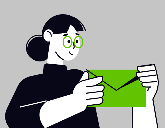
Communication. That’s what email is all about. The same is true whether you’re using it to apply for a job, or to seek help from customer services… or to market your product to thousands of customers.

Marketing emails typically go to lots of different people using lots of different devices. Your objective is to convey an equally intelligible message to all of them. That brings us to the concept of accessibility.

Defining email accessibility

Firstly, here’s what accessibility is not:

  • An inconvenience
  • An afterthought
  • Exclusively a matter of visual impairment

And now for what it is. Mozilla (the developers behind the Firefox web browser) describe accessibility as: the practice of making your websites usable by as many people as possible.

Applying this thinking to our favourite medium, it means emails that can be easily understood, navigated and interacted with. We want our mailings to render optimally in any application on any gadget. They must impart a clear message and invite a defined action from the customer. And accessibile emails are open to people whatever their level of physical ability.

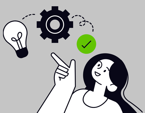
Email accessibility is a huge topic, encompassing many human and technical factors. Let’s take a look at some of them.

Clarity in message, design and function

A marketing email usually performs two main functions:

  • Communicates a message to your customers.
  • Invites them to take action in response.

Concise copy and a user-friendly structure support those objectives. Worry not – that doesn’t mean your email needs to be sterile and unimaginative. There’s still plenty of scope for characterful writing and vibrant imagery. The art is in creating an eye-catching design that supports your message rather than overwhelming or obscuring it.

Accessible copywriting begins with the subject line. Good, honest information beats vague open-bait every time.

Image of good and bad versions of an email subject line

I like big buttons and I cannot lie

There’s a tendency in email marketing to go link-crazy. Every heading, every subheading, every image, every block of text… and even empty space – all clicking through to web pages. That usually means ambiguous destinations and multiple links to the same places. The technical term for this is a mess.

The solution: buttons. Big ones. Big ones with clearly defined calls-to-action. Your customer should know in advance what sort of content to expect upon pressing it. And don’t forget to include plenty of breathing space around those buttons. You don’t want links to different places squashed up against each other, especially on touch-screen devices.

Don’t get left in the dark

Dark mode took off a few years ago, and remains a popular display option among those who care about things like battery life and corneas.

It can have a dramatic effect on the way your email is rendered. And often not in a good way. Images can be camouflaged against recoloured backgrounds, or left floating in unsightly squares.

Email being email, the rendering methods for dark mode are not consistent from one email application to another. It therefore requires an assortment of coding and imagery techniques to create dark mode-friendly mailings. Dark mode-specific CSS classes are possible. PNG format images with border effects help them stand out, should they be unexpectedly displayed atop a dark background.

Comparison of a logo as seen in light and dark modes

The technical details are a complex topic for another day. But let’s be clear on the objective – you want to optimise your email for dark mode, not override your user’s preferences.

So many apps, so many devices

Sorry in advance, but I’m about to throw a bunch of words at you. Here goes.

Desktop computers, laptops, tablets, mobiles. Screen sizes, model versions, display settings. Desktop software, webmail services, mobile apps.

My point: there are many software and hardware combinations out there, and your marketing emails could be viewed on any one of them. You want your email to be just as legible on a dusty old laptop running Microsoft Outlook 2016 as it is on a brand-new iPhone.

Responsive email – i.e. that which is coded to fit to any screen size – is the answer. It’s standard practice nowadays, but that absolutely does not mean that it is always handled adequately. All too often, mobile rendering remains a secondary concern – leading to visual problems like tiny text and confusingly mismatched imagery. We’ve written extensively about responsive email in the past, but let’s sum up some of the most important points:

  • Plan your responsive design from the outset. The mobile layout should never be a secondary consideration.
  • Support for HTML and CSS in email is extremely varied and somewhat limited. An email developer must understand how to code effectively for all major devices and email services.
  • Be prepared to simplify an overly-ambitious design. Fanciness for the sake of fanciness is not in the spirit of accessibility.

Even if you’re confident that your email is perfection itself, always include a link for it to be viewed in a web browser.

Hear me out: your emails could be confusing to screen readers

I mentioned earlier that accessibility is not all about visual impairment. It is however an extremely important aspect, and will largely be the focus of the remainder of this article.

A screen reader is a piece of assistive software that will audibly describe the content of an application, web page… or indeed an email. You probably have a screen reader right in front of you right now. Press COMMAND + F5 if you’re on a Mac, or CTRL + WIN + ENTER if you’re on a Windows PC. While the use of a screen reader takes time to master, this will give you a helpful insight into how a visually impaired person might be interacting with your content.

As technically incredible as screen readers are, it is unfair to expect them to do all the work. A website must be designed and coded in a way that a screen reader can navigate and interpret. The W3C Web Accessibility Initiative (WAI) publishes extensive guideance on this topic, and a lot of the advice carries over to email.

Let’s take a look at some ways to develop emails with screen readers in mind.
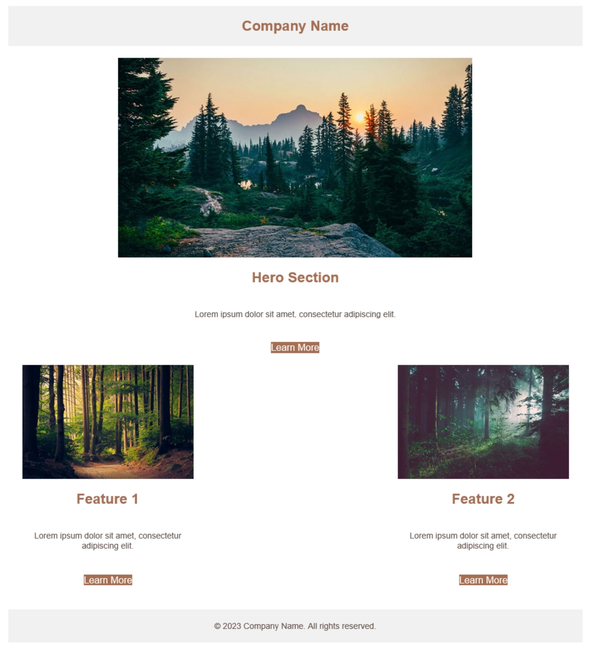
Write semantic code

Do you shop in supermarkets? They have signage to help you find your way around the array of aisles. ‘EGGS’ here, ‘HOUSEHOLD ESSENTIALS’ over there. If those signs didn’t exist, your shopping experience would be a lot more frustrating. An email without semantic code is a bit like a supermarket without signs.

Semantic email code can be defined as meaningful HTML tags. These are the basic elements behind the scenes that make up a mailing. Here are a few important ones:

  • <header>
  • <nav>
  • <section>
  • <article>
  • <h1> (the main heading on the page)
  • <h2> to <h6> (increasingly minor headings – seriously, I don’t think I’ve ever gone past h3)
  • <p> (a paragraph)
  • <strong> (bold text)
  • <em> (italic text)
  • <footer>

But there are also multi-purpose, non-descriptive HTML elements:

  • <div>
  • <span>
  • <table> (for the presentational purposes of email, that is)

Those last three are far from invalid. But it’s easy to be lazy in web and email development alike, and rely on them too heavily. In fact it’s actually somewhat rare to code particularly semantically in email.

But guess what – descriptive HTML tags help screen readers know what’s what. Say your main heading is just sitting there in a generic <span> tag. A screen reader won’t know that it’s any more significant than any other text that happens to be floating about on the page. If it’s wrapped instead in an <h1> tag, the screen reader will announce it as “heading level 1”. Now the user better understands what is being communicated. Construct your entire email with semantic code and you communicate useful information to those who can’t see it.

Similarly, sequence is important. Screen reader users will often be using a keyboard to navigate through the email. By default this will jump from item to item in the order they appear in your code. Make sure it makes sense.

And while there is actually a way to override this sequence, doing so is so far removed from best practice that we will discuss it no further! Far better to construct an email that follows a logical sequence in content and structure.

Mark your bricks as bricks

Modern websites are constructed with the finest materials available – divs, spans and all sorts of CSS-styled goodness.

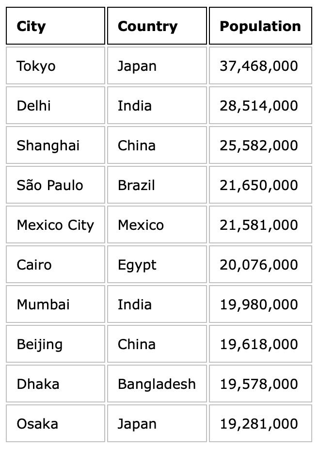
Emails are built using a more… rustic method. They use HTML tables for structure, just as web pages did once upon a time.

When a screen reader encounters a table, it assumes that it is a table of data. Something like this:

Image of a table showing populations of capital cities

A screen reader may therefore produce confusing results when dealing with the structural table of an email. There’s an easy fix for this. Just apply the following HTML attribute to all of the tables that comprise your email:

role="presentation"

Congrats – you’ve just told screen readers what your tables are for, and made your email immediately more accessible.

Let text be text

When you write a text message to a friend, do you take a screenshot of it and then send it as an image? Unless you’re charmingly eccentric, I suspect the answer is no.

The same principle applies to email. And yet countless companies – sometimes even the biggest of corporations – produce marketing emails in this roundabout manner. Paragraphs of text are drawn up in a design application, saved as JPEGs and dumped into HTML emails. Why?

This practice is so widespread that phrases such as ‘live text’ have sprung up. Let’s get out of that way of thinking. It’s just text.

There are probably multiple factors at play here. Brand guidelines and typography. A desire to achieve complex layouts in a medium that doesn’t make it easy. Or it could be the it’s-always-been-done-this-way mentality.

Accessibility and usability trump all of those things. There are all sorts of reasons to use proper text. It renders sharply and at a consistent size, whereas images shrink and grow. Users can zoom in without the letters becoming blurred. Chunks of text can be selected and copied. And it’s the purest form of copy for screen readers to detect.

Web fonts are reasonably well supported in email these days, so you don’t even need to lose your brand typeface. Now all of the boxes are ticked.

Animated comparison of text and image versions of the same content being scaled

Pictures speak a thousand words

But only if you let them. And you should probably cut that down to a handful of helpful, descriptive words.

HTML comes equipped with a thing called alt tags. That’s short for alternative. These tags allow you to attach text content to any image on the page. We can use them to describe what is pictured or relay copy from a heading. Normally the alt tag goes unseen.

They are however of critical importance for users who cannot see your image. That might be someone who has chosen to turn pictures off, or perhaps the file has failed to load, or it could be a person with a visual impairment.

Take a look at a few examples:

Overhead aerial photograph of a hotel's outdoor pool, surrounded by trees and rooftops

alt="Overhead aerial photograph of a hotel's outdoor pool, surrounded by trees and rooftops"

Watercolor painting of a pink flower in a plain background

alt="Watercolor painting of a pink flower on a plain background"

Example heading saying SALE NOW ON

alt="SALE NOW ON"

Without these descriptions, the content of these images would be completely concealed to a screen reader user. By typing just a few words, you have produced an immeasurably more inclusive email.

One more thing – emails often include some purely decorative or spacer images. Just leave the attribute as alt="", and screen readers will know to ignore them.

Self access-ment

We’ve covered a reasonable amount here, but this is a topic too broad to fully explore in a single article. There are plentiful accessibility resources online, even for the relatively niche branch that is email.

Among those are tools to analyse the accessibility of your web page or email. Some of these are commercial products, but there are also some handy free ones.

Paste in your email code at accessible-email.org and you’ll see an instant report with suggestions for improving accessibility.

You might also wish to try WAVE – web accessibility evaluation tool. As the name states, this is intended for web pages. But much of the feedback also applies to email, so there’s nothing to stop you popping a ‘view online’ link in there.

Perhaps most useful of all is a simple checklist. That’ll let you score your emails consistently according to your particular requirements.

Here’s to more inclusive emails

Making your emails accessible is a complex task – but it doesn’t need to be an extra one. Accessibility standards are intertwined with email best practice. By putting accessibility at the core of your design and development process, you automatically produce better emails all round. Everybody benefits.

Perhaps the key to accessibility isn’t to think of it as a separate subject at all, but simply the act of making a good email.

Email coding

Cut and waste: is email clipping ruining your mailings?

Websites are displayed in web browsers. Browsers, for the most part, agree on how things should work. There’s a high degree of standardisation.

Emails are displayed in email clients. They do whatever the hell they want.

As email developers we need to contend with patchy support for modern web technologies and a shifting landscape of rendering quirks. And then there’s the matter of email clipping. That’s a nice way of saying your email could potentially be chopped in half.

The root cause of email clipping

Gmail has a 102 kilobyte limit on email code. Let’s round that to a neat 100KB. We’re not talking about images – they’re a separate entity. The 100KB cap applies to the HTML at the core of your email.

Exceed the limit and your email will be unceremoniously sheared. It doesn’t matter if you’re using a desktop or mobile device, via the Gmail web page or the app. The same rule applies across the board.

I’ve knocked together a purposely code-heavy email to demonstrate this process in all its ugliness. Here’s how my mailing should look:

Image of demonstration email

There’s a significant amount of bloat in this email. That includes things like superfluous code, border effects, device-specific imagery, and a drop-down menu on mobile.

The result is a file weighing in at 120KB. In Gmail it renders up to a certain point and then… stops. This is as far as it gets:

Image of clipped email

And yes, there is a link to view the email online in its entirety but realistically who is going to press that? I wouldn’t. The damage is already done.

Apart from the obvious consequences of a broken email and wasted content, clipping can also result in the unsubscribe link and terms & conditions going missing. That’s a serious problem.

Let’s find out what we can do about it.

Accept the limit

This is step one. The limit exists and there’s no way to circumvent it.

We also cannot afford to ignore it. Gmail is the world’s second most popular email platform and accounts for a third of the market.

I think it’s important not to think of this restriction as a nuisance. Much better to regard it as a reminder to follow good practice. If your emails are being clipped, that’s your cue to reign in rambling marketing spiel or refine your code or declutter your design.

Respect the limit and your marketing emails may end up all the better for it.

Code efficiently

There’s a single top-level cause of email clipping: the file size is too big. This is caused by one or more of the following factors:

  • Excessive content
  • Excessive code
  • Complex design

Let’s focus on code for now. If an email is being clipped, it doesn’t necessarily mean that its code is bad. It may be error-free and email-friendly in the traditional sense. There’s just too much of it.

We should always strive to find the most efficient way to turn content into code. Some of the most helpful methods I’ve found are as follows:

  • Padding on table cells is well supported in email and makes for a lighter alternative to spacers.
  • Nested tables are intrinsic to email-coding, but it’s easy to get carried away. See if you can cut back.
  • Merge tables where possible. If you can add a row to an existing table rather than creating a new one, do it.
  • Be prepared to deviate from the design. A simplified email is eminently preferable to a truncated email.
  • Allow some leeway. If you’re scraping under the limit, remember that image references and tracked links could end up longer than they appear in your local files.
  • Know your templates. It’s worth reviewing what every piece of code actually does.

If you’re have truncation troubles, it’s not a battle that needs to be fought on a daily basis. Snippet-based development and a template library lets us record and re-use good code. Solve the problem, save the solution.

Show the right products to the right people

I wasn’t kidding when I suggested that Gmail’s code limit is a good thing. Sending huge mailings with lots of products and no personalisation is a haphazard and old-fashioned approach to email marketing. Please buy something, buy anything! A limit on file size discourages that.

Tailored email marketing via strategic segmentation and data-fuelled product recommendations is the way to go. It’s easy to treat personalised content as an afterthought, but personalisation deserves to be at the heart of our marketing programmes. Modern email tools and technologies make that possible.

With a mere 100KB to work with, code is precious. Let’s not waste it on irrelevant content.

Redefine your design

If elaborate design is the root cause of your email clipping woes, then it’s time to go back to the drawing board. As dramatic as it sounds, it can be helpful to re-assess what email actually is.

Consider these questions:

Simplified design means a slimmer file. I’d wager that customers are a lot more interested in product and price than borders and background effects. And if you pit fancy design against an email that actually works, there’s no contest.

Out with the indentations

In the real world, this fix is likely to be the first course of action. It can be extremely effective and takes seconds to implement. But I haven’t listed it first here, as it doesn’t reflect the same spirit of best practice as the other improvements above.

Indentations in code are useful… to humans. A screenful of HTML or CSS becomes a lot more readable when it’s neatly formatted.

Image of some HTML code with indentations

But these indentations serve no purpose for a computer, and they account for a surprising chunk of your overall file size. Stripping them is often all that’s needed to save an email from clipping.

Image of some HTML code with no indentations

The scale of this kilobyte reduction is affected by various factors but it primarily depends on whether your indentations are tab-based or space-based. While tab-based reductions are relatively modest, space-based reductions hover around 20% in my tests. That’s a significant result for such a low-effort fix.

You don’t even need to lose your indentations forever – create a copy of your HTML file for uploading, and keep the original for editing.

Final cut

It’s time to take my Fauxrniture email and rescue it from Gmail’s axe. I don’t want to sacrifice content, so my focus is on improving code and dropping unnecessary extras.

There is huge scope for code refactoring. Several blocks of HTML can be merged, dramatically reducing the overall file size. Plus that makes it even more readable for my human brain.

The application of links to every single paragraph is overkill. The drop-down menu is a gimmick. Alternative imagery for desktop and mobile serves no useful purpose. So we’re saying goodbye to all of those.

The code-based border effects on the main image come with a hefty kilobyte cost, so I’ll incorporate them into the JPEG directly instead.

And finally (although we’ve done enough already at this point) let’s get rid of the indentations for good measure.

The end result is a file that is half the size of the original. That’s so far into the safe zone that we can relax completely. And crucially, nothing of importance has been lost.

The lesson here is that a clip-proof email absolutely does not have to mean a short email. Code efficiently, design for email, and lose the fluff. Now you can concentrate on content creation rather than email truncation.