

Email Design

Can AI design a marketing email?

AI is a big deal at the moment. And by “the moment”, that likely means from this point onwards in human existence.

We’ve previously talked about AI’s skills as a copywriter and its influence on email marketing in general. Now it’s time to look at another major branch of AI content generation: imagery.

The journey begins

Midjourney is one of the most advanced and best-known AI image generators in the market. If you’re not familiar, let me explain – it’s a form of digital magic that needs to be seen to be believed.

Picture something in your head. Anything. Now type it into Midjourney’s prompt bar. Within seconds, it will generate four images based on your input. How about:

a Jaguar E-Type parked next to the Eiffel Tower in the rain

Four AI-generated images of a Jaguar E-Type in front of the Eiffel Tower

Incredible, right? Pictured unmistakably are the vehicle, landmark and weather conditions of my choice. But after the initial wow factor has worn off, it doesn’t take much scrutiny to spot the flaws. In one picture the Jag is making a nuisance of itself in the face of oncoming traffic. In another there’s not one Eiffel Tower, but two. This is a landmark that surely doesn’t need any more replicas!

As a user, there are several options at this point. We can spin again and get four brand new images based on our original prompt. Or we can ask Midjourney to create variations of what it’s already generated. Maybe we’d like to do some manual editing in Photoshop, feed the image back to Midjourney and ask it to work from that. Perhaps we’d prefer to rewrite our prompt and be a little more specific.

But let’s move on. We could play with whimsical pictures of this and that all day, but we’re here to examine Midjourney’s potential visual contribution to email marketing.

An a-eye for design

We’re going to test this from two distinct angles:

  • Overall email layout
  • Individual images

I should preface this by saying that Midjourney clearly isn’t intended for the design of websites or emails. It’s a tool with an artistic bent (and one that gives it a distinct character from its rivals). Nonetheless, let’s see what it can do as a source of design inspiration.

We’ll work with purpose. Our goal is to design an email for a make-believe travel company. Its brand colours are a sunny blue and a beachy tan. Those can sit on a traditional white background, with body copy rendered in an eye-pleasingly contrasting dark grey. AI can’t read our minds (yet), so my request is quite specific:

Marketing email for a travel company. Beach imagery. White background. Dark grey text. Use of colours #6084f7 and #c1aa60

And here’s what it came up with:
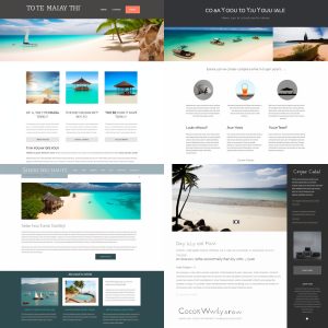
Four email layouts created by AI

TO TE MAIAY THI – do you know what language that is? It’s mangled English. And that’s an indicator as to how AI image generators work. The output is a visual echo, based on countless source images that have been fed in. That’s why it’s not uncommon to see distorted intepretations of brand watermarks or artist signatures. As with all AI products, we’re seeing the results of complex algorithms rather than any real intelligence.

But can we make use of these mock-up emails? Of the four images above, option 1 is the most useful. It may have largely disregarded my colour choices, but in terms of layout and volume of content it’s the most plausible as an email. Now we’ll conjure up some imagery to bring it to life.

It’s a kind of image-ic

The big beach image from our layout mock-up is pretty nice:

AI-generated image of a beach

That picture is of too low resolution to use in its current form but thankfully Midjourney is a flexible tool. I’m going to feed the image back to the platform, along with some instructions:

[beach.jpg] panoramic illustration of a yacht next to a tropical beach with palm trees and rocks --ar 11:4

That ‘ar’ tag at the end is a way to define the aspect ratio of our images. We don’t want the default square shape in this case, so I’ve picked dimensions that suit a long strip-like image.

Here’s the result:

Four AI-generated images of beaches

I like option 4. So let’s upscale it to a useable resolution, and I’ll modify the colours a little in Photoshop to make it more on-brand.

Final, modified version of an AI-generated beach image

We have a layout. We have a main image. Now we can move onto the final step.

Assembly required

Let’s put the AI-generated components into an actual email. If this was a real commercial mailing, we’d have generated many more trial layouts and images, and made a lot more edits along the way. Working with AI tools feels a bit like the infinite monkey theorem. Spin and spin again until we finally get the result we had in mind.

But what we have here is good enough for experimental purposes. Here’s the final product:

Is it a revolutionary design? No. Could the main image be better? Yes. The point isn’t perfection but progress.

Some final thoughts on AI email design

AI content-creation tools are becoming more sophisticated and widespread. It’s not far-fetched to see image generators becoming an everyday tool that lets marketers conjure up fresh, on-brand graphics in seconds.

In answer to the opening question – can AI design a marketing email – my verdict is sort of. It can certainly help. But at the current rate of progress, who knows what it’ll be capable of a year from now.

Email Design

How to make light work of dark mode

Black text, white background. That’s been the go‑to colour scheme on websites and emails for a long time. After all, it emulates the printed typography of a book or newspaper.

But a digital display isn’t a piece of paper. That’s why some bright spark came up with the idea of dark mode – an inversion of the default colour schemes of old. And there’s a point to it beyond ‘because we can’. Light text on a dark background is easier on the eye, especially in a dimly‑lit environment. It’s also easier on battery life. Whereas ink comes with a material cost in physical media, light comes with an energy cost on a screen.

The use of dark mode is entirely optional. You can generally switch from light to dark whenever you like, or set your device to react automatically based on light conditions. Most modern operating systems, lots of applications and some websites cater for dark mode.

We’re not here to talk about any of those. Email is our thing. Let’s take a closer look at how dark mode affects email, how to design for it, and how to code for it.

Don’t be afraid of the dark

There’s an important point to set down from the outset: the objective is to optimise your emails for dark mode, not to override your reader’s settings.

That means we all need to be flexible with our brand guidelines. Whether your customer has a visual requirement for dark colours or simply prefers them, user prerogative trumps everything else.

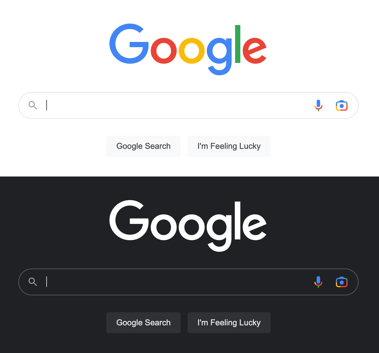
Google homepage in its light and dark versions
If Google isn’t afraid to invert its brand colours, none of us should be!

Discover the dark mode landscape

Rendering quirks and the tricks to get around them are at the heart of email development. The handling of dark mode maintains these traditions.

Some email services allow full control – you get to set the dark mode colouring. Others ignore your styling and force a dark colour scheme of their own. Some offer partial control, and a few don’t support dark mode at all. The challenge is to design and code an email that looks good on all of them.

It’s important to note that those services which apply their own dark mode colours are not a lost cause. You can and should still optimise your design so that they look as good as possible. Familiarity and consistency ward off unsightly surprises and the wasted time of trial & error.

Don’t be vexed by text

Warning: please excuse the rant‑like nature of this paragraph. It’s frustratingly common in email to see images used to display copy. There has never been a convincing reason to do so. Images‑of‑text instead of actual text is often a way to foist a brand font or elaborate design on users. And one that comes at the expense of accessibility, usability and best practice.

Dark mode is one more reason to use text. Image‑based text can lead to a messy, partially inverted email in dark mode. Real text puts the email developer in the driving seat. Some email services support web fonts, so it’s still possible to show brand fonts to a reasonable percentage of your audience. Other accounts will fall back to standard fonts of your choice.

Let’s be (partially) transparent

Email supports a handful of image formats. JPEGs are common, and best‑suited to photographic content such as product shots. GIFs are also popular, and handy for simple images such as icons, or for short animations.

Somewhat less widely used are PNG images. Which is a pity, because their built‑in transparency support is a dark mode designer’s best friend. Let’s take a logo as an example. Save your logo as a JPEG and it could end up sitting in an unsightly white box against a dark background. Utilise the PNG format instead and it’ll automatically let the background colour shine through. If your logo itself is dark, it could be lost against a darkened background. A white outline or glow effect – invisible on light mode – can counteract that.

Fictitious Travel logo shown in various light and dark mode variations
Here’s how a logo might look in various light and dark mode setups

It’s worth noting that GIFs also have a transparency capability… but it’s limited. It’s an all‑or‑nothing deal – a single colour can be set as fully transparent. While that can be useful in some situations, it doesn’t allow for the smoothly‑blended curves of a PNG.

Code for the mode

It’s time to get coding. First up, you need to explicity enable dark mode in email. That’s a two‑step process. Add the following HTML <meta> tags in the <head> of your document:


<meta name="color‑scheme" content="light dark">

<meta name="supported‑color‑schemes" content="light dark">

And then create a new <style> sheet, separate from your existing responsive styles. Now add a couple of root selectors to define light and dark mode:


:root {
color‑scheme: light dark;
supported‑color‑schemes: light dark;
}

These colour modes can now be targeted via media queries. Not only does that mean you can set up specific custom colours for dark mode, you can even swap images.


@media (prefers‑color‑scheme: dark) {
.email‑background {
background‑color: #313336 !important;
}
.darkmode‑show {
display: block !important;
width: auto !important;
overflow: visible !important;
float: none !important;
max‑height: inherit !important;
max‑width: inherit !important;
line‑height: auto !important;
margin‑top: 0px !important;
visibility: inherit !important;
}
.darkmode‑hide {
display: none !important;
}
}

There’s an important reminder in that prefers‑color‑scheme syntax! We should always bear in mind that light or dark mode is a user preference.

Give it a go

We could go on about the technicalities of dark mode all day. But let’s now put it to the test.

Below is a simulated email. It’s interactive – try the controls to see how it looks in various states of light and dark mode.

Note: this demo approximately simulates light and dark conditions in email. Specific email services and devices will have their own rendering quirks. This simulation is set to automatically disable the use of swapped images on forced dark mode, so some switches will be tripped automatically.

Simplicity keeps things… simple

The more complex the design, the more work will be involved in making it dark mode‑friendly. That raises a question: is that design essential, or can it be stripped back? I like to find the answer in a second question: does the design help to relay information to the customer, or is it a box‑ticking exercise for the marketing department?

In light of that way of thinking, the best solution is often to simplify the design rather than piling on more and more CSS code.

Final thoughts

Dark mode is a good thing. It’s a piece of functionality in the spirit of accessibility and respects the user’s autonomy.

As with all things development, you don’t need to work from scratch every time. An email template and snippet‑based coding style mean consistent results.

Despite that, surprisingly few companies are actively supporting dark mode in email or even the web. By designing for dark mode, you are helping to lead the way.

Perhaps it isn’t light work, but it’s definitely the right work.

Email best practice

How to figure out when is the best time to send your email campaign

It’s a question that comes across our desk almost weekly, “When should we send out the email, when is the best time?” – The answer as with so much in email marketing is… “it depends”. Working out when you should send an email is really unique not only to the company sending it but even unique to the content of the email itself. If your goal is to increase your engagement rates then you are going to need to work out when is the best time to send emails.

We have been sending out emails for quite a few years now and to say ‘we’ve seen it all’ would be a bit of an understatement. With over 5 million emails sent every month by myself alone. Therefore we can say with a great degree of certainty that there is no one perfect time to send an email. The best time really does vary from industry to industry, business to business as well email to email. Unfortunately for you dear reader there is no singular time that is best for all emails to be sent. Although that would make all our lives a lot easier.

The main goal of any email is to drive traffic to a website. This email engagement can only be improved if every part of the email is carefully designed to suit the audience. This includes everything from the pre-subject line, copy, design, email length, buttons and even the send time.

Test, test, and test again

Getting email engagement to increase really does require quite a lot of different tests. This includes testing the send time, subject lines, copy, design, and other key elements of the email. Ideally each aspect of the email is tested one part at a time as to not cloud the results from any specific test.

Having so many things to test and evaluate may seem daunting at first but by systematically working through each with a number of A/B tests you should start seeing patterns of engagement. Make sure to test one aspect at a time and also try run 1-3 A/B tests per item so you are sure of the results. Employing other tools like our subject line creator tool can also assist with this process.

1. Divide your list into segments

The first step is to divide you database into smaller segments. Ideally the divisions are not arbitrary but based upon matching characteristics such as, purchase history, geographic location, age, gender or as many matching characteristics that seem relevant. Hopefully by grouping similar subscribers together they will produce less random results and make testing to those segments more accurate.

Most email marketing platforms have segmenting tools built in and if not we can assist with any data segmentation you might require.

2. Create your tests

With your newly created segments it’s time to start testing. It is important to be able to measure the success of each test so try not to test multiple things at once. Always be goal orientated with each test. For example, “Does placing high value products near the top of emails result in higher sales for these item?” Make sure you tests are also based on some real world knowledge, for example people will always spend more closer to pay day. So this might skew some results if you’re testing close to those days. Try and isolate your tests as much as possible.

It is also important to also build on the findings of your tests. So for example if your Sales email is always the most profitable email and you know people spend more on payday. You should certainly then test if your Sales email is more effective if sent closer to payday.

3. Divide each segment into control and test groups

Once you have decided what you are going to test divide each segment into two equal numbered sub-segments. Your ESP should be able to do this for you. It is important to ensure each sub-segment is large enough to produce meaningful test results. If you think the segments are too small you might want to adjust what you are testing or add more data. The final option would be to run more tests to remove and randomness from the results. There is also a useful calculator you can use to calculate a good size

4. Create two versions of the email

To make the test create the email as you normally would then create a version that will test your hypothesis. This can be anything such as reordering of content, subject line, overall design, button placement.

5. Measure the results

Ideally your ESP has a robust reporting suite or heat-map capability. This should allow you to easily see which email generates more engagement as well as allowing you to see what element of the email is generating all the clicks. To really make sure of the results you could run 1-3 additional tests, testing the same thing to remove and randomness from a one off test. For evaluating send times make sure that you’re getting the same type of engagement you would expect regardless of when you send the email. Then choose the send time that gets the most engagement.

Build on the wins

Now that you have established the best time to send or any other aspect you have been testing implement these results on the main database sends. As long as the results are replicated in the main sends you are good to begin at the beginning of your testing cycle again. Testing should be a consistent practice that you continuously include into you marketing calendar. Remember also that just because a Sale email might perform well close to pay day doesn’t mean you should send your welcome emails out then to. You might find Welcome emails perform better if sent only 30 minutes after sign-up.

The key point with trying to improve engagement through email testing is to remember to constantly tailor your tests and ultimately your approach to your audience. Use your educated guesses to guide your questions and then make decisions based on the real data you get back from tests.

Email Marketing

Is ChatGPT the messiah or a very naughty boy?

Is ChatGPT for email marketing subject lines the Messiah or a very naughty boy?

So with Intuit Mailchimp running nationwide radio advertising announcing its new subject line analytics tool, for the record we built something very similar back in 2018 and you can read about it here. Subject line optimisation and the role ChatGPT could have in it has become increasingly prevalent. Every second post on LinkedIn seems to be about ChatGPT and how it’s going to revolutionise content writing and that includes subject lines.

Having tested ChatGPT for subject line content generation exhaustively, here are my thoughts. I preface this by saying these are my thoughts, not that of the business but those of one cynic who works for the company, just in case Microsoft come after us. Needless to say my conclusion is… ChatGPT is a fraud! There I said it.

ChatGPT does not generate better subject lines for open rates. I can’t write email copy using it without having to edit it enormously. Actually taking more time on the edit than it would if I wrote my stream of consciousness!

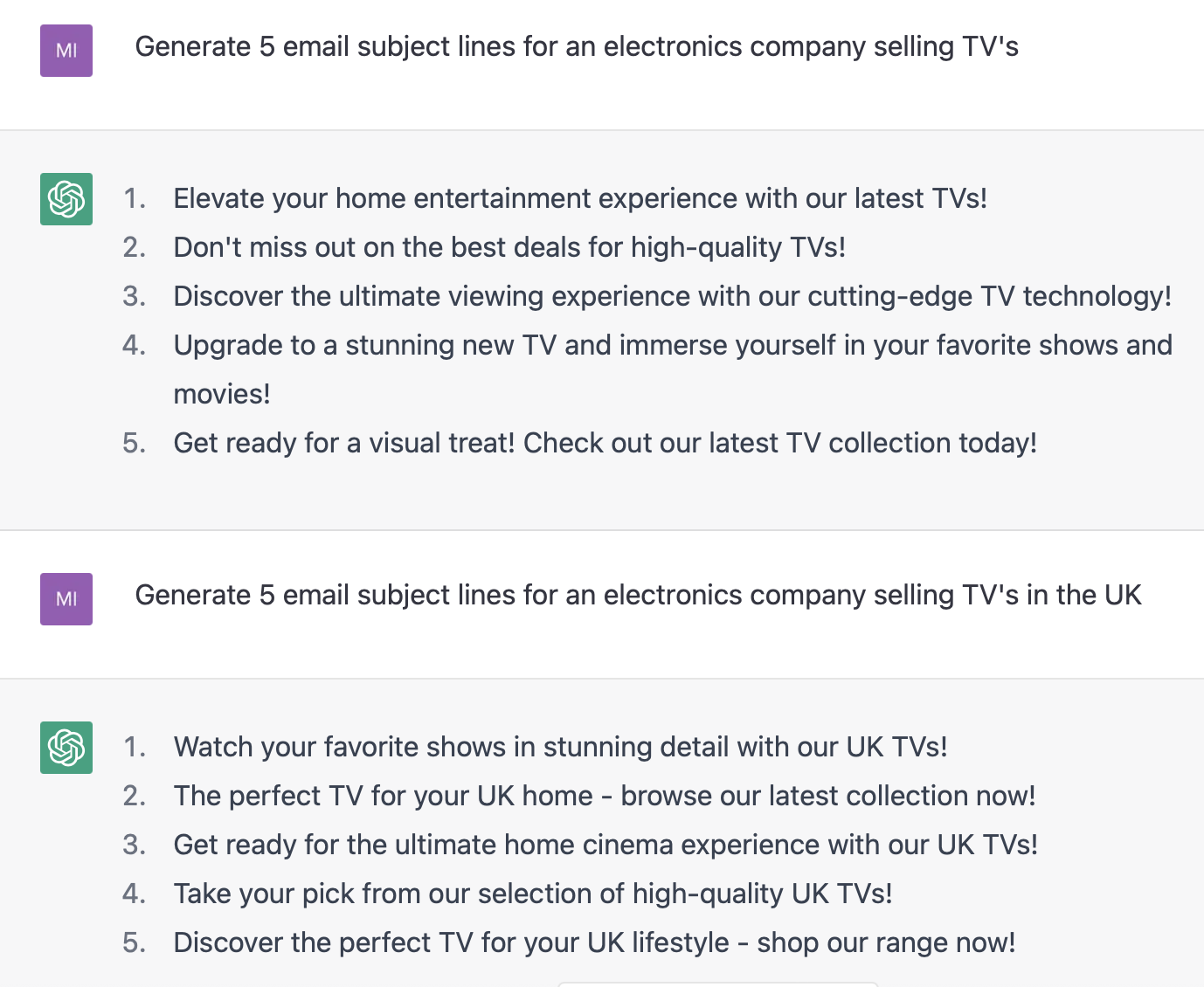
For the purposes of this blog let’s concentrate on subject lines. I asked it for 5 subject lines for an electronics company selling TVs and it came up with the below.

The results were as follows

ChatGPT question on subject lines
Generate 5 email subject lines

Now I thought these a bit “Stateside” and as I am based in the UK and wanted to compare it to UK companies’ subject lines I changed the question to reflect that…

ChatGPT UK version of subject lines
Generate 5 email subject lines in the UK

ChatGPT thought it important to inform people that this was for UK TVs showing a scant understanding or “intelligence” of the actual requirement. Now some of you will say that perhaps I should have been smarter with my question but and here’s the rub – if I can be smart enough to ask the question in a way that ChatGPT spits out a killer set of subject lines, then I can probably write those subject lines myself way quicker. I’ve already spent more time than I’d like to have done asking the 2 questions and not getting answers I could use.

So then I took a real life situation.

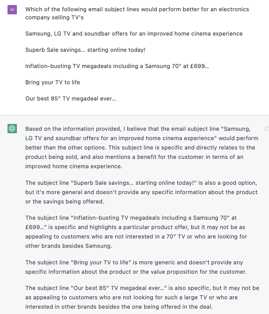
I took 5 subject lines from a client which had been used in specific campaigns and asked which one it thought would be most successful. The first time I did it, it ignored the first subject line because I hadn’t put it on a separate line from the question. It then subsequently said the following…

ChatGPT subject line performance
Which subject line would perform better

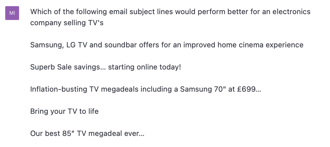
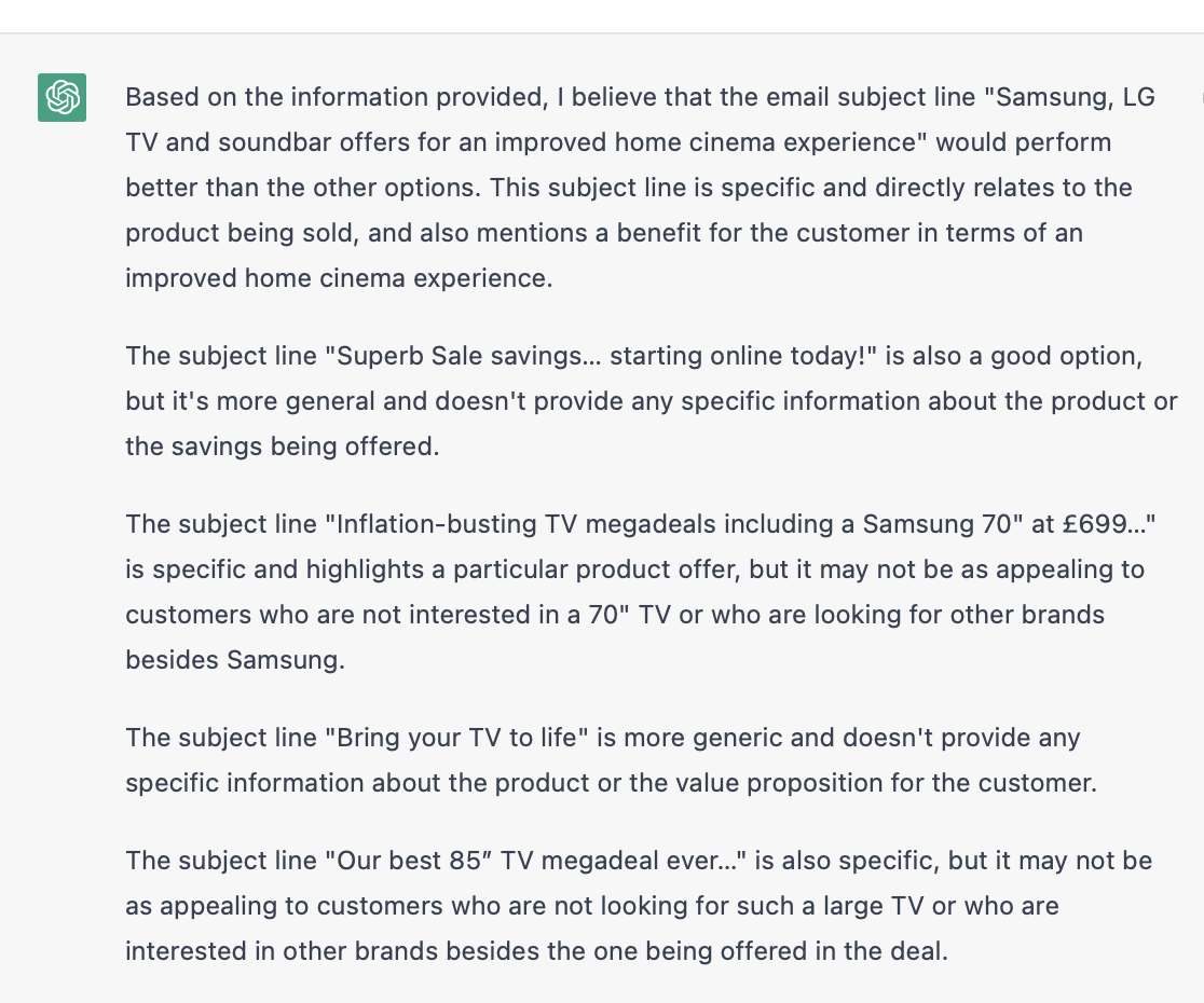
So I asked my question again but this time put the first subject line on its own in the question. ChatGPT then contradicts itself from the first set of questions and decides that the subject line that was missed out was in fact the best but the one it previously said was the best is now not so good because it’s too generic. But it doesn’t move it down from 1st to 2nd but from 1st to 3rd!

ChatGPT subject line performance
Which of these subject lines would perform better

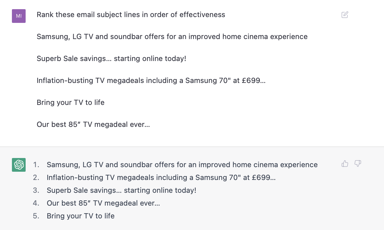
So I asked it to rank them in order of effectiveness and it said this

ChatGPT subject line rankings
Rank these subject lines by performance

What happens if you apply real intelligence instead of artificial?

Now I have real life data, I have a subject line tool which we built in house, which I can ask the above questions and get real answers. You can read about it here or Dela Quist’s SubjectLinePro or even Intuit Mailchimp’s version of our tool but ChatGPT, well I found it wasn’t useful at all. In fact it got things completely wrong.

So in order of their effectiveness in real life marketing solutions the rankings were…

1. Superb Sale savings… starting online today!

2. Our best 85” TV megadeal ever…

3. Samsung, LG TV and soundbar offers for an improved home cinema experience

4. Inflation-busting TV megadeals including a Samsung 70″ at £699…

5. Bring your TV to life 

And to remind you what ChatGPT said

  1. Samsung, LG TV and soundbar offers for an improved home cinema experience
  2. Inflation-busting TV megadeals including a Samsung 70″ at £699…
  3. Superb Sale savings… starting online today!
  4. Our best 85” TV megadeal ever…
  5. Bring your TV to life

At least we all agree that last one was the least effective. So my advice is, while AI is great and ChatGPT in particular is fun to play around with I will take real intelligence over artificial intelligence any day of the week! So in conclusion ChatGPT is a very naughty boy!

Email coding

Modules vs snippets in email development

As an email marketer, you probably don’t go back to the drawing board every time you create a mailing. Email layouts are saved as templates, and recurring components are stored as content blocks. There’s more than one way to do that. Let’s compare the email development merits of modules versus code snippets.

Some email development definitions

Modules are recurring template components stored on an email platform.

Code snippets are shorthand phrases defined by a developer that trigger pre-built chunks of code.

Modules and snippets therefore serve the same purpose. But the means to get there is very different. That deserves a closer look.

Module methodology

A module is essentially a standalone HTML file that can be dropped into a larger template. It might be a banner, or a stacking product section, or an intro with a hero image and a button. Whatever you like, it can be moduled.

Diagram of a project

That module is hosted in a library on your email platform. You can copy, edit and select any module for use in individual mailings. The specifics vary but you’ll generally perform this task via a graphical user interface. There often needs to be some additional programming using your platform’s scripting language.

Next, there’s usually a master template which has modules slotted into preset positions. These can of course be moved around or removed or added to as required.

So, that’s modules. Now for snippets.

Snippet style

The phrase ‘hand-coding’ is sometimes misunderstood. A developer will not sit and type thousands of lines of syntax in their entirety. Modern development environments support all manner of production shortcuts.

Among these shortcuts are code snippets. There’s more to these than simple blocks of code. A developer can set a snippet’s variables and cursor locations, thus producing a piece of code that can be navigated and edited in seconds.

Developer working on a laptop

Thinking about email development specifically, one example of a snippet could be a call-to-action button. By typing a pre-determined phrase – let’s say ’embttn’ – the developer triggers the snippet. Within moments, the text, link, colour, size and border can be set.

And the winner is…

I’ve kept the tone neutral(-ish) so far, but now it’s time to pick a side. By just about any reasonable measure, there’s a clear winner: snippets.

Here’s why:

Understanding

A skilled developer will work primarily in a code editor like Sublime or VSCode. Raw code may look daunting compared to the friendly GUI of an email platform, but ultimately that interface only fragments and obscures what is going on behind the scenes. When a new user needs to familiarise themself with the setup, it becomes a puzzle to be pieced together.

Speed

Working with modules means navigating through multiple pages and menus in an email platform. It is never quick. Working with snippets on the other hand is lightning fast. I’ve seen build durations reduced from all-day to an hour as a result of switching to snippet-based coding. There is no comparison.

Cohesion

Snippets mean far fewer sources of content for an email, and a more consistent format. Often an entire template can exist in a single file. Dynamic content written in your email platform’s scripting language can go there too, peacefully co-existing alongside HTML and CSS.

Flexibility

We’ve already covered the flexibility of snippets themselves. But there’s a related benefit – it means the developer can work in their environment of choice, rather than the one presented to them by an email platform. The advantage of a familiar and custom-configured comfort zone cannot be understated.

Final thoughts

To pit modules against snippets is part of a larger battle – drag & drop email builders versus hand-coding.

We are biased, of course. But with good reason. As a company of email developers, we’ve seen the comparative disadvantages of module-based configurations. There are situations in which errors can go unseen months or years. But the fault is buried somewhere in a maze-like setup that potentially no one person understands fully.

Hand-coding, by contrast, is uncluttered and transparent. For me, snippet-based email development is not only the best way to build mailings – it’s the correct way.

Email Marketing

The future is here. How will AI impact your emails?

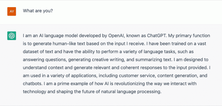
Artificial intelligence is a hot topic. There are several AI-powered tools on the market, whether in a commercially-viable or prototype form. Perhaps most significant is ChatGPT by OpenAI, which was made public at the tail end of last year. What’s ChatGPT? Why don’t we ask it:

Me: what are you? ChatGPT: I am an AI language model developed by OpenAI, known as ChatGPT.

To describe itself as a “language model” may be correct but it’s a little modest. ChatGPT’s abilities are vast. It can answer questions, generate code, write articles, translate documents, tell you a joke, or engage with you in some good old-fashioned chit chat.

This of course is an impressive piece of technology and a fun tool to experiment with. But its scope and usefulness extend far beyond curiosity. It has practical, real world applications. Why spend time programming a website component when an AI can do it for you in a fraction of the time? Why struggle with writer’s block when a copywriting deadline is looming? Why be presented with adverts when searching for information online? Prompt ChatGPT and it’ll take on the task and output some code, content or answers within minutes if not seconds.

Amazing, right?

Let’s take a step back

The validity of the phrase artificial intelligence is often contested. As a species, we are yet to develop something that is actually aware, or truly understands what it is doing. Perhaps a more accurate description is fancy algorithms. Patterns, machine learning… and sometimes very wonky output.

On that topic – ChatGPT makes mistakes. That’s not a criticism. Just like a human, ChatGPT learns from mistakes… but it doesn’t feel embarrassed about it. When things go wrong, you can tell it so. It’ll then take steps to rectify the error. There’s some give and take when working with ChatGPT.

What artificial intelligence could mean for email

The combination of email and AI (or fancy algorithms) is nothing new. One-to-one product recommendations have been around for years, picking relevant items based on previous shopping behaviour. Spam filters automatically guard inboxes against emails of the shadiest kind. Customer journeys and automated emails are made possible through complex workflows with little post-development need for human intervention.

What is new however is the concept of emails that are predominately or even completely designed and coded by computers. Imagine high-quality, on-brand design and copy that is generated in seconds. Perhaps the same AI tool could then select the audience, send the email, read the report and optimise the next send. Is there a point at which human input becomes zero?

What artificial intelligence currently means for email

Don’t worry – we’re not at the human irrelevance stage yet. In my tests with ChatGPT, I’ve seen it output some erroneous facts and broken code. From what I’ve seen it’s neither ready to fly solo nor likely to achieve such independence any time soon.

That doesn’t mean it’s not a revolutionary and practical technology in its current state. I already use it almost daily for writing inspiration and to help with coding questions that would otherwise mean trawling through forums for answers.

ChatGPT and other pioneering AI technologies have already changed the way we work, and they will only continue to evolve. It’s incredible to think that what was only recently in the realm of science fiction is now becoming a reality. The future really is here.

Data

Generate a PDF on the fly

What do you do if you need to send a document to a bulk mailing list (let’s say 5,000 for argument’s sake) that is unique to each person? For example, confirmation of a booking, a pre-populated form to be sent back, a quote, an invoice, a printable document…the list goes on. You can’t jolly well sit down and make one for each person, host them, and send everyone an individual link. That would be a colossal waste of time and resources. But what you can do is create auto-generated PDFs (the ideal format to be accessible across a multitude of systems and devices) that you can simply drop in the personalised details for each recipient and let the tool do its magic.


How does a PDF generator work?

As long as everything required for the PDF is stored for all recipients in your mailing platform, this will get passed along to the PDF generator URL held within your email template. When the link is clicked, the tool generates and redirects your customer to their own auto-generated PDF. It will get regenerated with each new click, so if space is an issue you can remove the PDFs. The only real design consideration for the PDF is how many characters could the personalised information be. Will it fit in any gaps you have provided in your document? The tool will allow for automatic line and page breaks so with a thoughtful design this should be an easily avoidable issue. It basically creates everything on a grid system, and you tell it what each cell should contain to give you total freedom across a page.


How complex can the PDF designs be?

You have control over the major elements of any design so it should be possible to create professional looking documents or replicate any existing document to a high degree using this auto-generator.


Fonts

Besides the standard font families you would expect, you can include your own fonts based upon .ttf, .otf or .pfb files. You just need a font definition file link. You can choose whatever size you need your copy to be, variable across the document sections, and style your text how you want with usual modifiers like bold, underlined and italics. There is no reason you cannot stay on brand.


Images

You simply need to link to a hosted image, set your dimensions and you can drop them in wherever you like. JPG, PNG and GIF are the currently supported image types.


Colours

You can change the colour of text, borders and the background using the whole array of RGB values. You can even change colour mid-sentence if you like, which is useful for example for highlighting a link.


Links

You can add hyperlinks to the document encapsulating both text and images.


See it in action

Want to see a PDF document generated on the fly? Filling out this form will replace the action of pre-selected information sent to the PDF generator inside an email, just to show how quick and painless the process is. There may even be a reward in it for you…


Design your email


Through this demonstration you can see the control you have over fonts (font sizing, colour and decoration), images, page orientation, borders, links, page and line breaks. You can find the full range of functions available here.

Just get in contact if this project is of interest on +44 (0)131 557 7780, via our online form or email us directly and we’ll be happy to help.

Email Marketing

User experience in email design

Email is a fantastic graphical way of communicating with others. But so often in email design the primary function of an email is forgotten. It may be time for a fresh look at user experience in email.

Sure, some emails are just to pass on information, but nearly every single other email is about selling. It is currently impossible to complete a purchase with just an email but this is no bad thing, it streamlines the email’s function. The email exists solely to drive traffic to a web page.

The email exists solely to drive traffic to a web page.

Email is not website-lite

This key idea is so often lost in email design. Often it is closely tied to reproducing a similar or lesser version of a website instead. I think this is a terrible waste of space, and poor design that doesn’t challenge the ways email should look.

Instead of the ubiquitous ‘view in browser’ link, the logo, and a site navigation bar, why don’t designers just go straight into some products? The Subject line, Pre-subject line, From address and Friendly From address could all be used to establish the brand. The ‘view in browser’ link doesn’t have to be at the top. Lastly the navigation bar is just a poor version usually of what is on the site. Furthermore it nearly always links away from the main campaign … which is the primary purpose of the email!

Emails are ephemeral messages, they focus on what’s happening now. Including links in a navigation bar at the top of an email design just takes the user away from the sale that is happening now. This is a bad user experience. It’s equally bad for the sender because the click has been wasted. The purpose of the email was to get the user to go to the sale section and now they have clicked something else in the navigation bar.

Link with purpose

Emails also need to consider where they are driving traffic to. If it is easy for people to complete a purchase from nearly any page, that’s great. However if the email can misdirect users to contact pages or other areas of the site before the reader has even seen the primary content of the email, that’s not great. There would be an argument to say the content is incorrectly ordered.

Large full-width images are also a component that can affect the overall user experience of an email. First, it must be said stated that they are necessary and often provide some much needed beauty and spectacle to a design. However, they can be tiresome to scroll through and take up a lot of space for a single link. Consider their use carefully.

Text links form the backbone of the internet and were the first types of link on the internet. In email design, however, designers don’t always stick to the rules and sometimes only use bold links or just colour them differently. Always apply underlines to text links. Format them with sufficient font size and line height so that they can be clicked easily. Unfortunately, it is not uncommon to find many text links all squished into a paragraph of small text. This makes it very hard on some smaller screens to click the link you intended.

The primary message must be the focus in order to provide a good user experience in email design. Links that might scatter users all over the website should be kept to a minimum and collected at the bottom of the email. Analysis of email heat-maps always show the vast majority of clicks happen toward the top of an email. They gradually decrease as you move further down the email. With this in mind, email designers should focus on making the primary message content of the email as close to the top as possible. Migrate all other types of content towards the bottom.

The courage to break convention

This could mean a layout that reverses the content order completely would be a better email design. Start with the products you want to focus on, then any other content and finally add the branding and any footer content necessary. This would be designing in a manner that takes into account where the most clicks happen and relying on people to know who sent them the email. This is a step designers have so far been too scared to take.

To this date I have not encountered a brand that has been brave enough with their email design to use such a forward thinking approach. There are some examples, though, where brands do drop superfluous components such as navigation bars, however I have never seen one brand completely flip the email design.

Design for clarity, not confusion

Individual components in email design often provide terrible user experience. For example, an email might be trying to sell a high cost item. Instead of solely linking to that product, the email links to all sorts of other things relating to that product. For example, the product might be a new car. Rather than taking the clicker to the new car page it links to the car accessories page. It can be argued that at least the user is on the website, but the point of the email was to sell the car. The goal wasn’t to sell windscreen wipers for their existing car. Polluting the layout with complementary links to add-ons or related products only decreases the traffic to the main intended link.

To have the best user experience in email design, the email’s components need to be concise and link to a single location. Prioritise content order and remove superfluous components. Subject lines and From addresses should factor into the email design. Place recurring content at the bottom of the email.

Email Marketing

Your email open rates are changing

Unless you’ve been living on a remote island somewhere you’ll know that on September 20th Apple’s iOS 15 update was launched. It contains a feature call Mail Privacy Protection (MPP) which – amongst other things – will eliminate the ability to accurately track email open rates.

For the uninitiated, email opens are recorded using a tiny image in the email code. When the email is opened, that image loads, which tells the sender an email was opened, by whom, when, where and on what device. What Apple have done is add a ‘middle man’ into the mix. Emails are now firstly routed through Apple’s proxy servers to pre-load email content – including the tracking image – before serving the email to the original recipients.

This will make it impossible to tell whether real people or Apple opened your emails. We won’t know when the open happened, where the person is located or which Apple device they use. That means no more mobile vs. desktop insights!

For some email campaigns, we are already seeing the percentage of emails where the device data is being hidden by MPP at 20%. That’s double what it was a week ago and we expect this to increase as more Apple users install the latest iOS 15 update.

What will the adoption rate be?

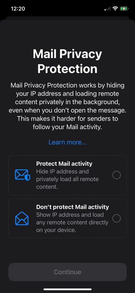
Whilst MPP won’t be switched on by default, when opening email for the first time after installing iOS 15, you are presented withprf a screen asking if you would like to be tracked or not.

When Apple launched its App Tracking Transparency tool in April, 96% of people opted out. There is no reason to expect Mail Privacy Protection will be any different. I mean, who in a post-GDPR and Cambridge Analytica, Facebook etc. world would say ‘Yes, please track me’!

So, from now on you can expect to see your open rates jump. You just won’t know if any of that increase is real. With estimates putting Apple proxy opens at 75% you can be sure this jump isn’t because your audience suddenly loves you more.

…and why does that matter?

The upshot of this is that open rates will no longer be a useful metric when measuring subscriber engagement. This has repercussions for a range of emails you may already be sending, including:

  • A/B testing subject lines using opens to determine the winner.
  • Targeting based on the last open date.
  • Automated workflows and journeys that rely on someone opening an email.
  • Send time optimisation based on previous open times.
  • Countdown timers may also show incorrect times as they will start at the Apple open rather than the real recipient open time.
  • Local content driven by opens or IP addresses, such as the nearest store location (although this is more of an issue in large geographies like the USA rather than the UK).
  • AI platforms that use email opens in their algorithm for creating optimised subject lines.

Going forward, list hygiene management using non-openers over time will become a challenge although as Apple can only cache images if the Mail app is running, it means those email addresses are valid.

There is a chance this could all backfire of course. The muddying of these waters will mean emails that are less targeted and none of us want that. We have all come to expect a high level of personalisation. Sometimes we even claim we are happy to trade a degree of privacy for an improved experience. However, I can’t see this becoming a big enough issue to prompt large numbers of people going into mail settings on their iPhones and switching MPP off again.

So what can we do to best prepare our email marketing for the future?

Who’s who?

The first step is to understand the email client breakdown of your audience to determine who uses an Apple device. You can also create a reliable opens audience for non-Apple Mail users as you can still use the open metric here.

Update and remind people about your email preference centre. Give them a range of choices on how they would like receive emails from you. And – as always – keep your email list clean to stay on top of deliverability.

Focus on click rates

The goal of any campaign is most likely not about how many people open an email but how many make a purchase and in between the email open and the website is the click. We are already focused on click rates and now we’ll need to rely on these even more. The open-to-click metric will also need changing to clicks compared to emails sent.

Expand your engagement-based segments

As open rates become increasingly unreliable, double-down on your engagement criteria to include clicks, web visits and purchase activity. The numbers who meet these criteria will naturally be smaller but it’s a good way to continue having highly-targeted engagement segments.

Segment your contacts based on how far they are on their path to purchase. This provides another data-driven measure of intent that can be used for targeting.

Add new channels

Other channels like SMS and push notifications can help expand your reach. In 2020, the number of SMS messages sent increased nearly 400% with conversion rates doubling.

For web push notifications, the increase was around a 30% conversion rate, which is nearly five times what it was the previous year.

Whilst you should consider these channels to mitigate no longer having complete email open data, neither SMS or push notifications have open rates at all so have always had to measure success in terms of conversions. It’s also worth reminding ourselves that email is still at the top of the pile in terms of ROI. A drop in the accuracy of measuring open rates isn’t going to change that.

Shopping data

Place more importance on customer purchases using recency, frequency, and monetary (RFM) data.

If you don’t already have one, create a customer lifecycle program which can identify customer stages based on all of these other metrics. It will allow you to build and automate data-driven campaigns based on purchase behaviour.

Be creative

Be adaptable so you are able to move quickly when things change. We should always be looking for new ways to provide value to our customers. The ultimate goal is revenue from initial and repeat purchases, not open rates.

As marketers, we have all the data we need to help understand customer preferences which should allow for smarter promotions overall. The open engagement metric may be more unreliable, but the metrics of clicks and conversions remain unchanged.

Hide My Email – should I worry?

Another part of Mail Privacy Protection allows people to hide any of their email addresses (e.g., Hotmail/Outlook, Gmail, etc.) by generating unique, random icloud.com email addresses that forward to their real email address. These are used only once. If people hide their email from multiple companies, they will have generated multiple fake emails (one for each website).

icloud email addresses aren’t anywhere near as prevalent as Gmail or Hotmail/Outlook. Nonetheless it’s worth tracking your email data at a domain level to check for growth.

These fake email addresses can be deleted which means next time you mail them they will hard bounce and, If you get a lot of these, your email deliverability will suffer.

Another challenge is tying email activity to purchases when, say, someone signs up for your newsletter with Hide My Email but then later make a purchase using their real email address.

Whilst it is early days, Hide My Email is unlikely to gain enough traction to become a problem. After all, there have been similar services available for years. Also, if you’re seeing lots of new random icloud addresses appear in your database then you have a more fundamental trust issue. These people saw enough of a reason to hide their real address from you in the first place.

The future is bright

If your core objective of marketing is to provide the right value to the right customer at the right time, you shouldn’t have too much to worry about.

However, Apple’s iOS 15 update is certainly making it more challenging. Apple may be leading the way but expect other companies to follow suit. We should all see this as an opportunity to look at the other ways customer engagement and behaviour can be measured and improved.

Ultimately what Apple has done is a good thing. We have all had our trust eroded over the years by unscrupulous marketing. Spammers often use harvested email addresses. There is ever-pervasive advertising that follows you around the internet. And the almost sinister use of AI algorithms that present us with filtered realities within social media platforms – just to keep us there longer so we see more ads.

In this brave new world it has become easy to forget the marketing fundamentals of building trust and respecting our customers. Apple have just given us a reminder.