Sleek. Fluid. Professional. The modern web is a far cry from the chirpy MIDIs, wacky GIFs and anything-goes spirit of the internet of old.
It would be silly to suggest that the fledgling internet of the 90s and early 2000s was ‘better’ in an objective sense. Connections were slow, web pages were often incomplete, and pop-ups were a scourge. But one thing is for sure – it had character!
Big tech, small planet
The internet started to go mainstream in the mid nineties. It was a big deal. The family computer was no longer limited to whatever topics happened to be on the Microsoft Encarta CD – suddenly it had access to all the information in the world. You could talk to people across the globe. The planet became connected.
That early internet experience was more than a little different to the one we’re used to today. It’s funny, almost quaint, to look back on those first few years. Some people used the internet, some didn’t. It was a thing you would “go on”… and then come back off. And all of this took place via a single conduit: the desktop computer in the living room. Having an ever-connected, pocket-sized device upon our person at all times wasn’t something that we could have imagined back then.
The digital Wild West
The early internet is often likened to the Wild West. It’s an apt analogy. Using free hosting services like GeoCities, anyone and everyone could make a website. While there has always been a corporate presence on the web, search results back in the day would often lead you instead to Random McPerson’s home-made website.
It was a simpler time. Most people weren’t concerned with engagement. McPerson’s site probably had a hit counter slapped somewhere on the page, but it didn’t serve any purpose beyond pure novelty. 680 people have stumbled across my website? LOL.
Tangled web design
Let’s get to the core topic: how it looked. The distinctive character of early web design was a product both of limited technology and unbridled enthusiasm.
Much of the internet had an unapologetically more-is-more ethos. Distinctly ‘untechy’ Times New Roman lettering would sit atop psychedelic backgrounds. Clashing, near-illegible colours? We had no problem with that.
Animated GIFs were everywhere. Bursting fireworks or dancing bananas or burning flames would be arbitrarily plonked onto the page. Sorry, did I say “or”? I meant and. The only theme was often no theme at all.

Modern CSS-powered layouts like grid and flexbox didn’t exist back then. Instead, websites were structured using HTML tables and frames. The pseudo-3D borders of these were often visible. That was nothing to be embarrassed about.
Another thing not to be ashamed of was blatant incompleteness. I don’t think it was possible to ‘surf the web’ back then without encountering at least one UNDER CONSTRUCTION sign per session.
![]()
Corporate sites tended to be more restrained (usually), but they had an unmistakable look and feel of their own. Image-based side bars, rigid page structure, grainy GIF-based graphics, tiny fonts and Photoshop-generated bevel and emboss effects were common. And don’t forget that lens flare!

Can’t stay that age forever
If 90s internet was a hyperactive child, today’s has matured into a sensible adult with refined tastes. Modern websites are places of flat design and minimalism. I’d be lying if I said I didn’t find it dull in its sterile perfection.
But I know why it must be this way. The internet has become heavily commercialised. The carefree, unregulated feel of the past is gone. Even the average internet user now craves views and likes as a form of validation. The internet takes itself more seriously these days.
Social media of course has become a major aspect of online life. Platforms like YouTube and Facebook serve as a base for other people’s content. It makes sense that their interfaces should be understated.
There’s another consideration: responsive design. In the past, websites could get away with fixed sizes. Visitors back then would be viewing content on a desktop monitor at one of a handful of screen resolutions of similar aspect ratio. Now web developers need to consider the huge range of screen sizes out there – from desk-spanning ultrawide monitors to the slimmest mobile phones.
Remnants of the old internet
It’s still possible to happen upon old-school websites. On the rare occasion I find one by chance, the wave of nostalgia is instant and immense. Such trapped-in-the-past websites will only become fewer as time goes on.
Famously, Disney’s original Space Jam website from the nineties remains up and running. GIFs, tiled background images, garish colour combos – it’s got the lot and it’s glorious for it.
The old internet isn’t just a curiosity. It’s technological history worth preserving. Internet Archive’s Wayback Machine provides an invaluable service in this respect, with a vast series of snapshots of websites over the years. These are pieces of the internet that would otherwise have been lost to time.
Neo-retro design
Nostalgia is powerful. While change is inevitable, there’s an intoxicating sense of comfort in memories, rose-tinted as they may be. Neo-retro design cracks open the door to the past – if only a little.
Adidas provides one such example. It meticulously produced a 90s-style web page for its Yung trainers a few years ago. The original page is gone, but you can view screenshots of it at awwwards. Satisfyingly old-school, right?
But just like a movie that tries to replicate the spirit of the 70s or the 80s, it can never be truly authentic. It’s a love letter to the era, but it’s not of the era.
Creativity is alive and well
The experimental feel of the early internet faded away because it was no longer necessary to design that way. We know now what works. There are tried and tested frameworks for building websites, without the need to go back to the drawing board again and again.
These days we spend a lot more time on the same handful of websites. We’re used to the neutrality of their interfaces. Consequently, it can be easy to assume that there is little room for creativity in web design any more.
But that’s not quite true. There are wonderfully inventive websites out there. Some of these sites push the boundaries of web design in creative and technical ways that surpass anything we could have dreamt of in the 90s. It just takes a little exploration to find them. Check out CSS Design Awards and the aforementioned awwwards for starters.
What about email?
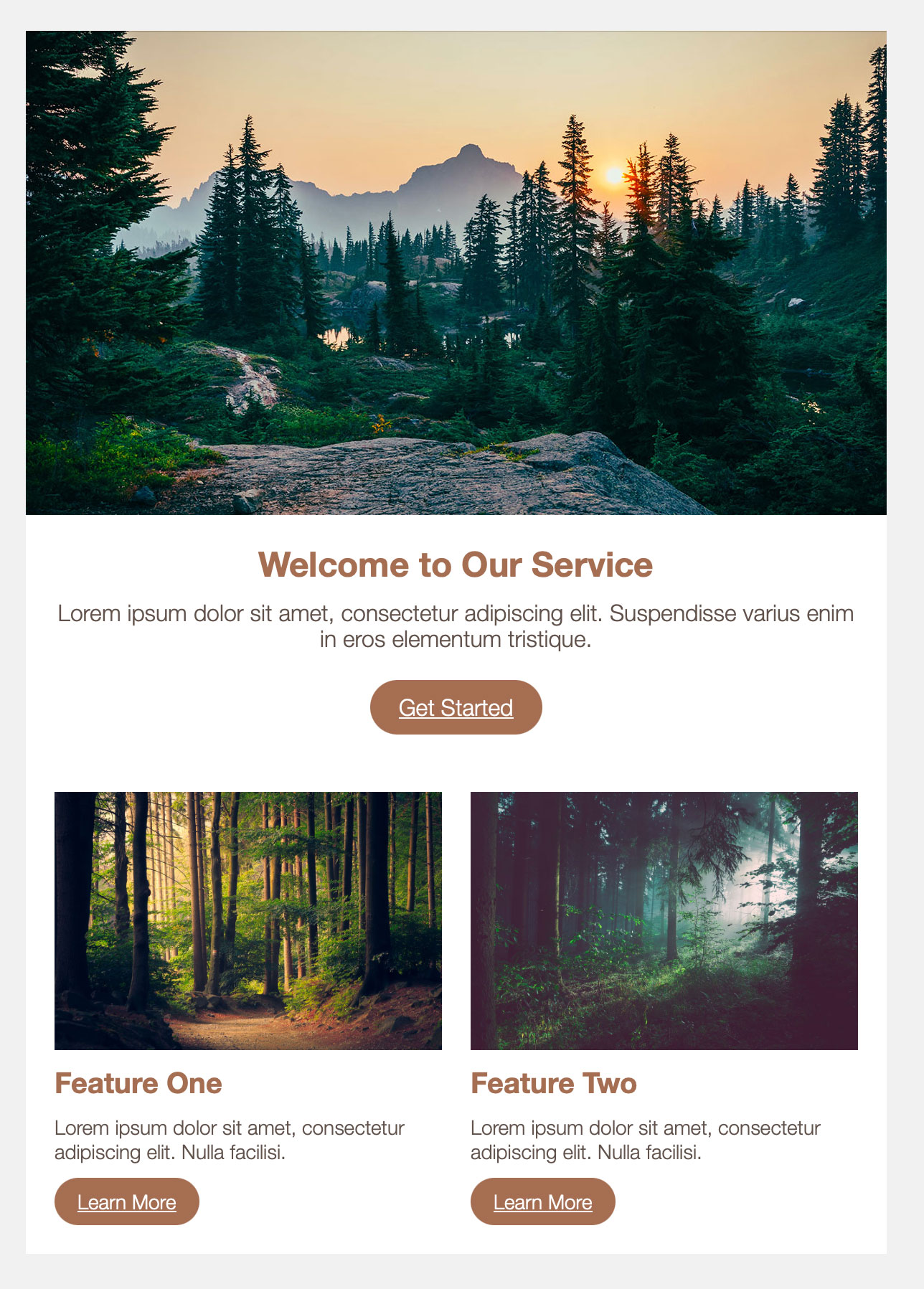
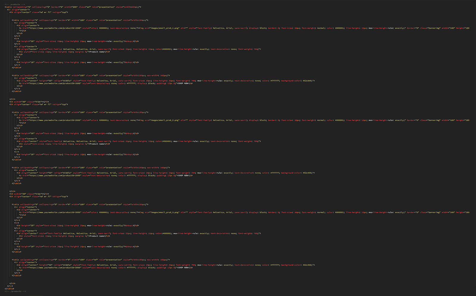
We’re an email marketing agency, so let’s tie all of this to our medium of choice. Emails to this day are built around HTML tables. That really is coding like it’s 1999.
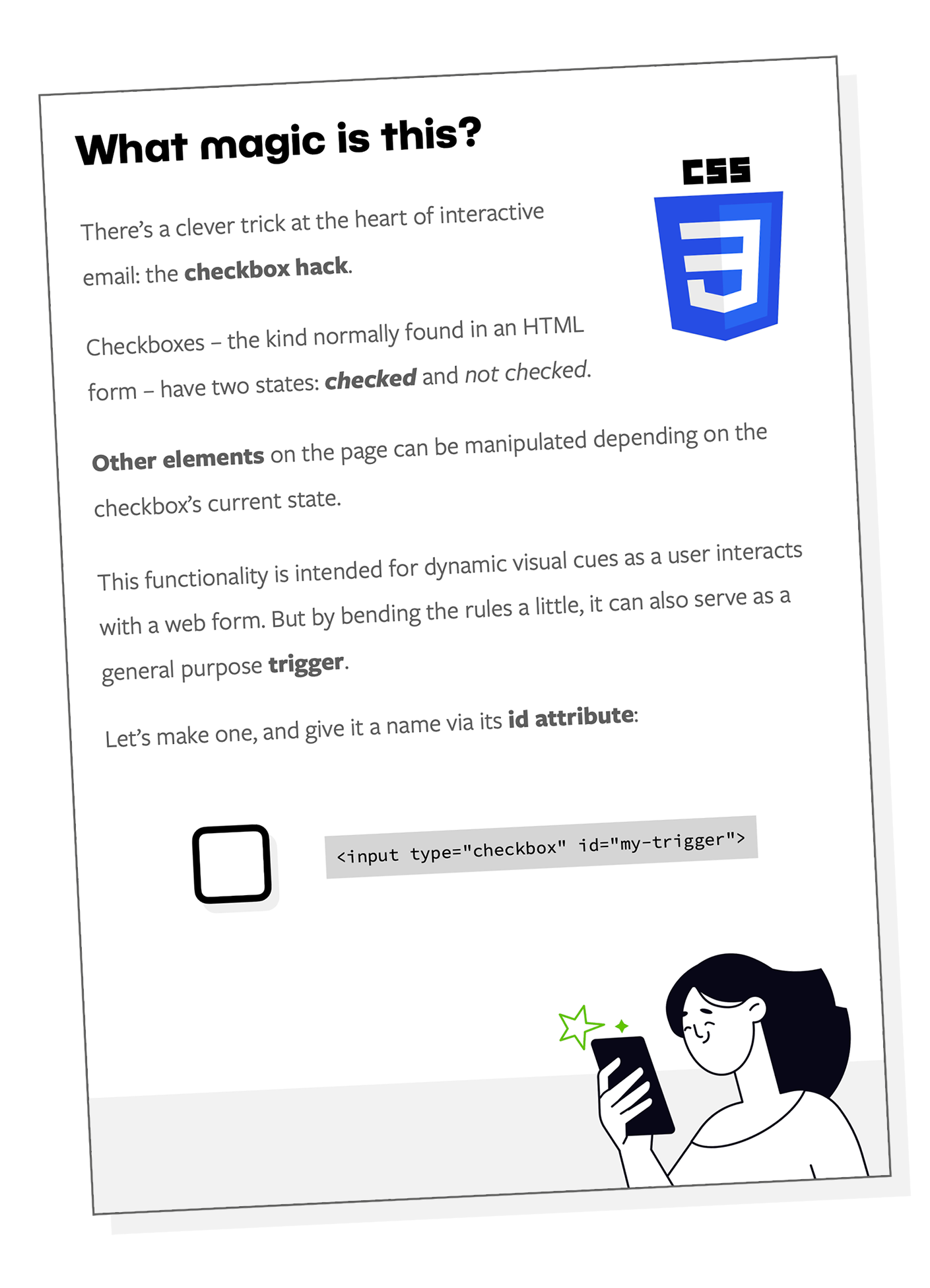
And yet email, both as a medium and as a marketing channel, is home to some world-class creativity and state-of-the-art technology. That includes the rule-bending experimentation of interactive email. The digital Wild West may be history, but the pioneering spirit of progress will never die.