I have some exciting news: I received a Black Friday sale email last Black Friday. And I actually noticed it.
At a time of year when brands are screaming for attention, this one particular email stood out. The reason: minimalism.
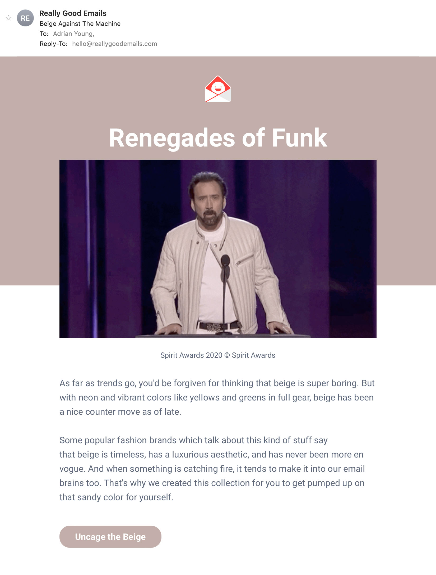
Take a look
The email in question came from a niche record label to which I subscribe. Here it is, in all its glory:
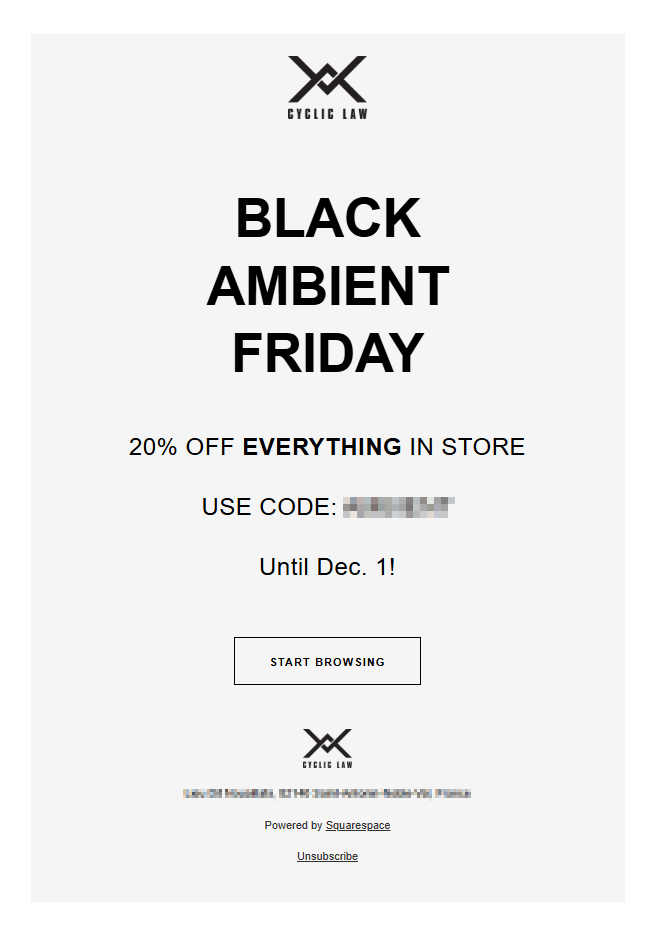
There may not be a lot to this email in a literal sense… but there is a lot to like about it. Before we talk about that, let’s examine the opposite end of the marketing email spectrum.
The ‘everything’ panic
There’s a famous scene in the 90s movie Léon where Gary Oldman’s character yells “EVERYOOOOOONE!” in a feverish panic. Subtitute that word for ‘everything’ and it becomes strangely relevant to the thinking behind content-heavy marketing emails.
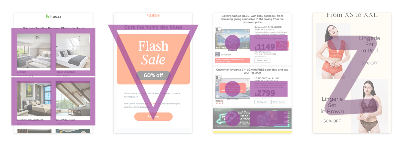
Retailers generally have lots of products to sell and lots of customers to send to. Therefore, there’s at least some logic to the idea that their mailings should be chock-a-block with choice. But start adding offer banners and brand partnerships and rewards bonuses and editorial features, and the situation goes from content-rich to content-ridiculous.
The root of the problem is an unspoken fear: if even a single piece of content is dropped, someone out there might not be connected with their perfect product. And thus emails balloon into behemoths.
Hocus-focus
There’s a big problem with big emails: lack of focus. The more-is-more approach ultimately becomes self-defeating. The more content in an email, the less likely any one item is to be seen.
In our modern digital world, notifications aplenty compete for our ever-decreasing attention. People do not peruse a marketing email. Think in terms of seconds, not minutes. It’s more important than ever to get to the point.
Blurred roles
Email plays a crucial part in the marketing chain: deliver a message and get people onto the website. It’s a conduit, not an end point. Once a customer is on the website, they can search and compare and customise at their leisure.
However, if the email itself is packed with options, it crosses the thematic threshold into mini-website territory – with none of a web page’s actual functionality.
The truncation situation
Complexity of design + excessive content = lots of kilobytes. In a technological era where we commonly speak in terms of gigabytes and even terabytes, matters of kilobytes might seem inconsequential. But in email, kilobytes matter.
Once the base code of an email exceeds around 100KB, there’s a problem – truncation. Some email services, most notably Gmail, will chop off the latter part of a code-heavy email. Sure, there’s a little blue link to see the email in full… but by that point the damage is already done.
Protracted production
There’s an important internal factor to consider with large mailings: production time. Long emails take time to design and develop. And even longer to update. In dynamic market sectors like retail, it’s not uncommon to rebuild parts a mailing several times before it goes out the door. Is that really the most efficient way to operate?
Win-imalism
Ok, enough negativity. We’ve looked at various reasons to avoid overly-complex emails. Let’s now consider the benefits of minimalism, using the earlier Black Friday email as an example.
The email is 100% focused on its objective. I know immediately what the offer is. There’s a single call-to-action that encourages me to explore. The total absence of secondary links means that the email is not competing with itself, and its purpose is not watered down.
There’s a respectful quality to the email. No guesses or assumptions are made about my preferences. The brand respects the recipient’s freedom to make up their own mind.
The design is devoid of flashy imagery or tacky emojis. The offer speaks for itself without these extras.
Accessibility is another aspect of this email that deserves praise. All of the copy is presented via real text, not images. Links are applied only to components that make functional sense – those being the button, logos and underlined text in the footer.
Oh, and it doesn’t greet me with a faux-chummy “Hi, Adrian”. I know my name and don’t need a database to remind me. Appreciated!
Something to consider
Okay, okay – it’s perhaps easy for this particular email to take a minimalist approach. The brand sells music, which is something listened to rather than looked at. Therefore a big ‘hero’ image of a product is not required.
The mailing promotes a general sale, so individual items are not strictly necessary. And the greyscale colour scheme befits the unusual character of the brand.
It would be overly-simplistic and frankly wrong to claim that minimalism is the correct way to build every email. A simplified approach can be effective given the correct circumstances. It’s certainly worthy of consideration.
The spirit of minimalism can also be applied without resorting to extremes. It’s not an all-or-nothing deal. Reining in a meandering mailing and reducing some of the content is a significant improvement in itself. Choice is good, overload is not. There’s always tomorrow to send the rest of it.
Don’t guess. Test
Hard facts beat guesswork, and this is where A/B testing is invaluable. To know for sure whether minimalist email design is right for you, a carefully-planned split-testing strategy is the way to go. The goal is to generate real data about what your customers respond to.
In any case, minimalism isn’t about less. It’s about doing what works best.